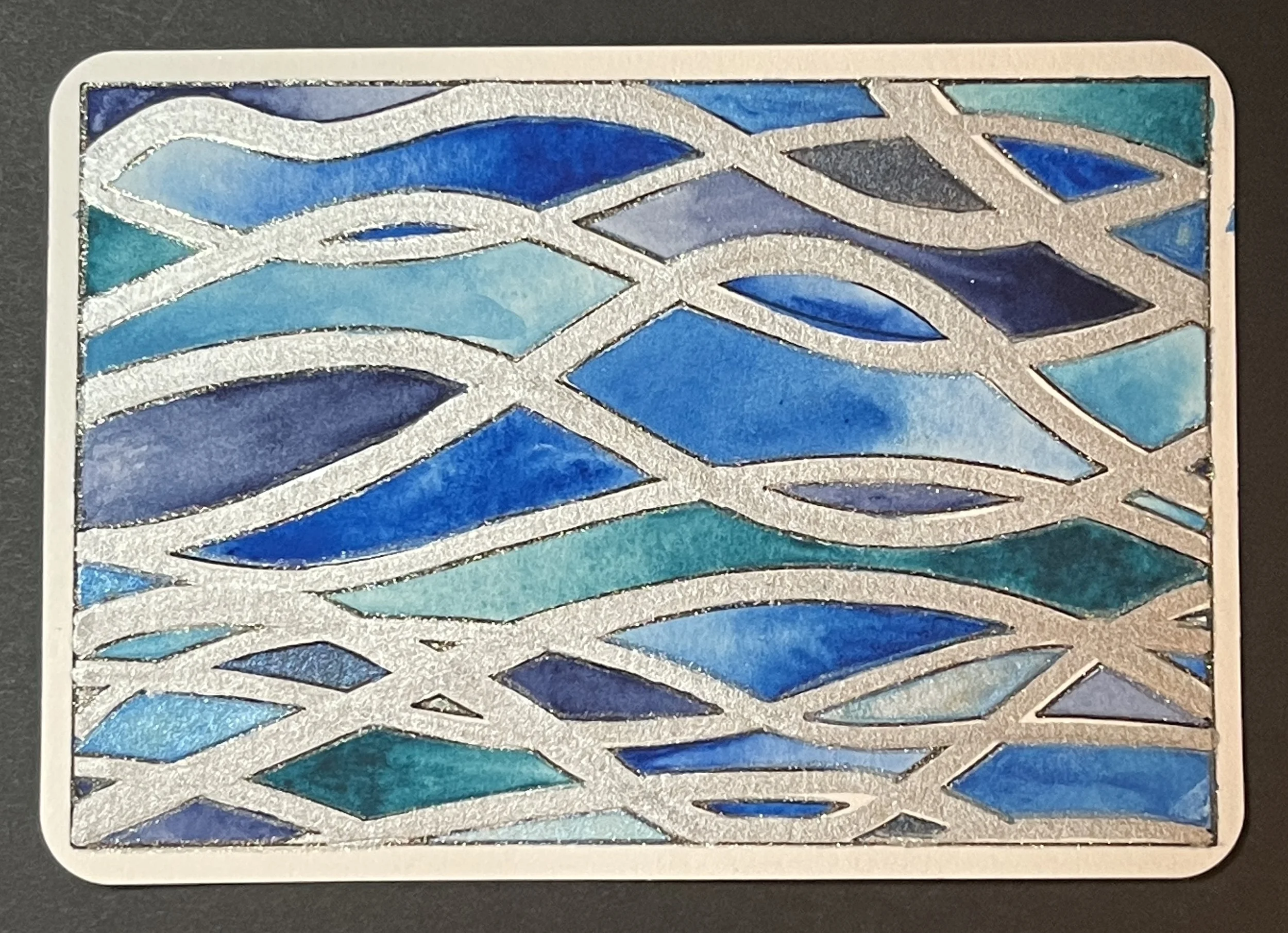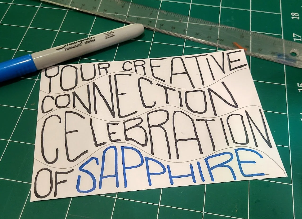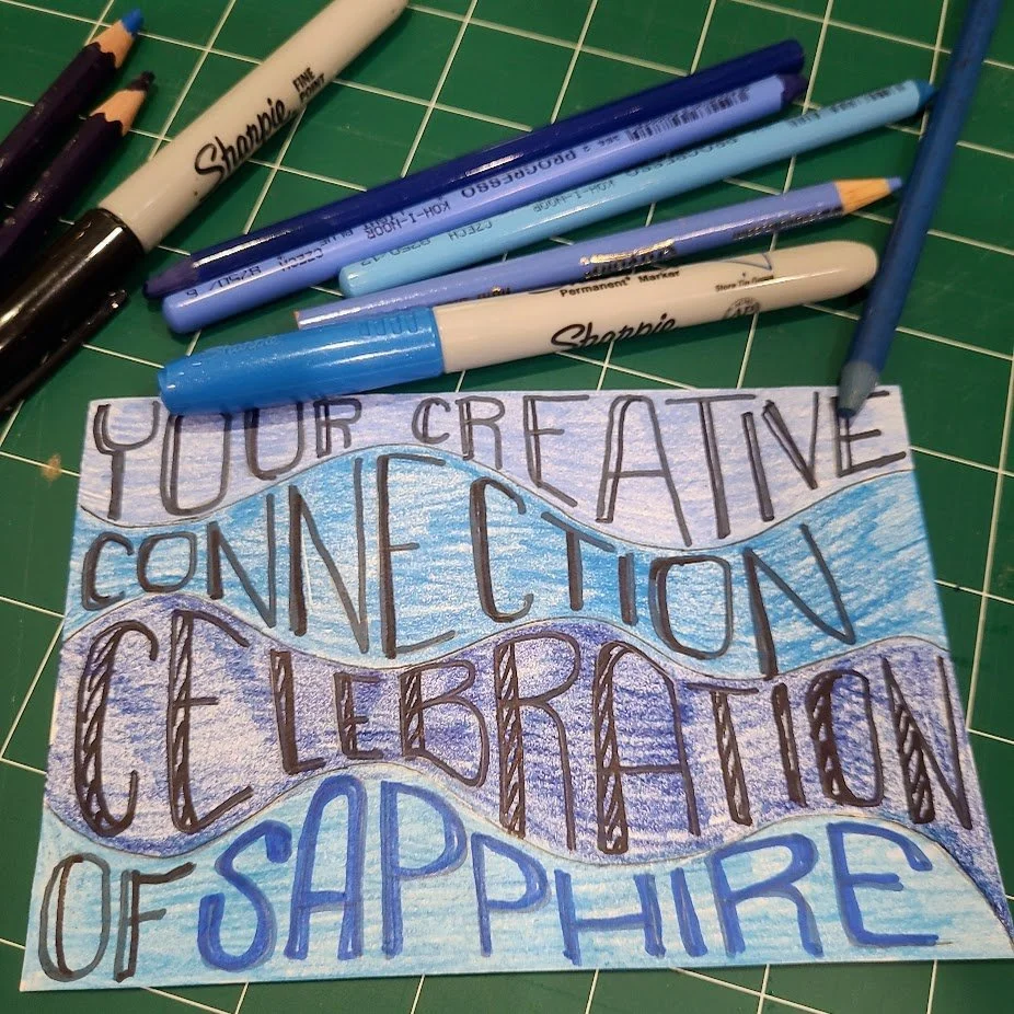
I often say that Christmas brings out the blue in me—no, I don’t mean holiday blues—I mean in reaction to the proliferation of all things red and green, I am drawn to the color blue. Which is perfect for this, my final ToT for our International Mail Art Celebration of Sapphire which falls during the holiday season!
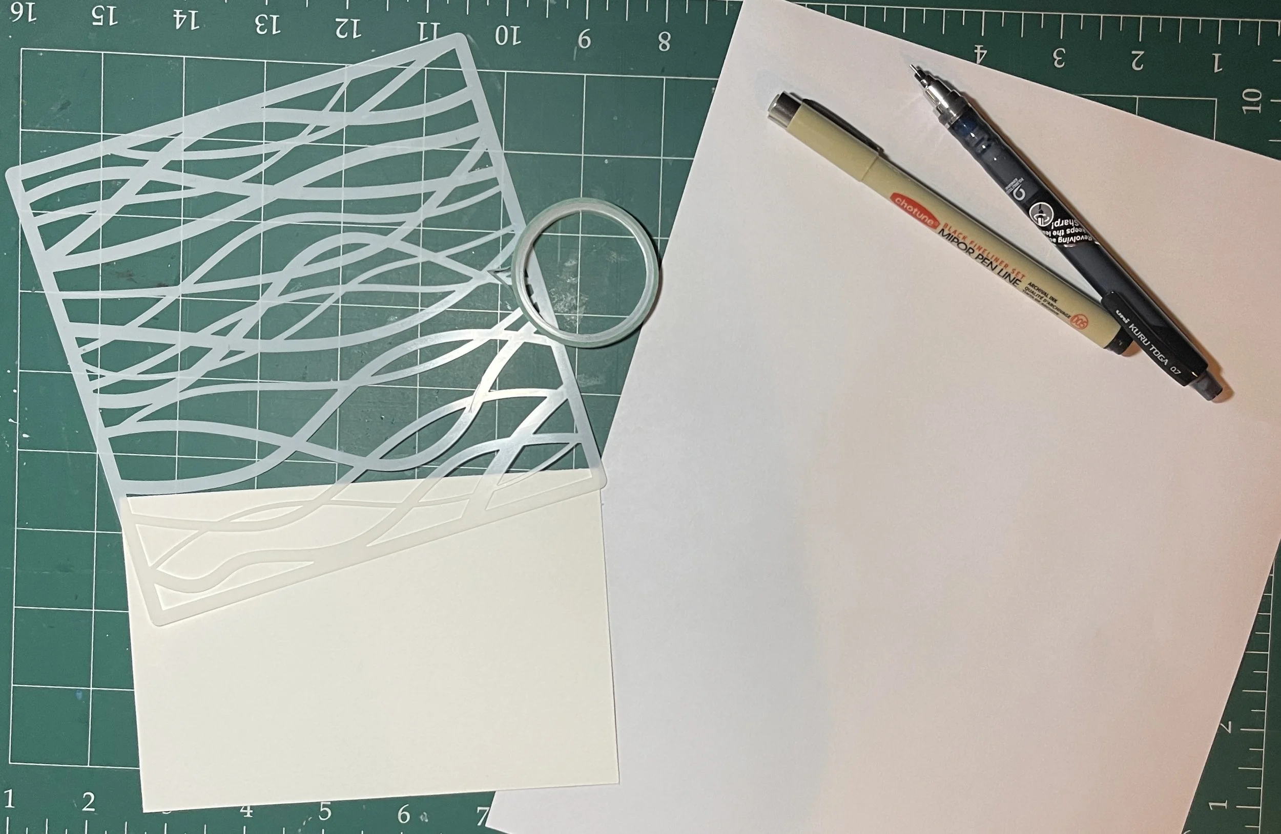
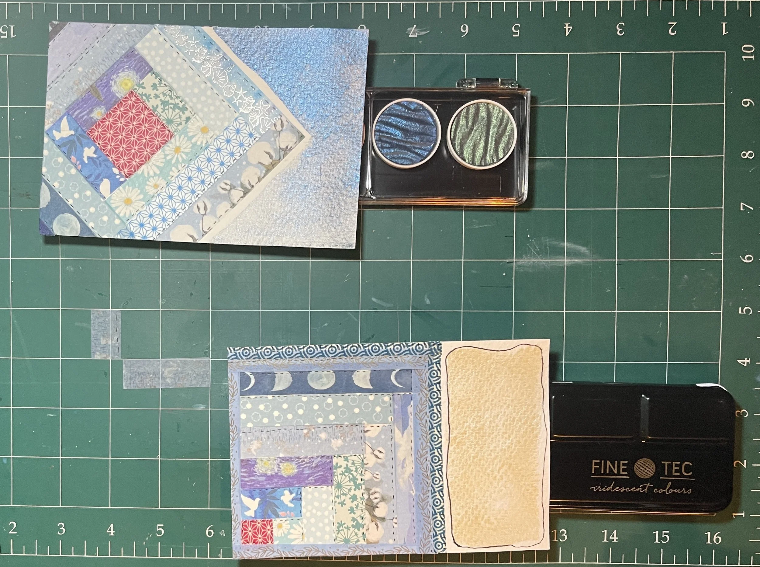
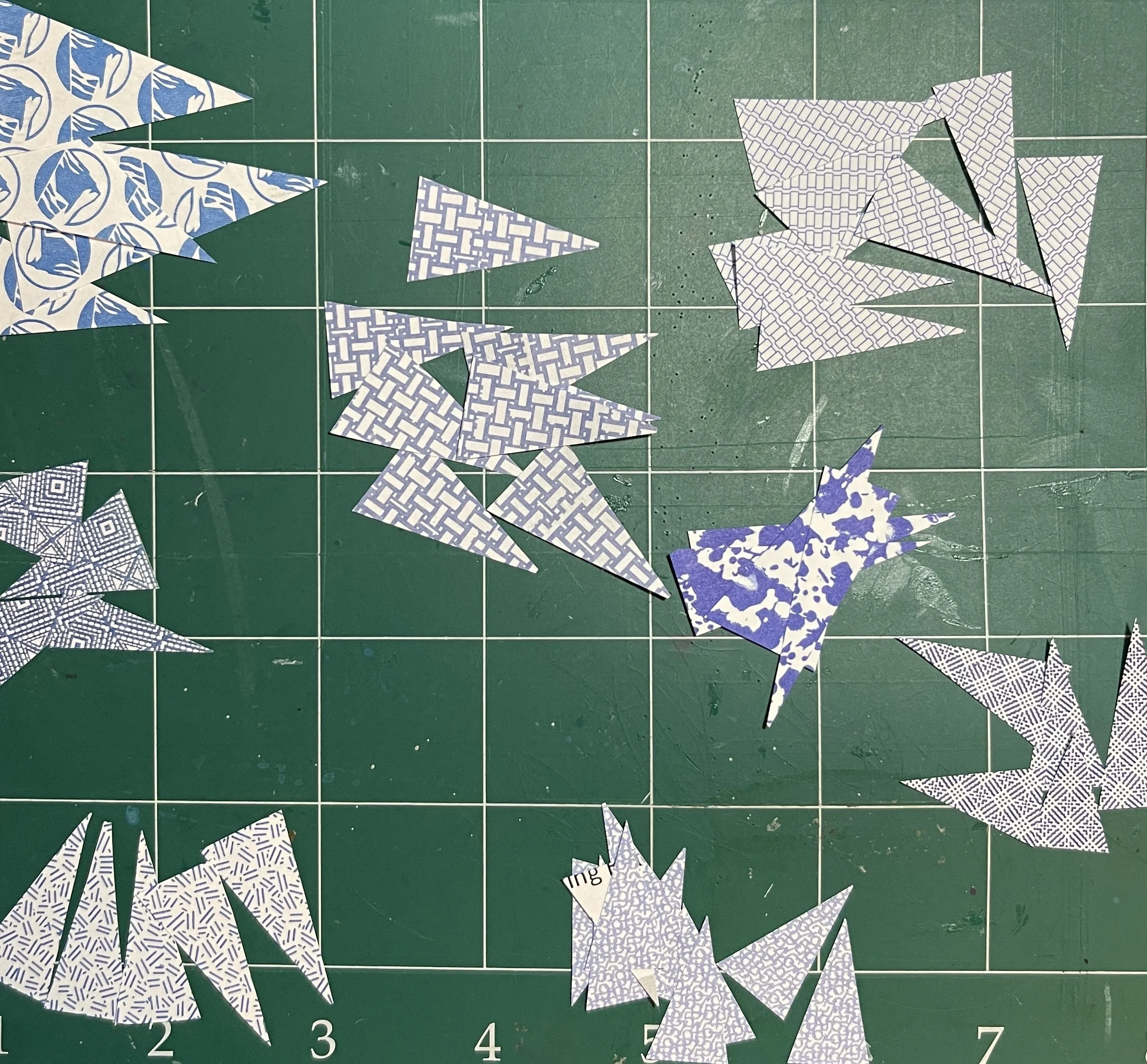
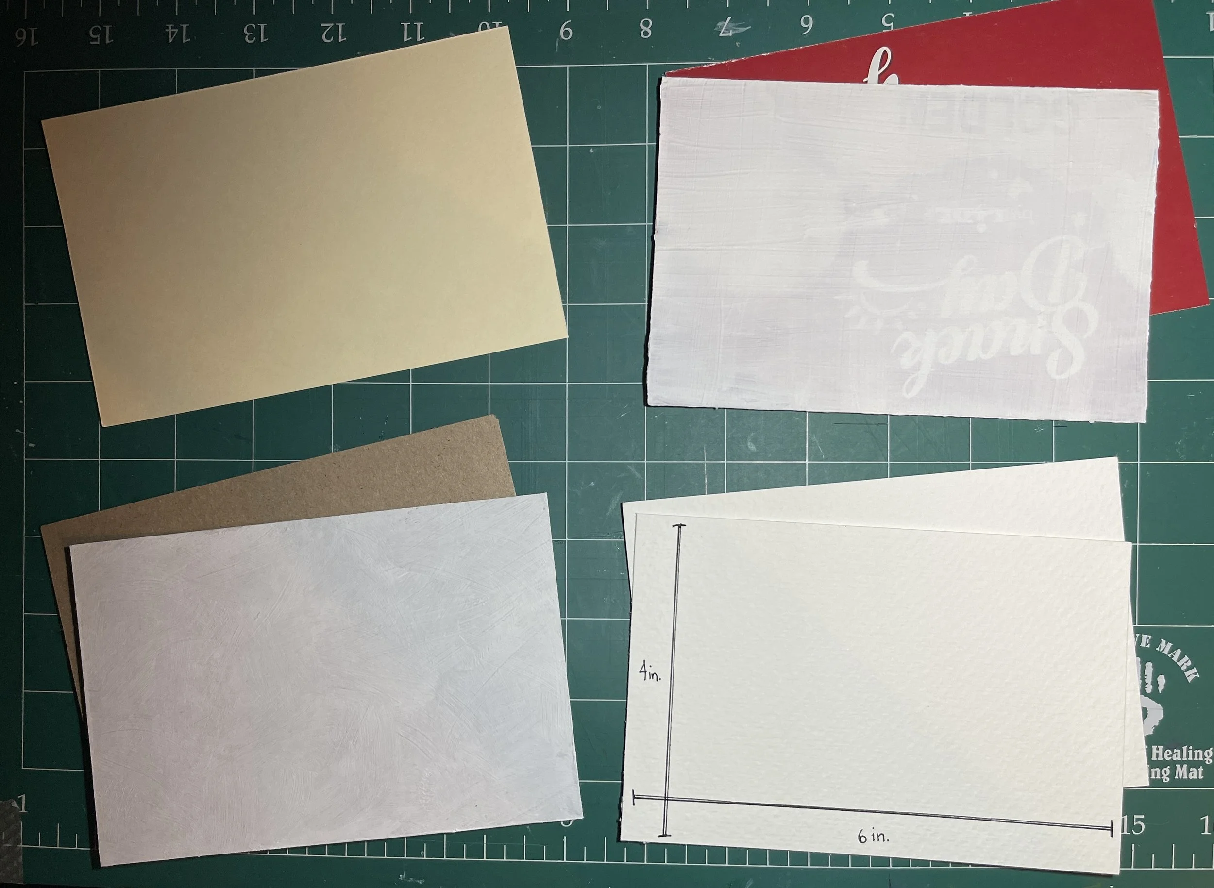
My holiday themed idea was to create two mixed media collage tree ornaments on a postcard using found painted papers, specially created painted papers (because, of course), and snippets of blue culled from magazines. To draw the ornaments onto white card stock, I used a circle template, choosing two sizes which would fit on the 4”x6” card. Next I drew in the top hangers. Once the ornaments were cut out, I began searching through my stash of painted papers and old magazines for just the right shades, patterns, and textures of blue to create the ornament collages.


In a lovely moment of serendipity (during which I exclaimed aloud and woke Luna from a sound sleep), I found this Van Cleef & Arpels “Treasure Island” advertisement, which included the word Sapphire, in blue!!
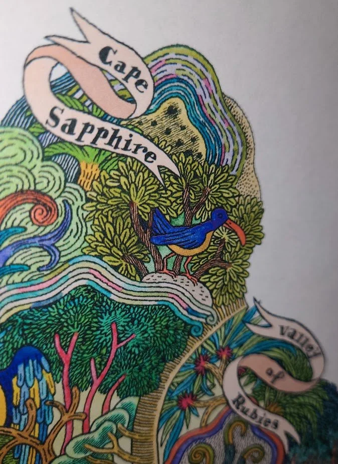
On the back of this image in the magazine, there was a blue outlined version, which suited my needs PERFECTLY!
Of course, I HAD to use this, and it formed the basis of the larger of my two ornaments. I also found a satellite view of the Earth which fit the smaller ornament exactly (also magical, right?!), which became the anchor for that one. Everything else fell into place, and once the elements were glued, each ornament contained a combination of painted paper scraps and magazine finds. For a final flourish, I added Posca Metallic Blue pen details to accent the ornament tops and hooks.


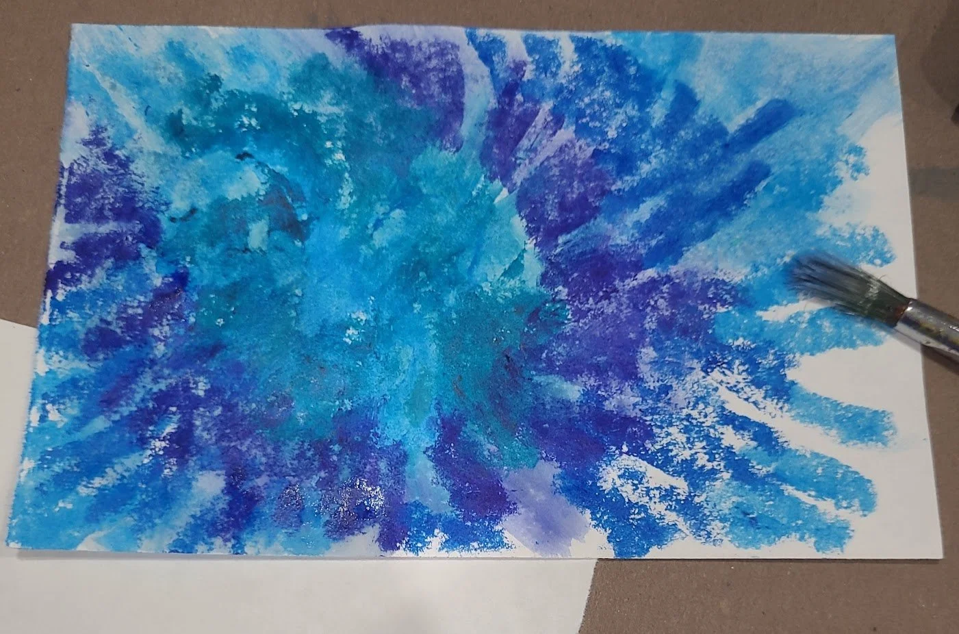
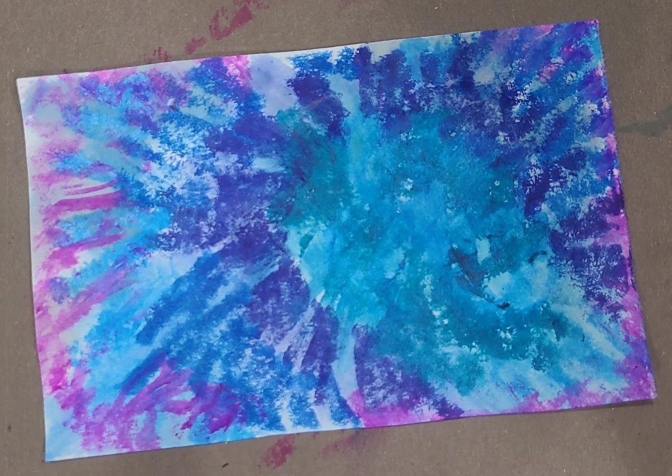
I didn’t have a pre-painted paper in just the right shades of blue for the postcard background, so I created one. I sponged a layer of DecoArt Metallic Peacock Pearl over a Lumiere Pearlescent Emerald overall background. Once those layers were dry, I swiped swaths of almost dry paint from the center to each side with Golden Fluid Acrylic Anthraquinone Blue, to suggest evergreen (or everblue?!) boughs.
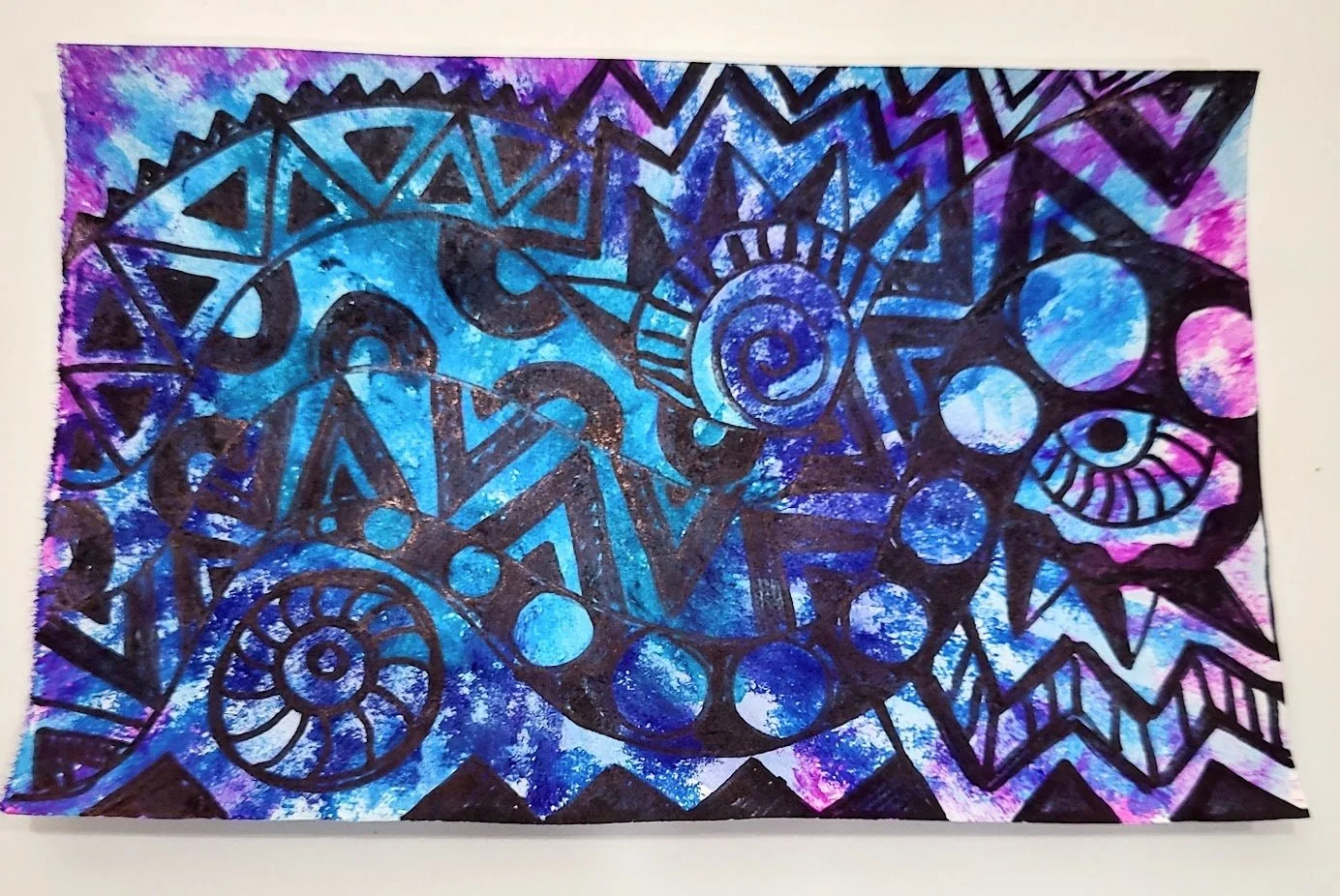
Once I placed the collaged ornaments on the painted background, it was clear that something was missing—the various blues complimented each other, but in some areas, the ornaments seemed to disappear. Black Sharpie pen to the rescue! I ran the side of the fine point nib around the edges of the ornaments, and voilà! The thin rim of black defined the edges just enough; subtle but effective.

I added a bit of black Sharpie fine line detailing on the ornament tops too.
So, check your paper and magazine stashes for shades, textures, patterns, photos, or advertisements for your own Sapphire serendipity…who knows what treasures you’ll discover!
And, there’s still time to join the fun: the deadline for Celebration of Sapphire postcards to be postmarked is December 31st.
Need a refresher on the ‘rules’ and where to send?
Click here for our original post.
Penny will round out our Tips on Tuesdays posts soon, so stay tuned!
Until next time,
Michelle