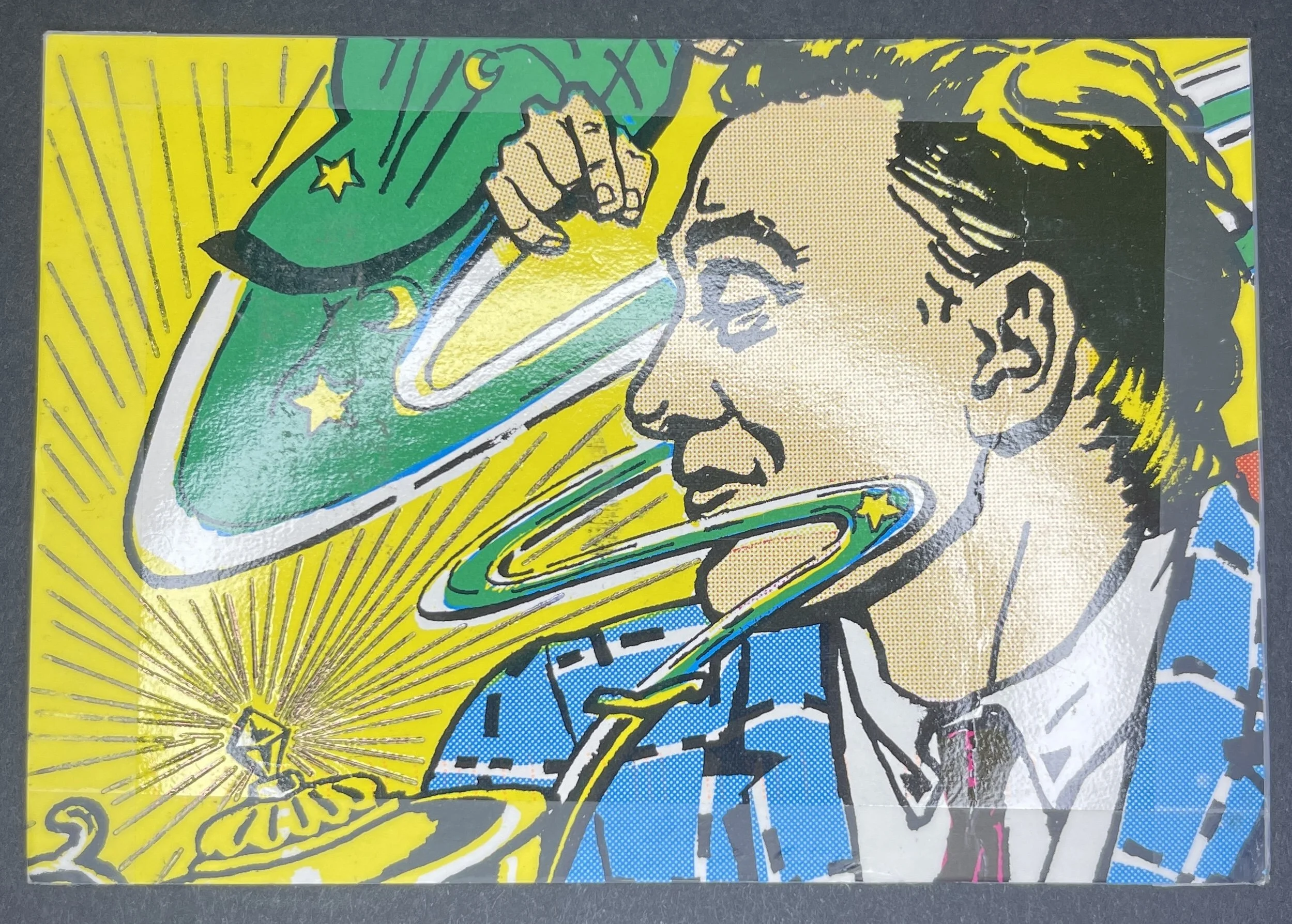
Zlatko Krstevski
Prilep
Macedonia
Celebration of Sapphire #104 | Heidi Gurney
Heidi Gurney
Fayetteville, NC
US
Celebration of Sapphire #103 | Akif Nabihan

Akif Nabihan
Shah Alam
Malaysia
Celebration of Sapphire #102 | Beate Senf-Hentsch
Beate Senf-Hentsch
Kunnersdorf
Germany
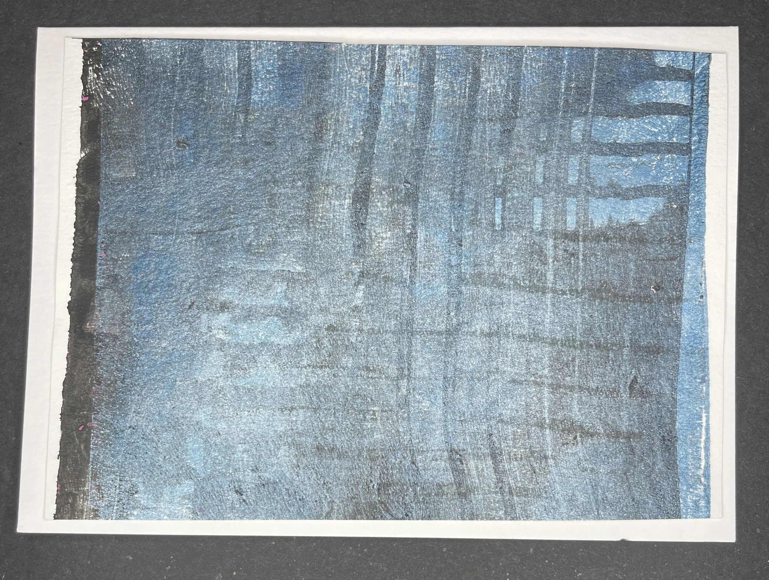
Celebration of Sapphire #101 | Lutz Beeke
Lutz Beeke
Neverin
Germany
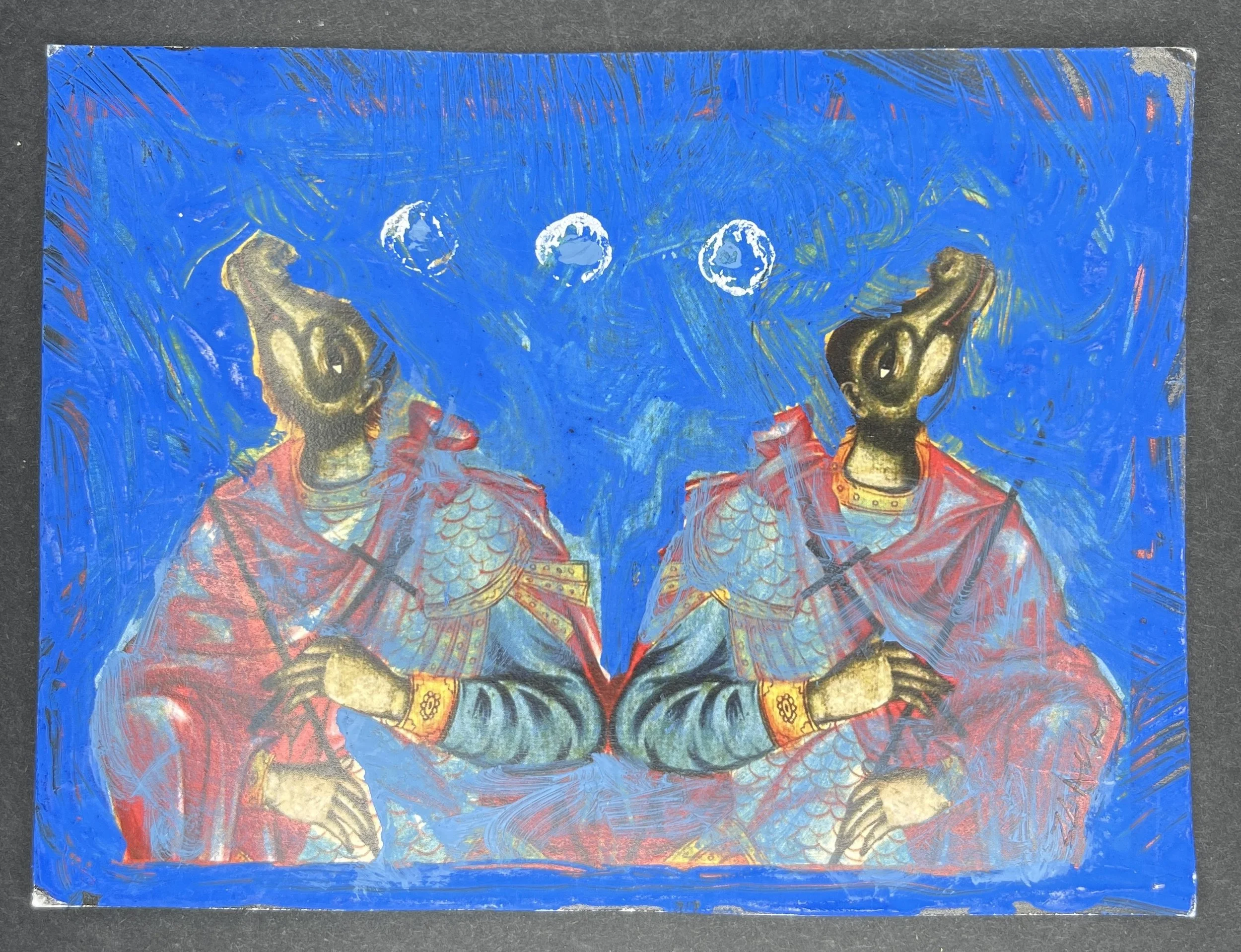
Celebration of Sapphire #100 | Danish Hamike
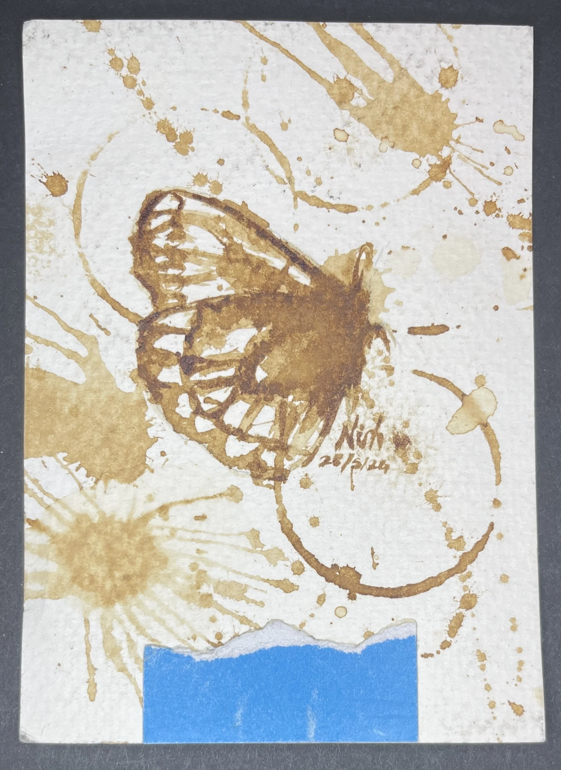
Danish Hamike
Cheras, Kuala Lumpur
Malaysia
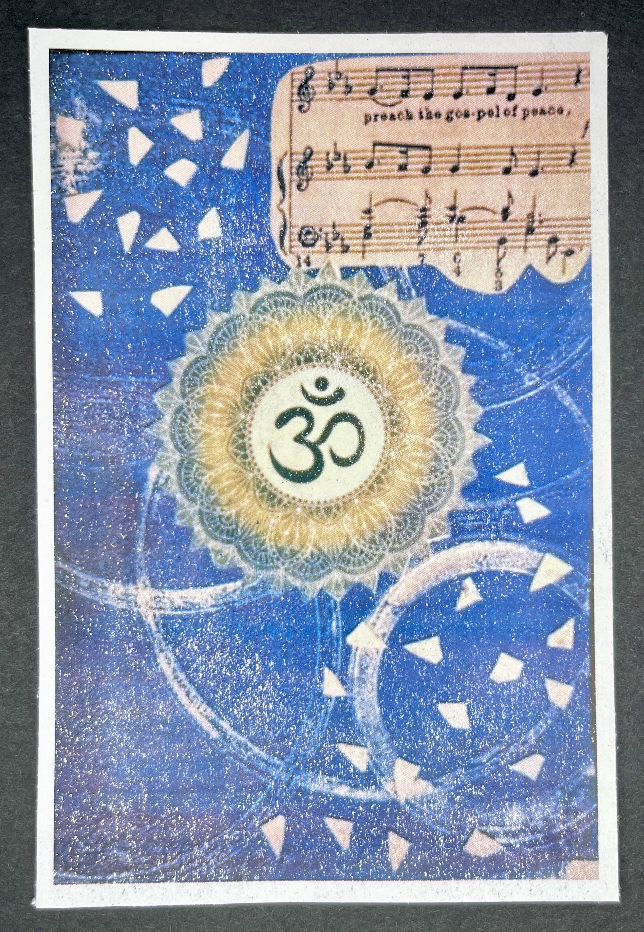
Celebration of Sapphire #099 | Chantal Laurin
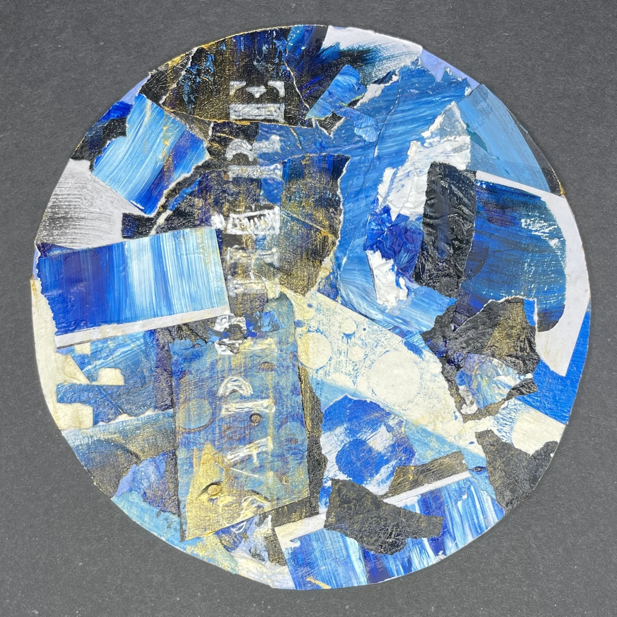
Chantal Laurin
Montreal, Quebec
Canada
Celebration of Sapphire #098 | Horváth Piroska
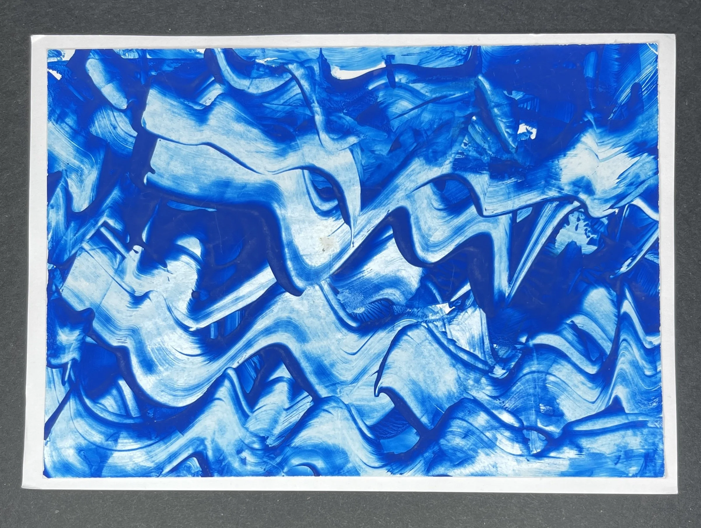
Horváth Piroska
Ried im Innkreis
Austria
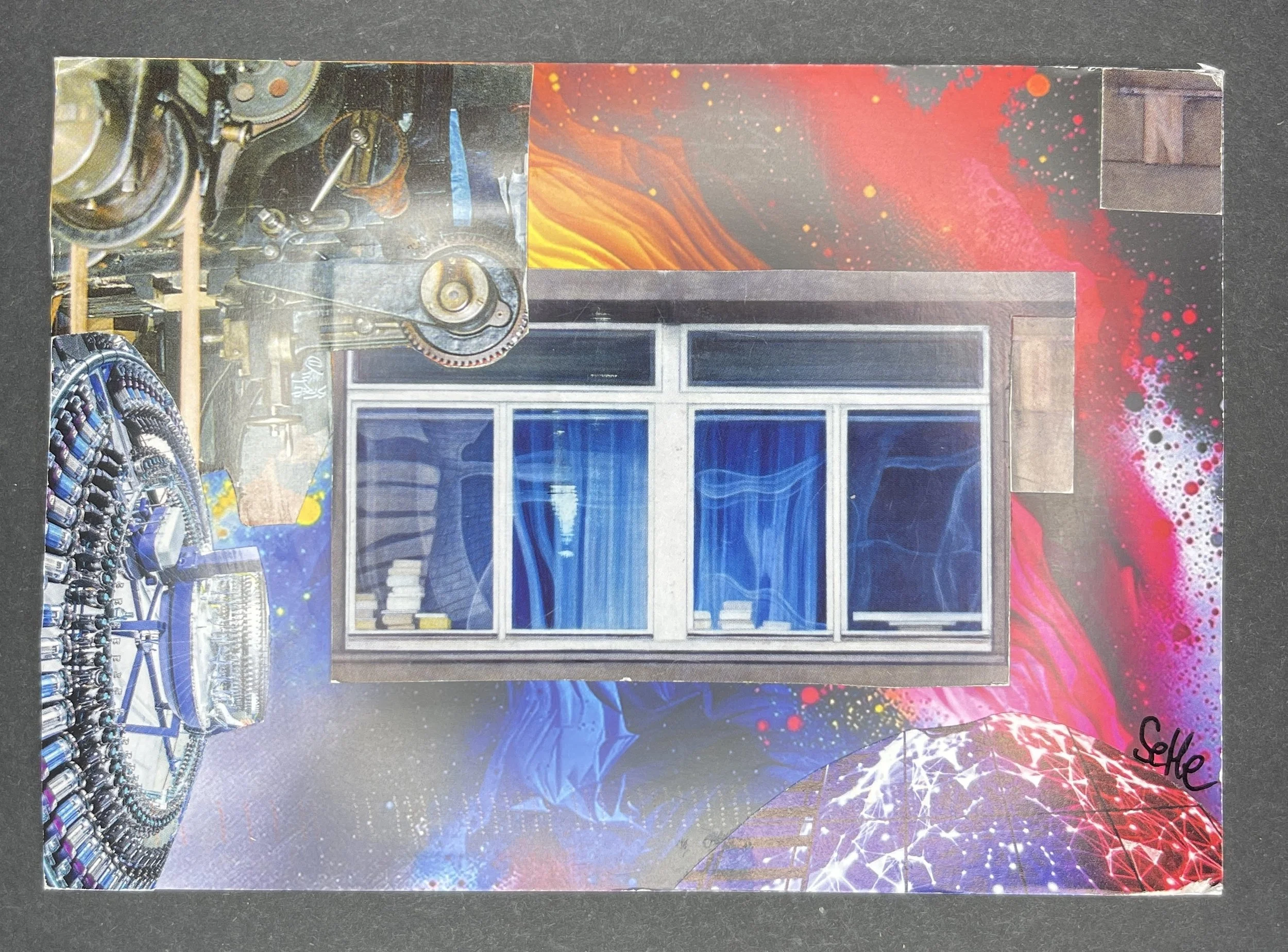
Celebration of Sapphire #097 | Maggie McGlothin
Maggie McGlothin
Garner, NC
US
Celebration of Sapphire #096 | Jose Luis DelaBarra Bellido
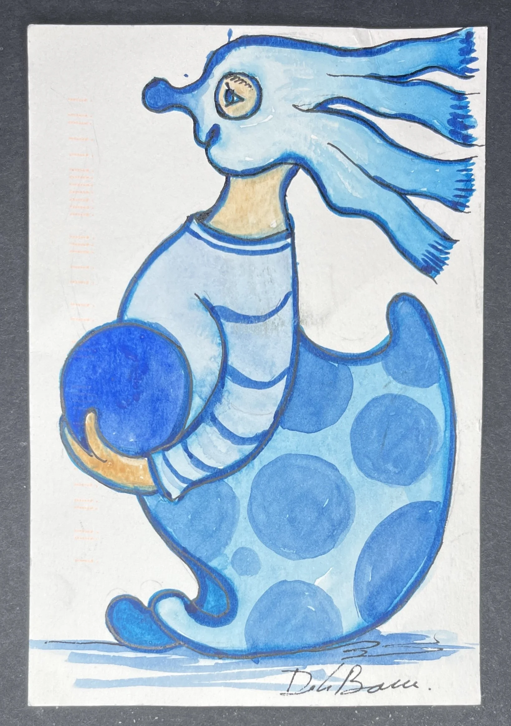
Jose Luis DelaBarra Bellido
Lima
Peru