As you know, our International Mail Art Call for the Celebration of Sapphire is underway, and we hope you’re beginning to think about what your postcard will feature—will yours be the first one we receive?
We hope so.
For this, our second installment of “Tips on Tuesdays” (affectionately known to us as ToTs*), I bring you one possible solution for the question:
“I want to use words on my postcard, but how can I make them look interesting?”
If you’d like to feature words, here’s a fun and easy way to do it. (without having to be an expert calligrapher to achieve a really cool looking design).
Step One: on your 4”x 6” (or 10.16 x 15.24 cm) postcard, draw some contoured lines across the full width, separated by enough space to insert letters into the sections (when I teach a project using this technique, I call it the ‘wavy line way’):
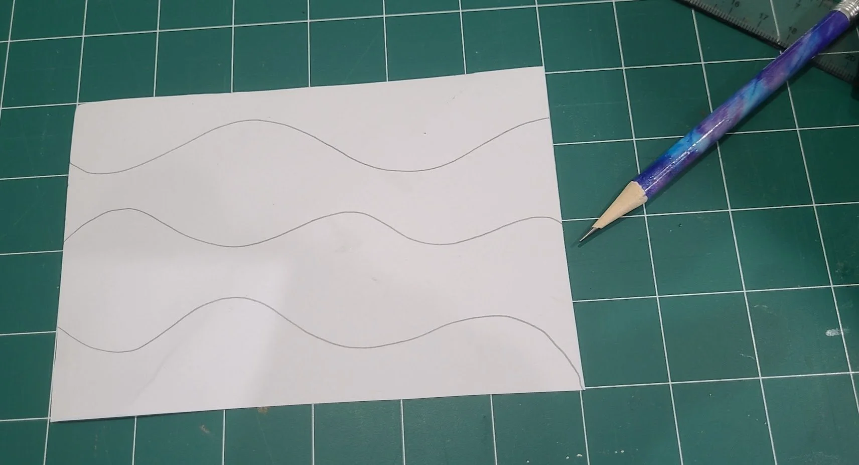
I’m using plain, white, smooth card stock, and regular lead pencil lines. Because I’m going to use colored pencils and water-based markers, I don’t need to do anything special to the substrate. (Note my pencil in lovely shades of blue!)
Step Two: figure out what you want to write—actually, you probably should be thinking about this before you draw your wavy lines! In this case, I knew I wanted to use fairly large letters, but you’ll see in the examples below that you can use letters of various sizes.
Step Three: following the contours of the wavy lines you drew, fit your letters into the sections. The cool part happens when letters in the same word occur in very different-sized parts of the waves:
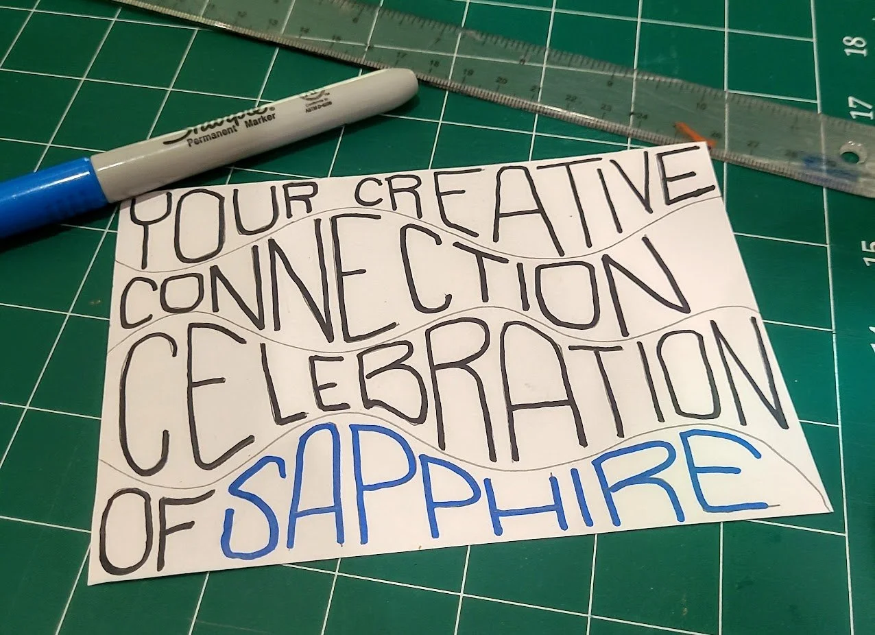
You can pencil in your letters to figure out the spacing first, or just “go for it” with marker!
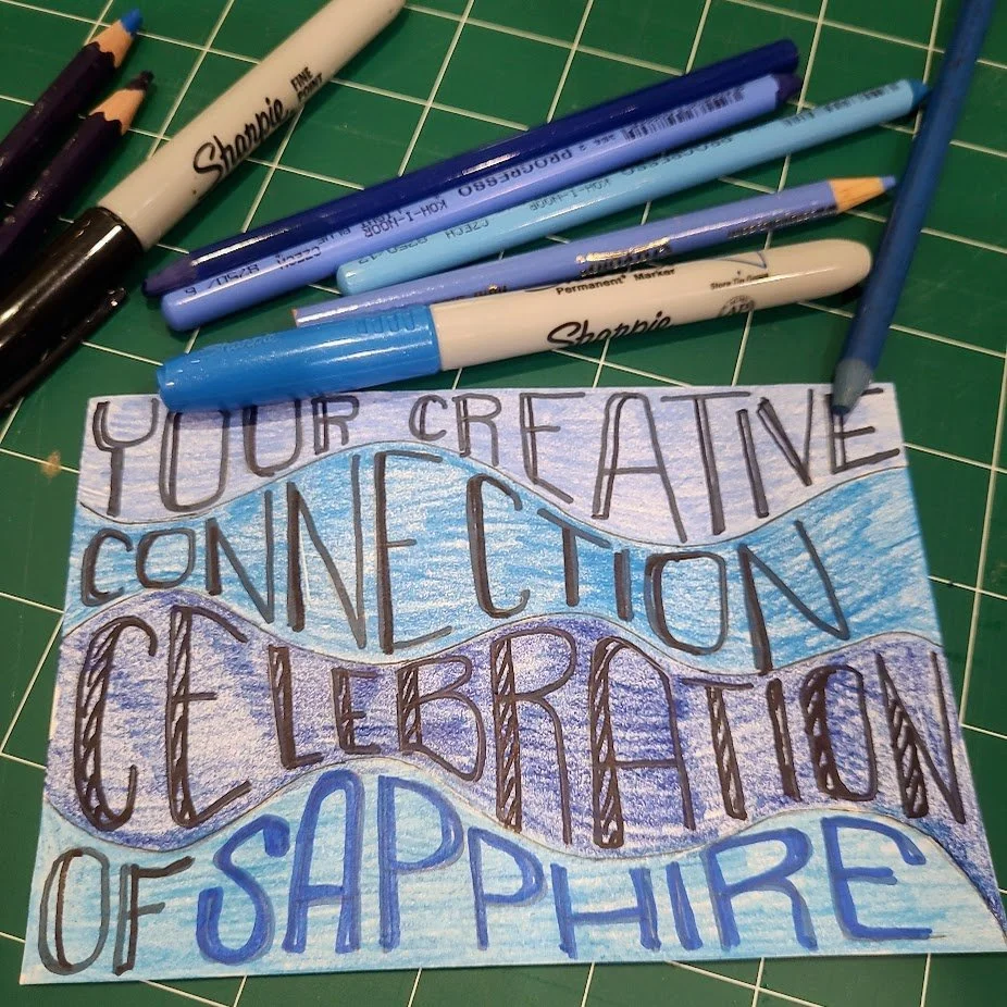
Step Four: time to decide about color. As you can see, I chose to use a different shade of blue colored pencil for the background of each section, and used a metallic sapphire Sharpie marker for the word ‘sapphire’. You can do this, or you could begin with a colored paper background (blue, perhaps?), or you could start with a watercolor paper painted postcard, or color the postcard with colored pencils before you draw the wavy lines (with muted shades of blue, so your letters will show up)—the possibilities are almost endless here. For mine, after applying the colored pencil, I bumped up the wavy lines and put in a bit of detail onto the word ‘celebration’ for some added visual interest, and to make each stand out.
Step Five: finishing up; I might increase the weight of the wavy lines (or not), add more details to the letters of the other words, or even add an illustration of a sapphire to the right of the word connection—it’ll be up to you to decide how much embellishment you want to do!
Below are some examples of how other artists have used contour lettering and color:
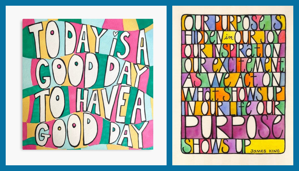
Contour lettering two ways; at left, the white letters really pop out of the 4-color background. At right, the artist has used the spaces between the block letters to add different colors with either marker or watercolor.
And lastly, another example of using contoured lettering around an illustration:

I drew the flowers in and colored them first, then fit the words around them. I will confess to have done this one while chatting on the phone with a dear friend…do I have blue on the brain these days? Yes, INDEED!
I hope this has sparked ideas for simple ways to incorporate words into your mail art if that’s your jam (blueberry, of course—more evidence of the aforementioned blue on the brain!).
Stay tuned for more ToTs* next week from Penny.
Until then, happy creating!
