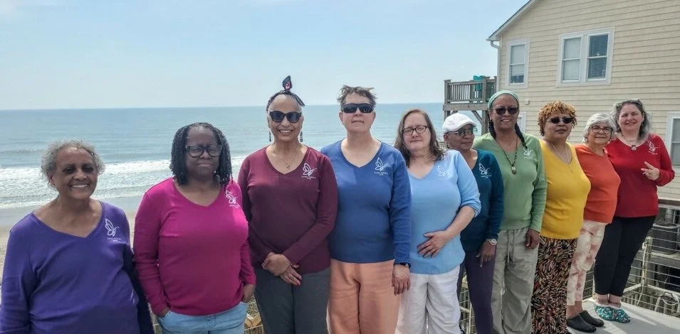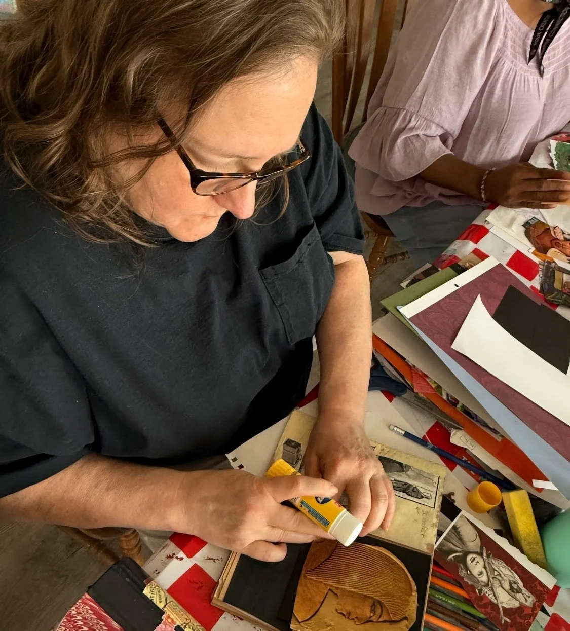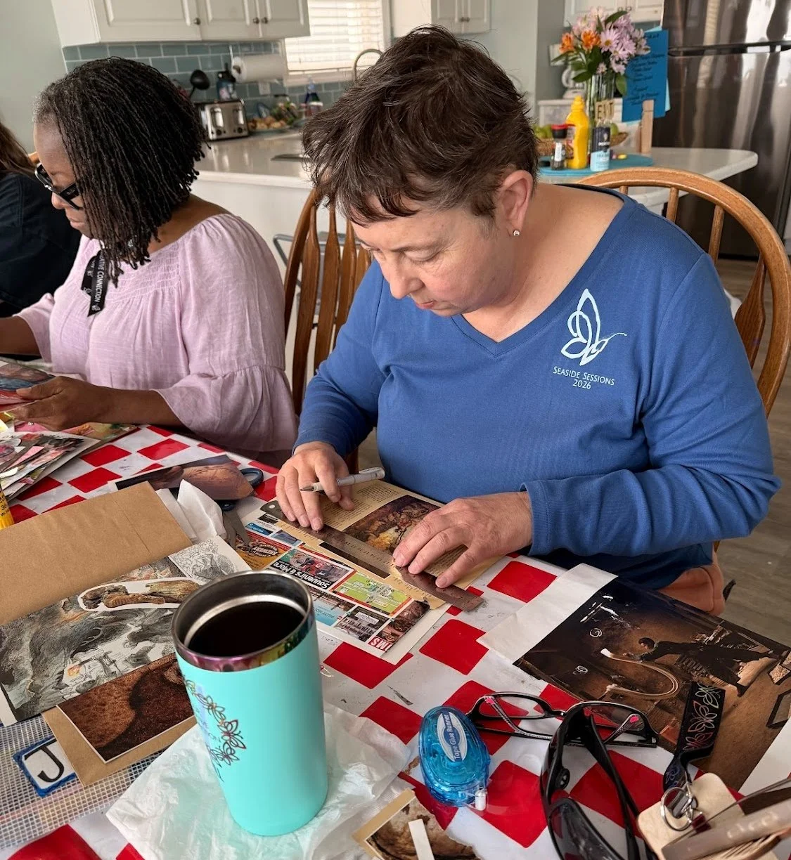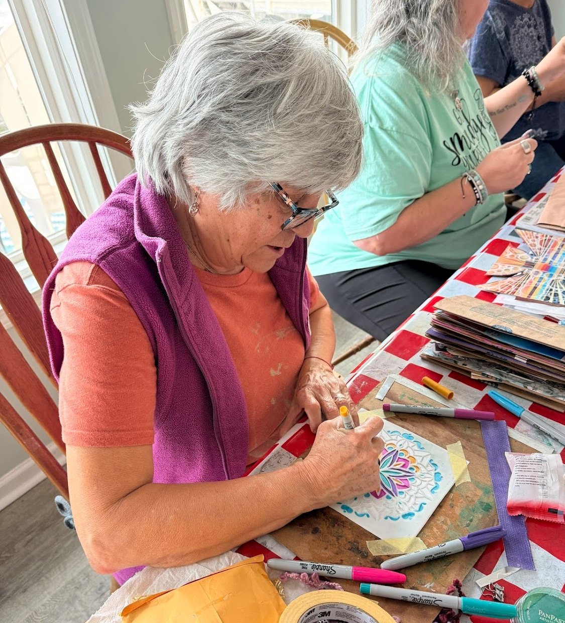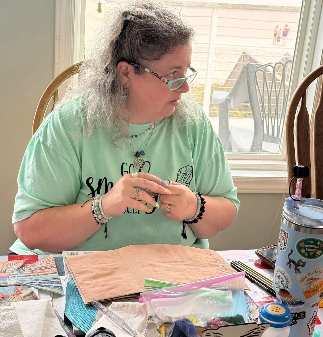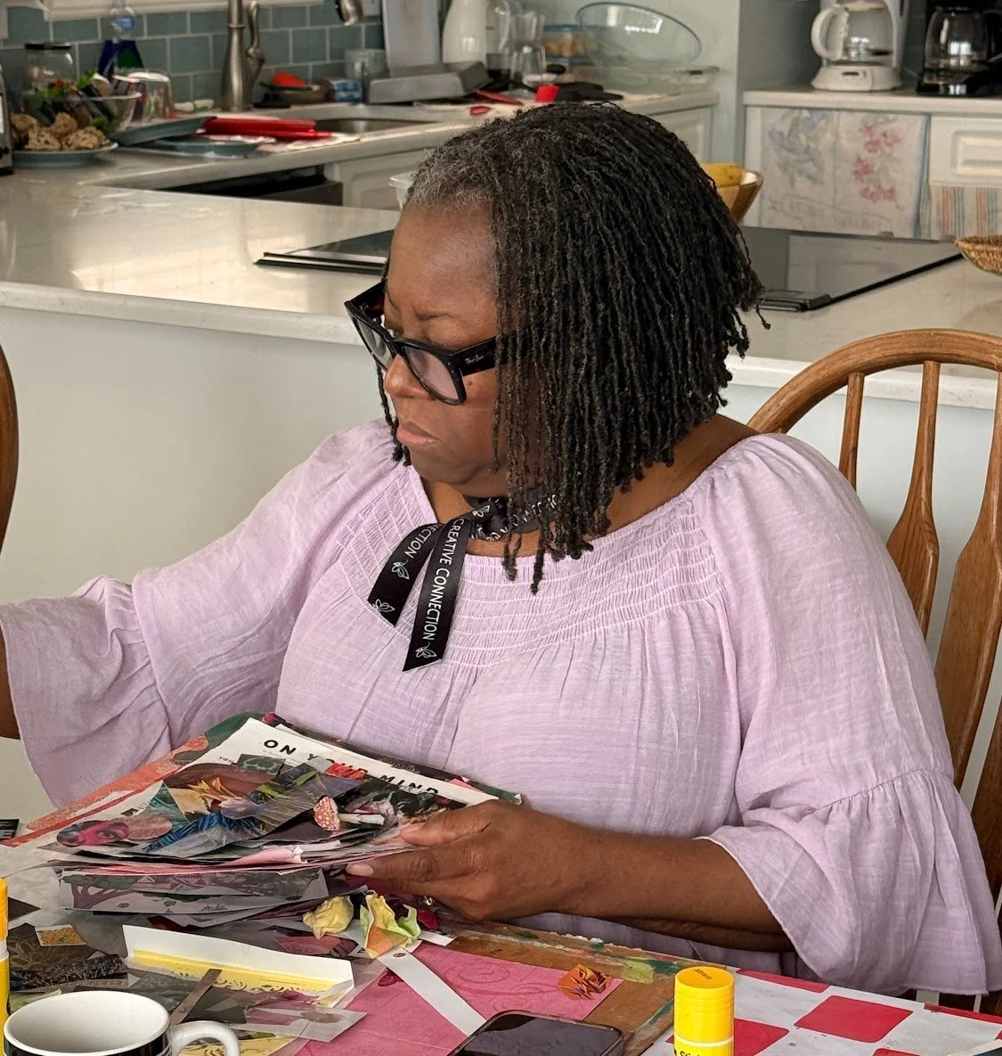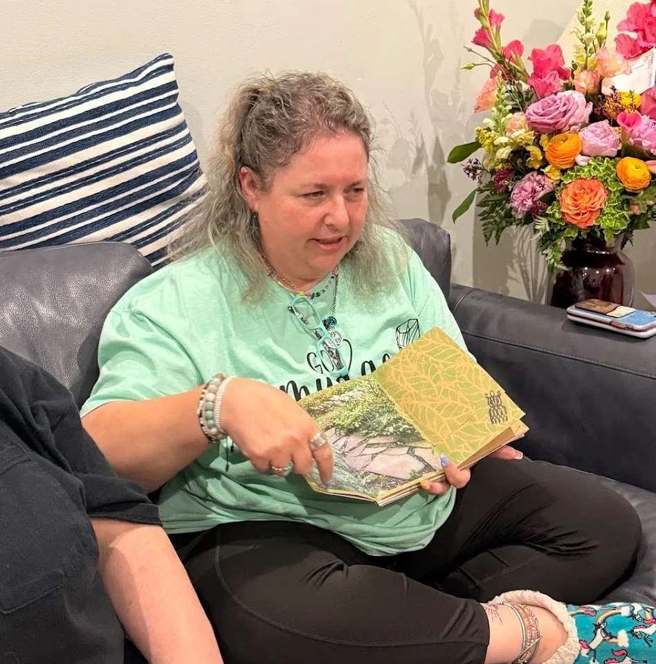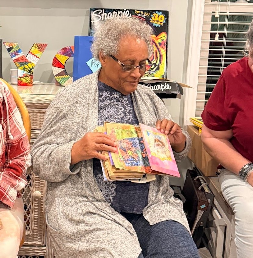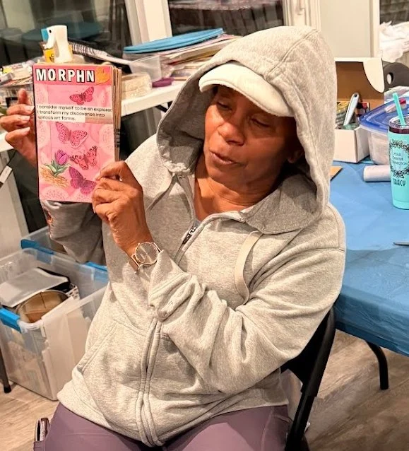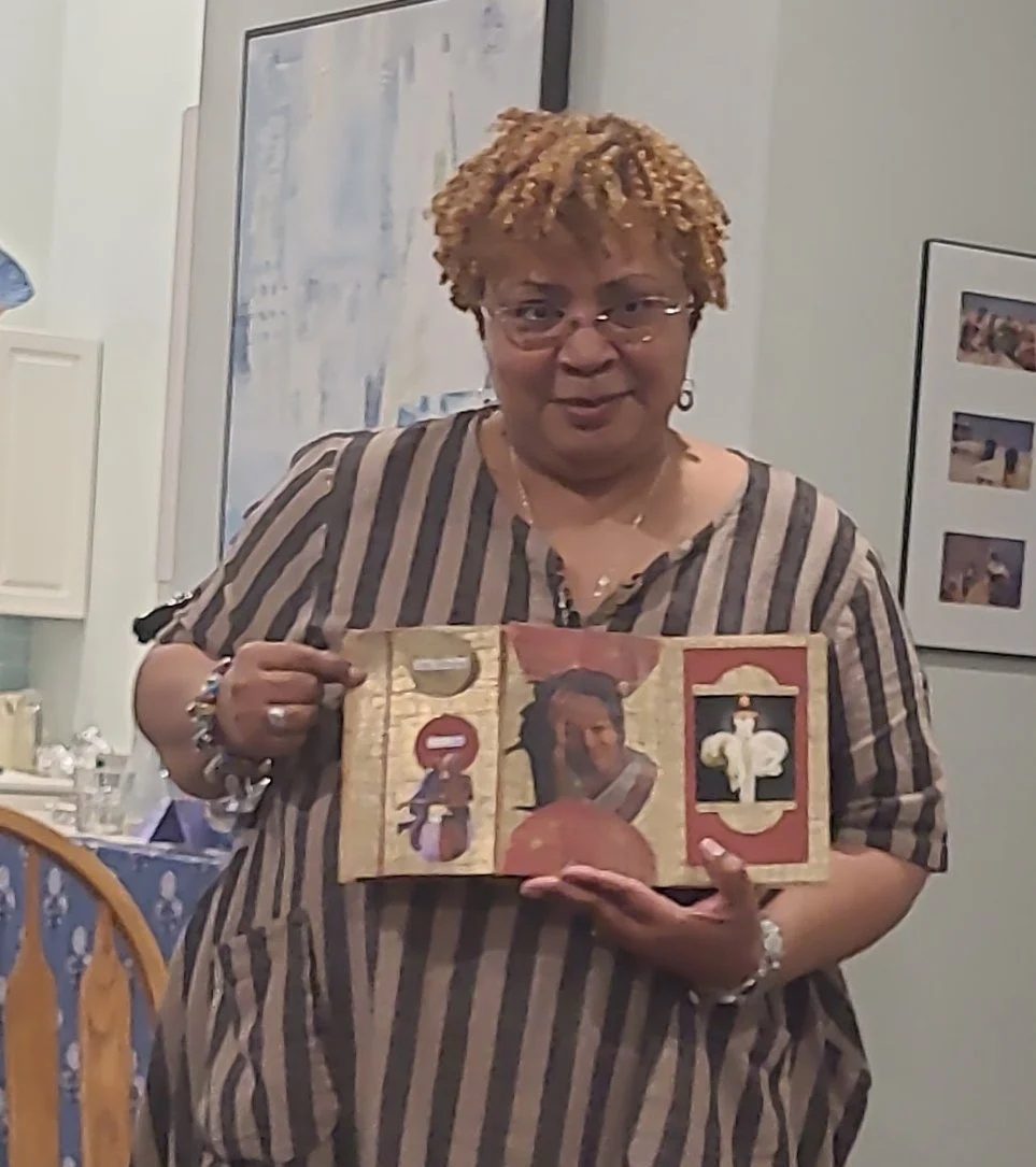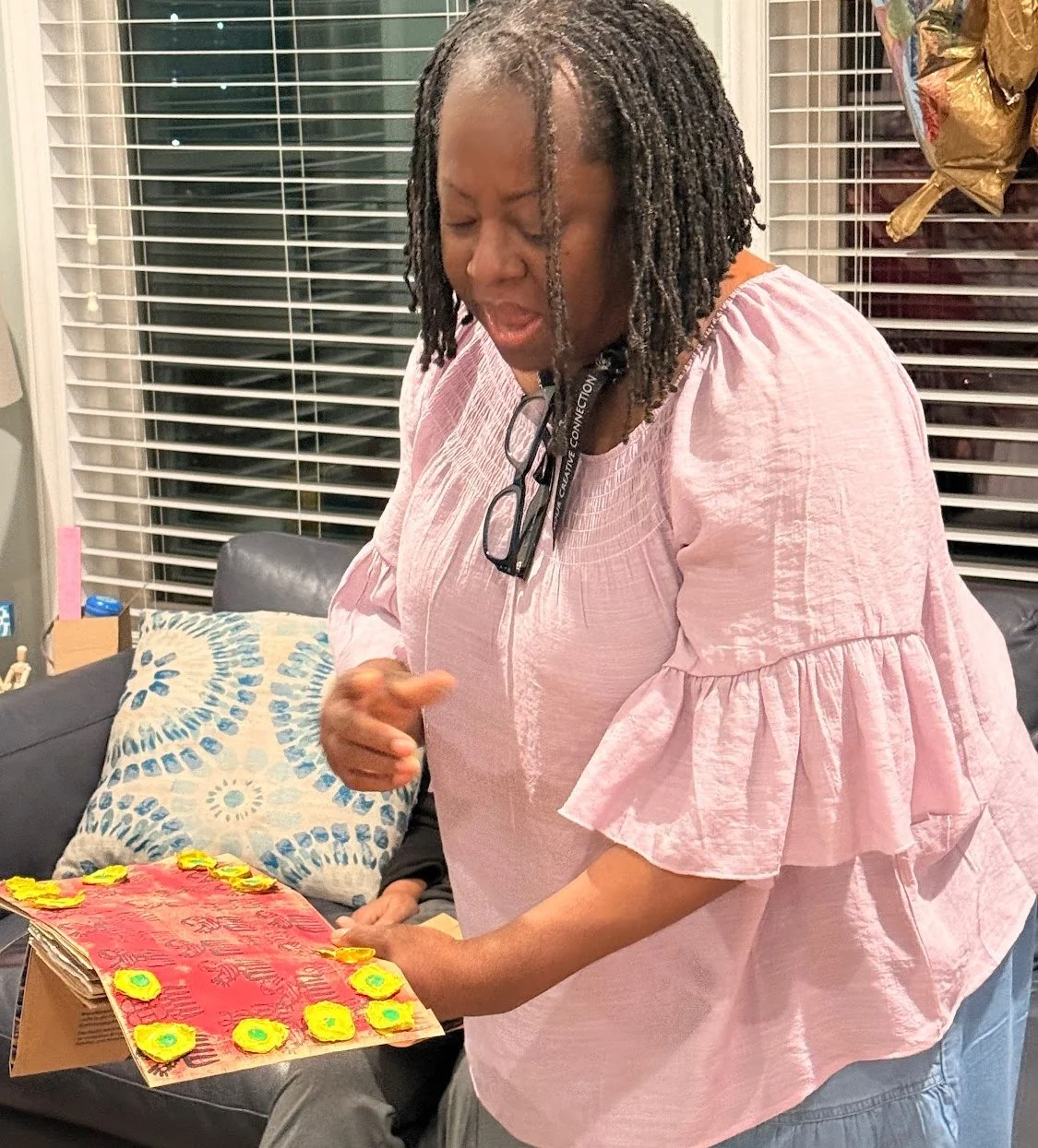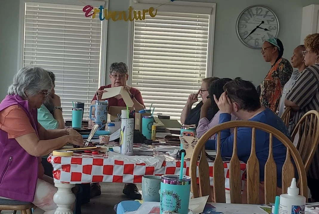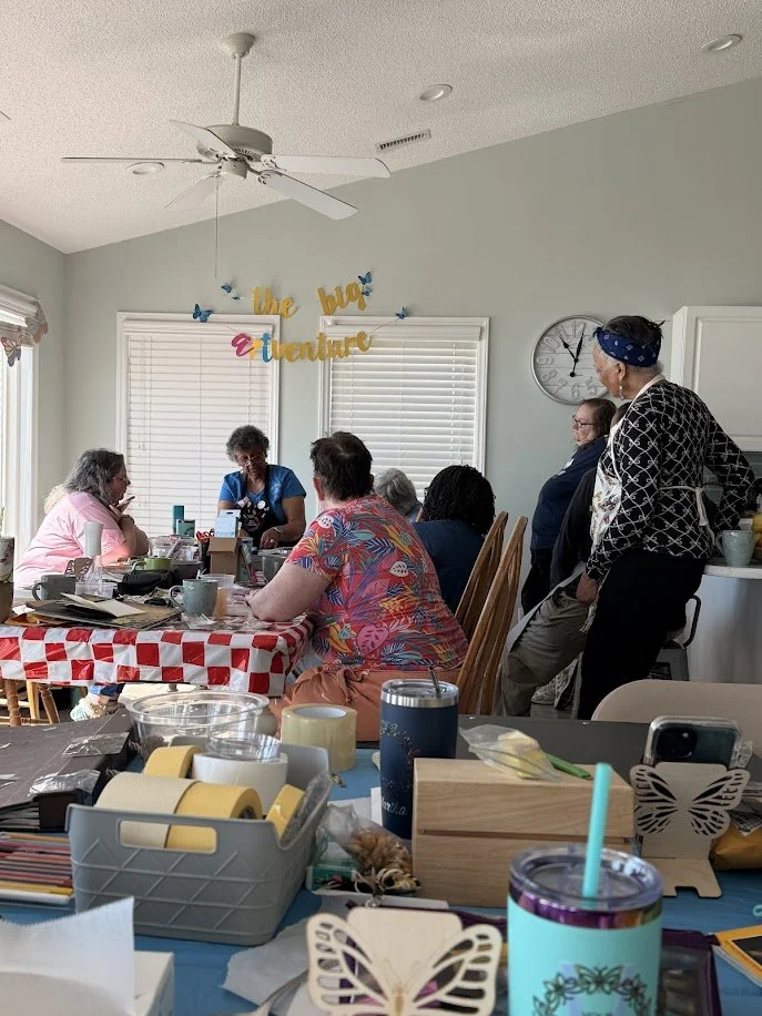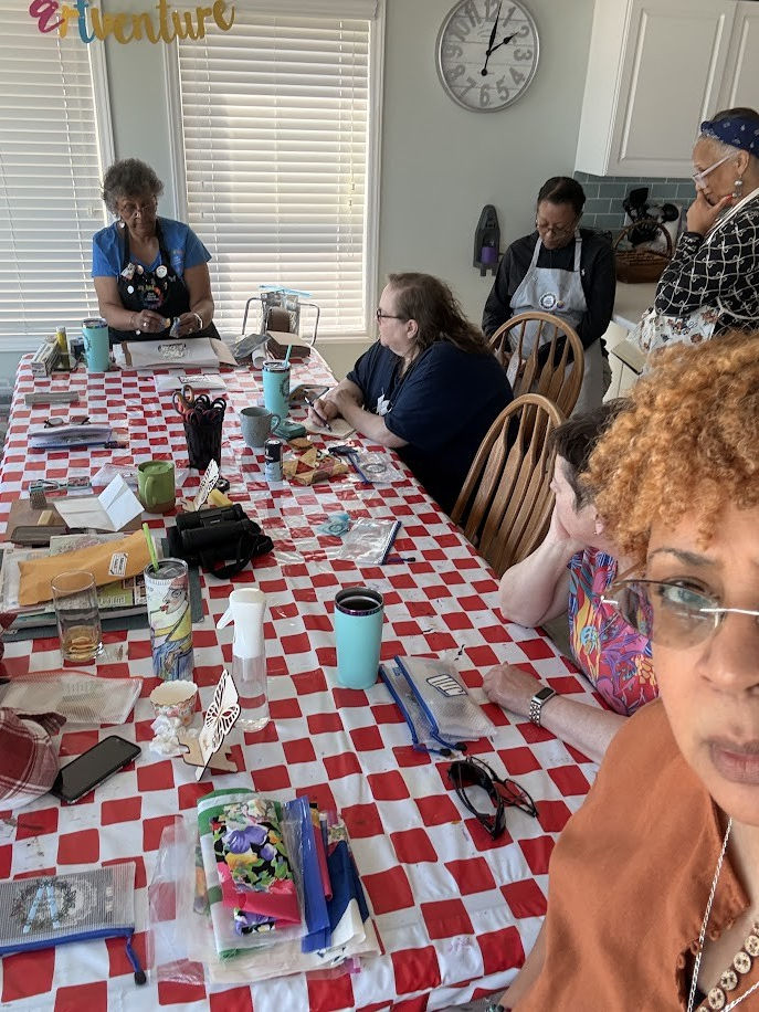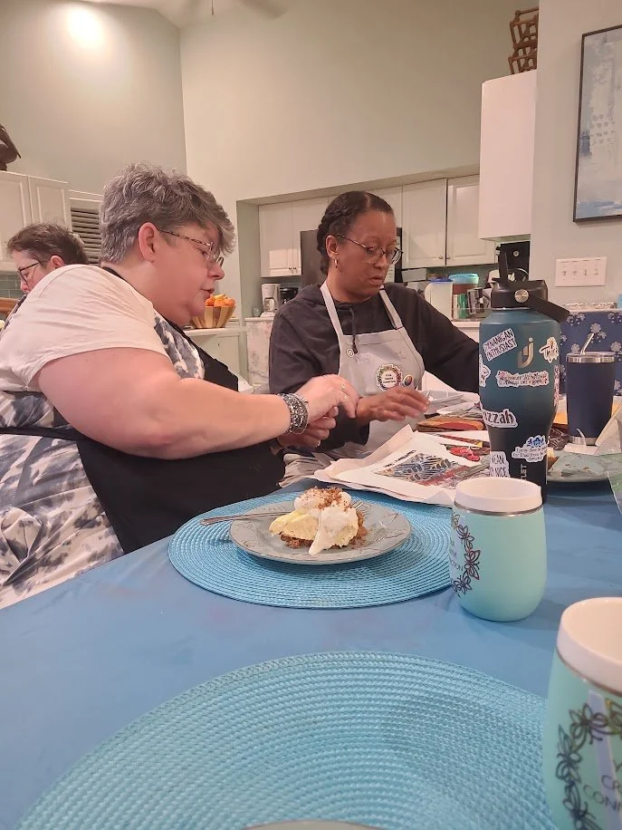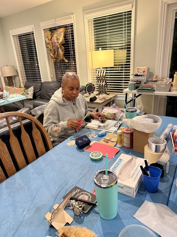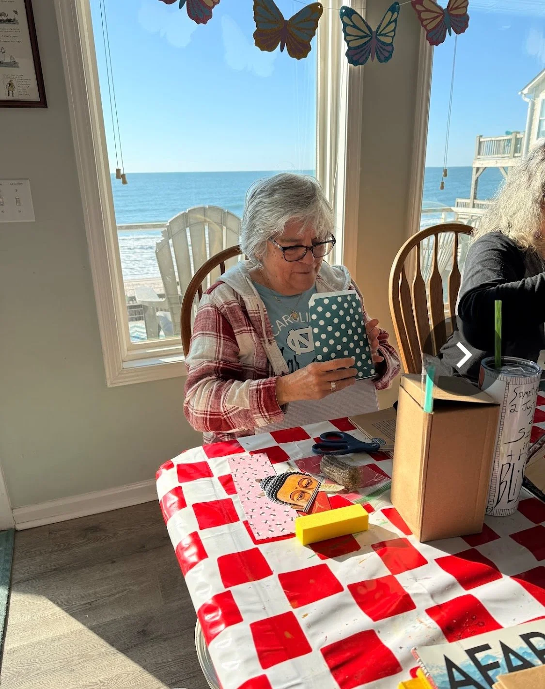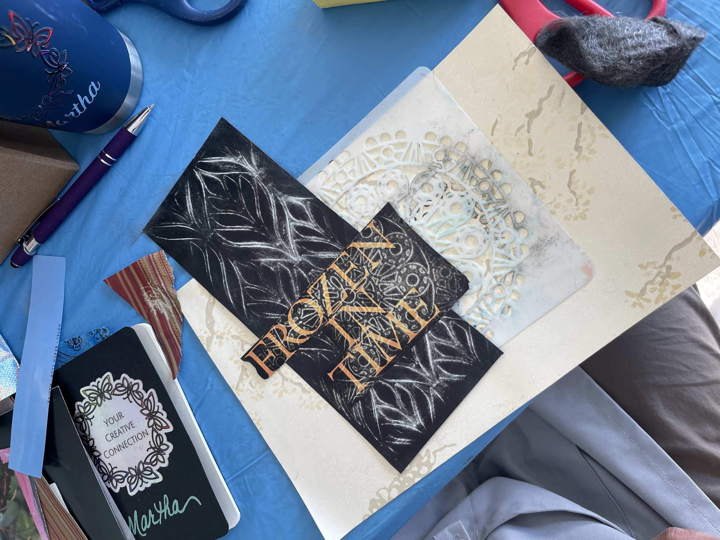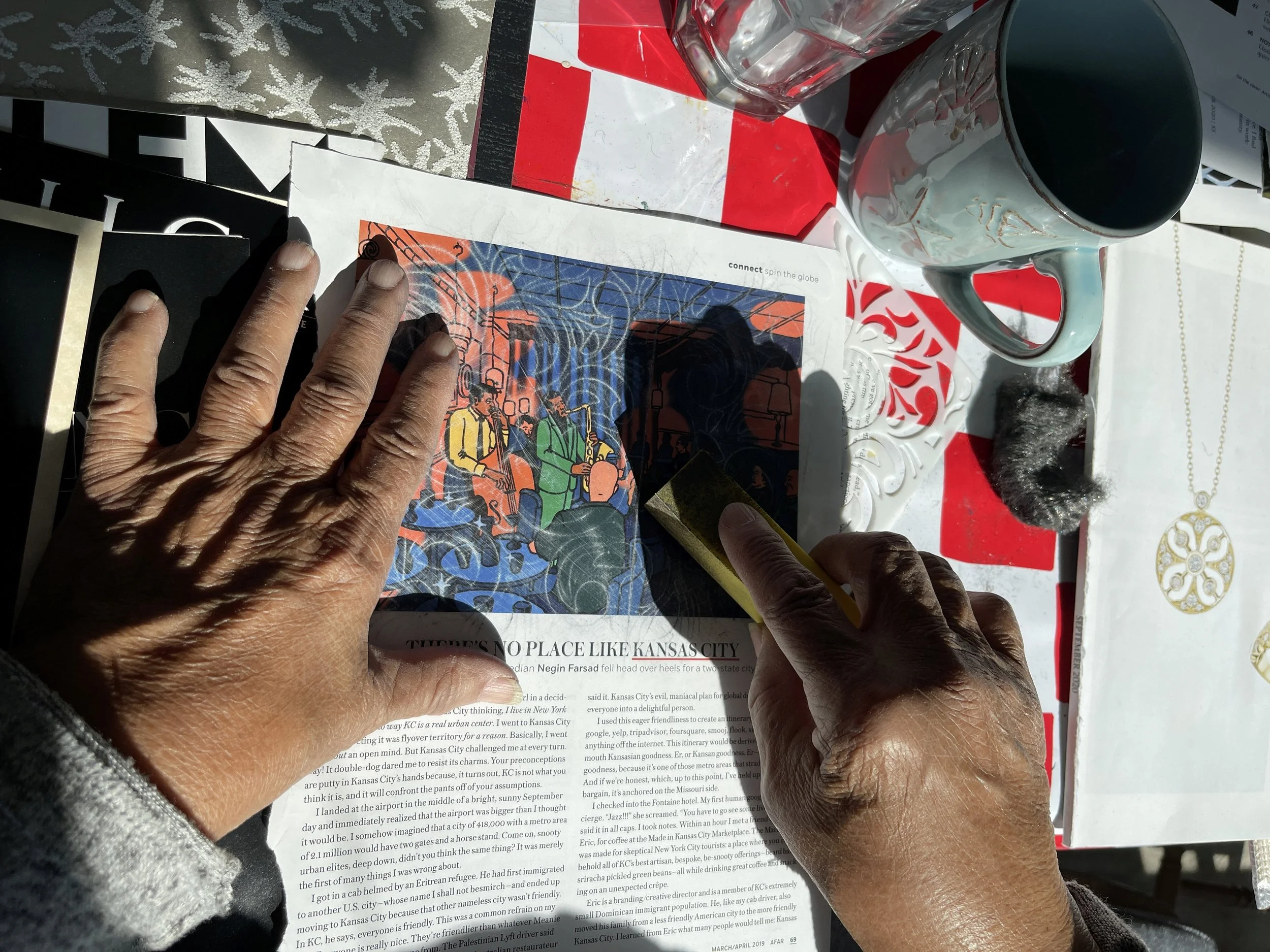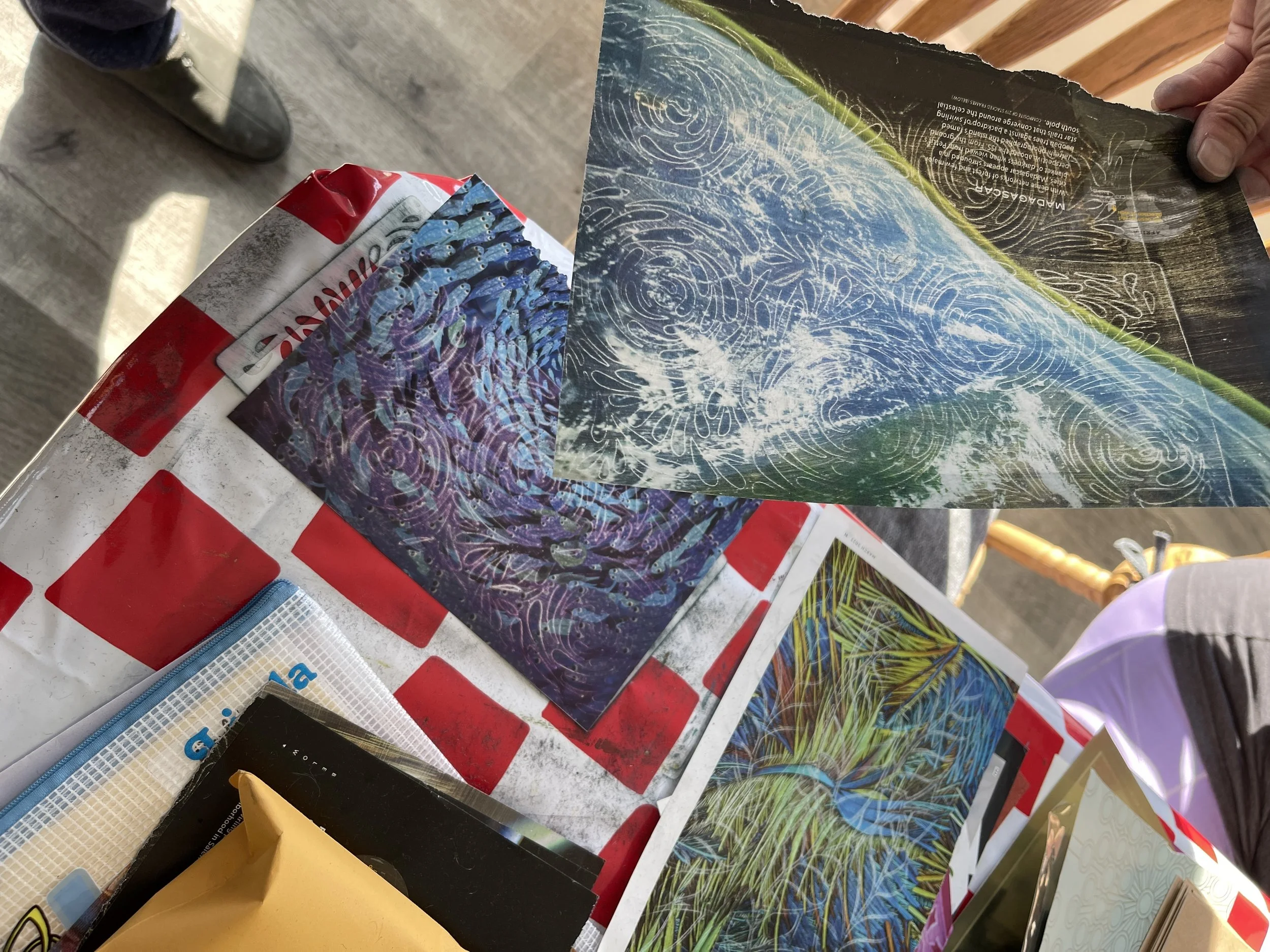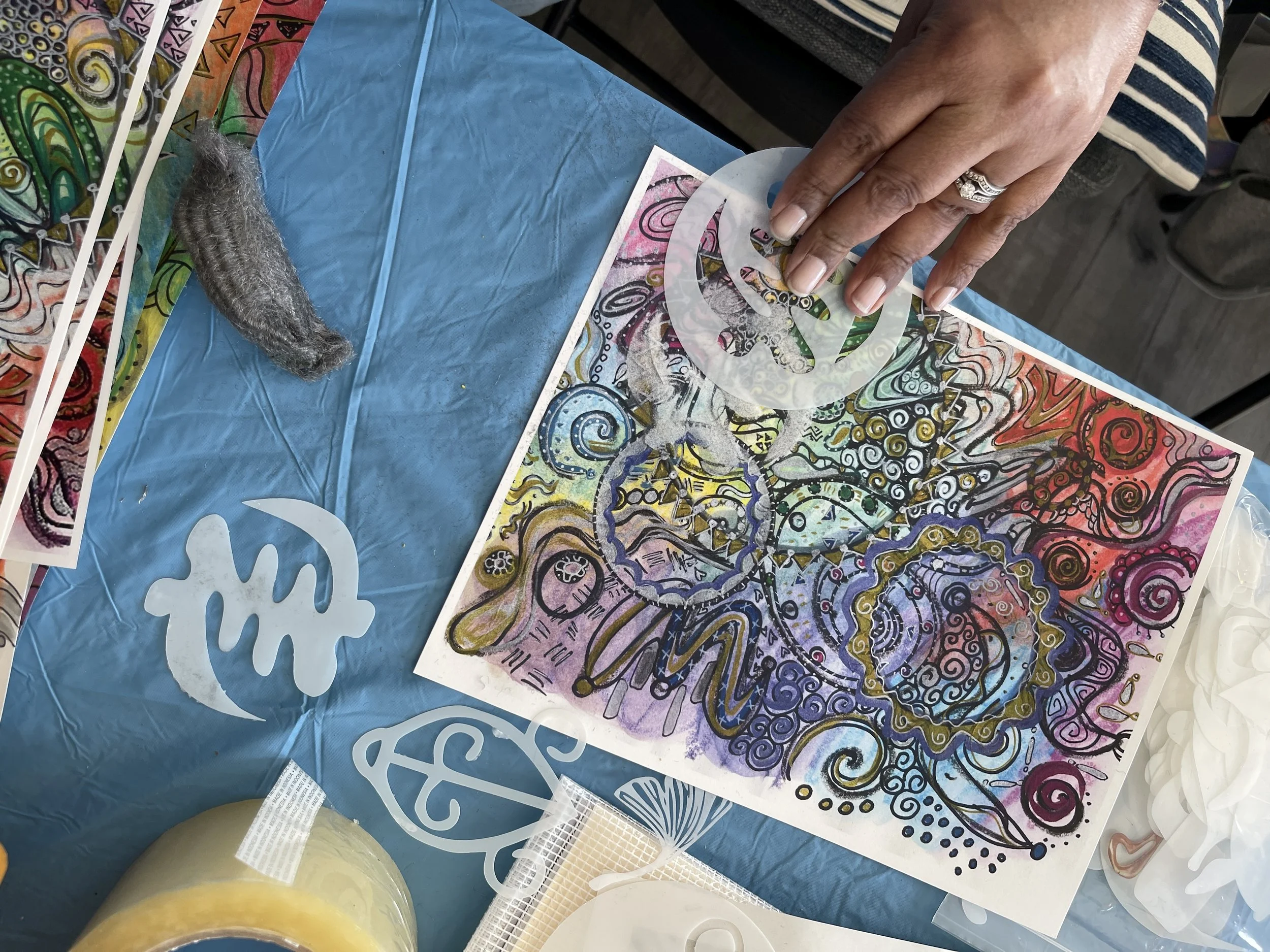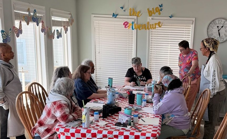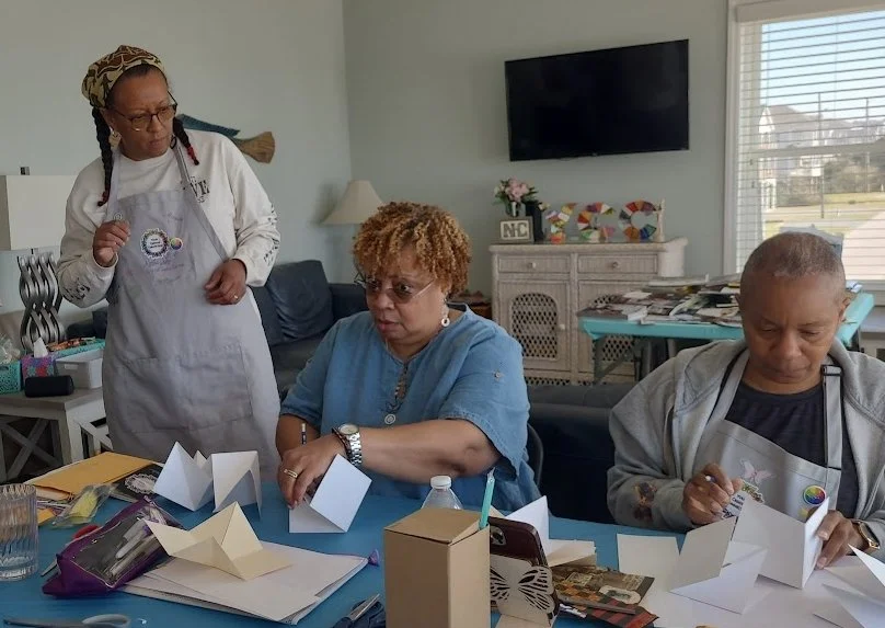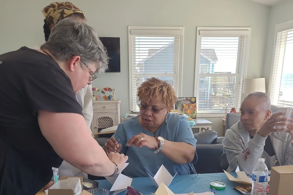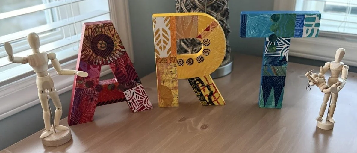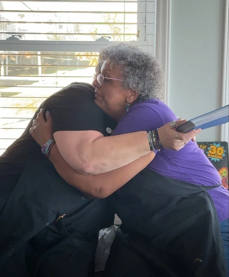

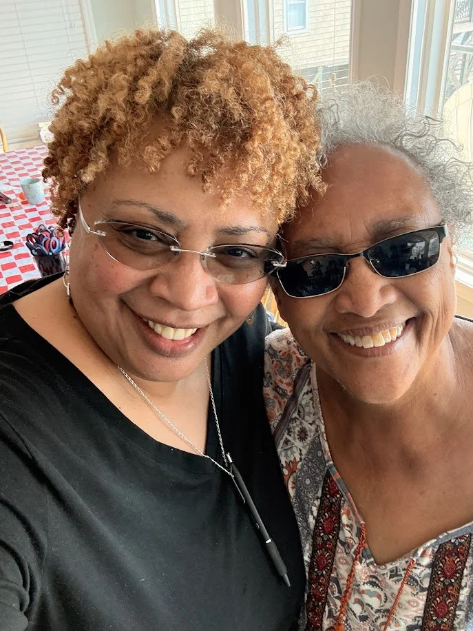
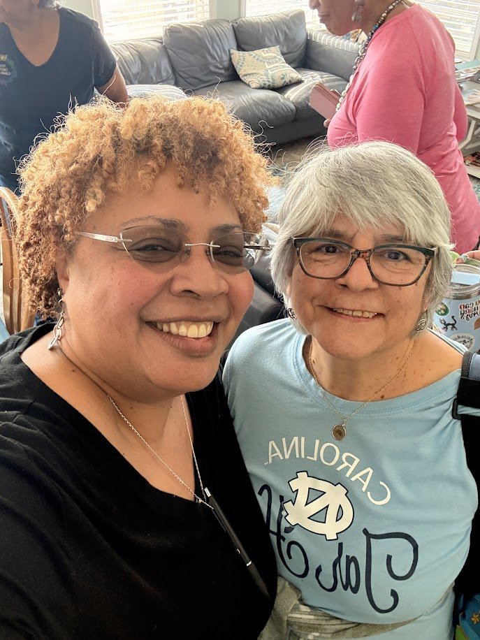
Seaside Sessions Sundays are departure days, filled with the flurry of packing, fond farewells, promises to stay in touch, and last walks along the seashore. We always marvel at the closeness developed over such a short time together; the sharing of knowledge, creative goodness, and the absolute joy fostered within our circle of like-minded women. Thank you to each of our Creative Explorers who made this 5th occurrence of Seaside Sessions so memorable.
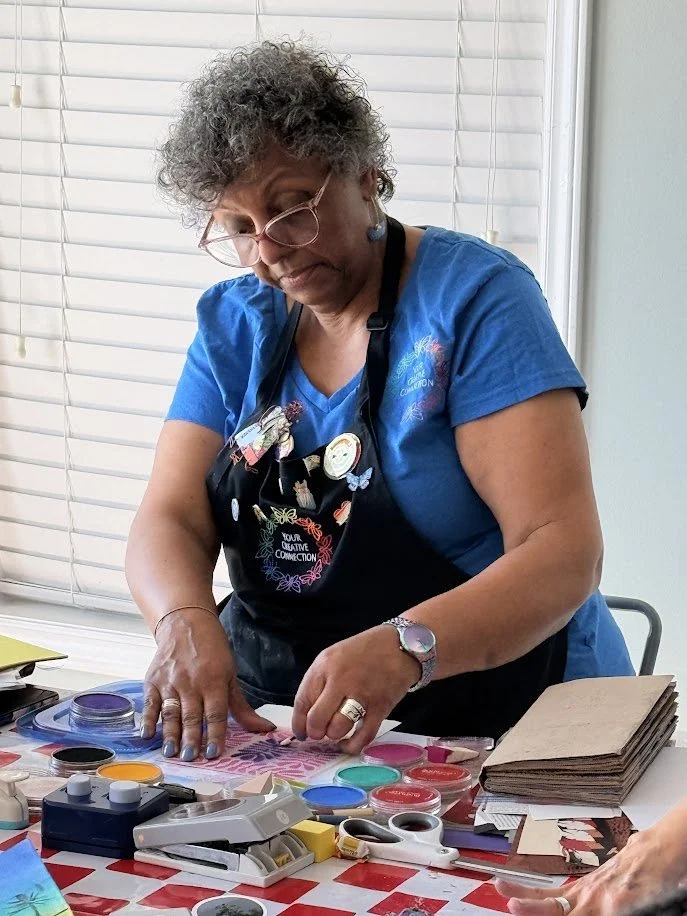
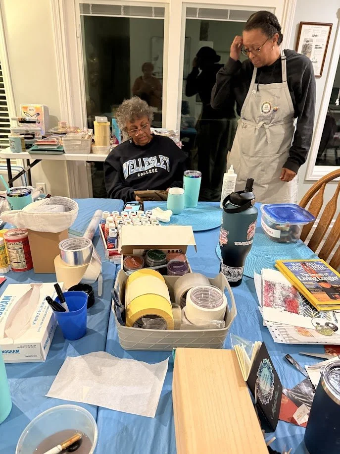
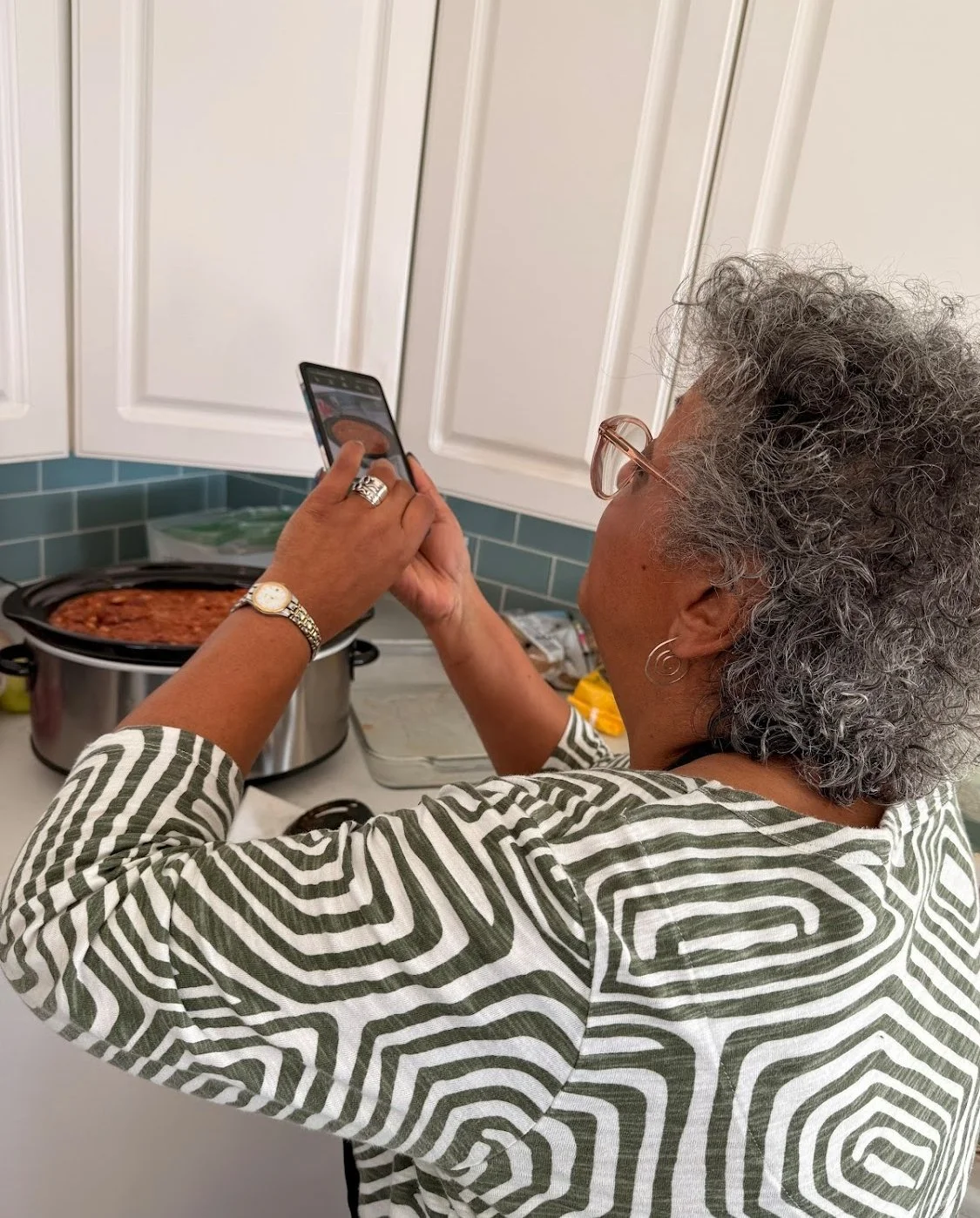
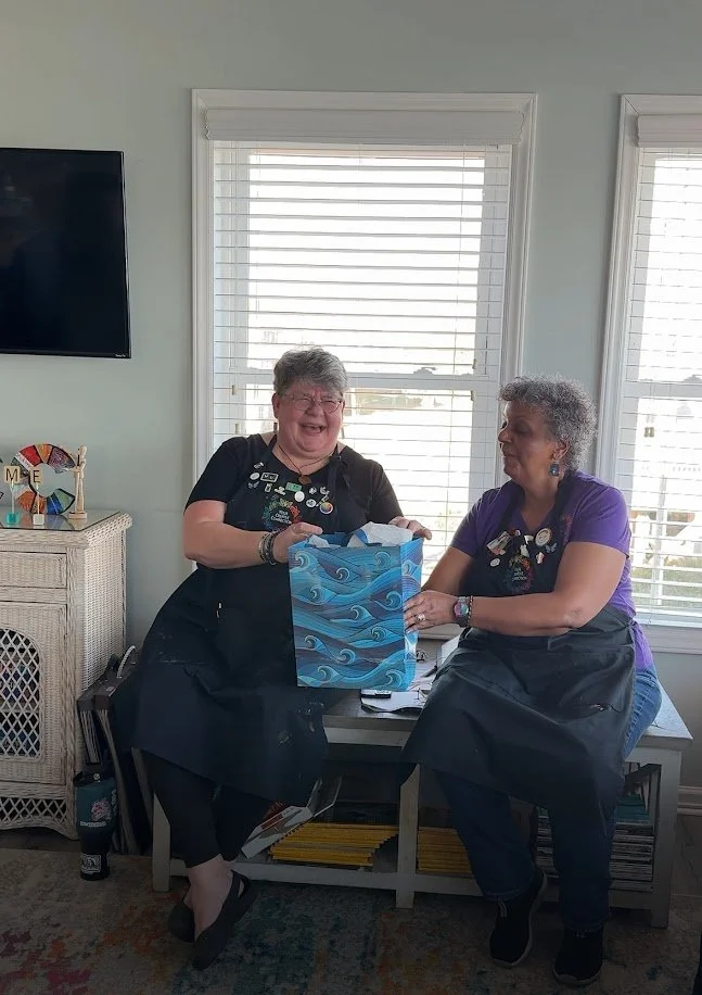
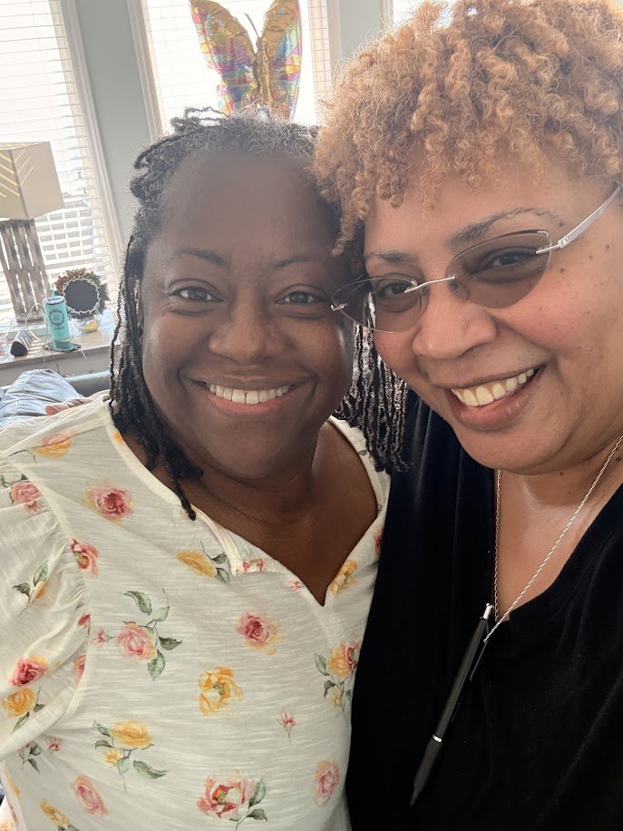
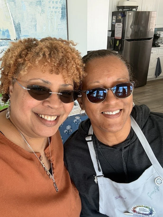
We especially want to thank our photo documentarian and “Kitchen Maven Extaordinaire” Virginia Coleman for her cheerful and able assistance before, during, and after; always ready to lend a hand, an ear, or a chopping knife (!)
...she helped make the magic happen and we couldn’t have done it without her!
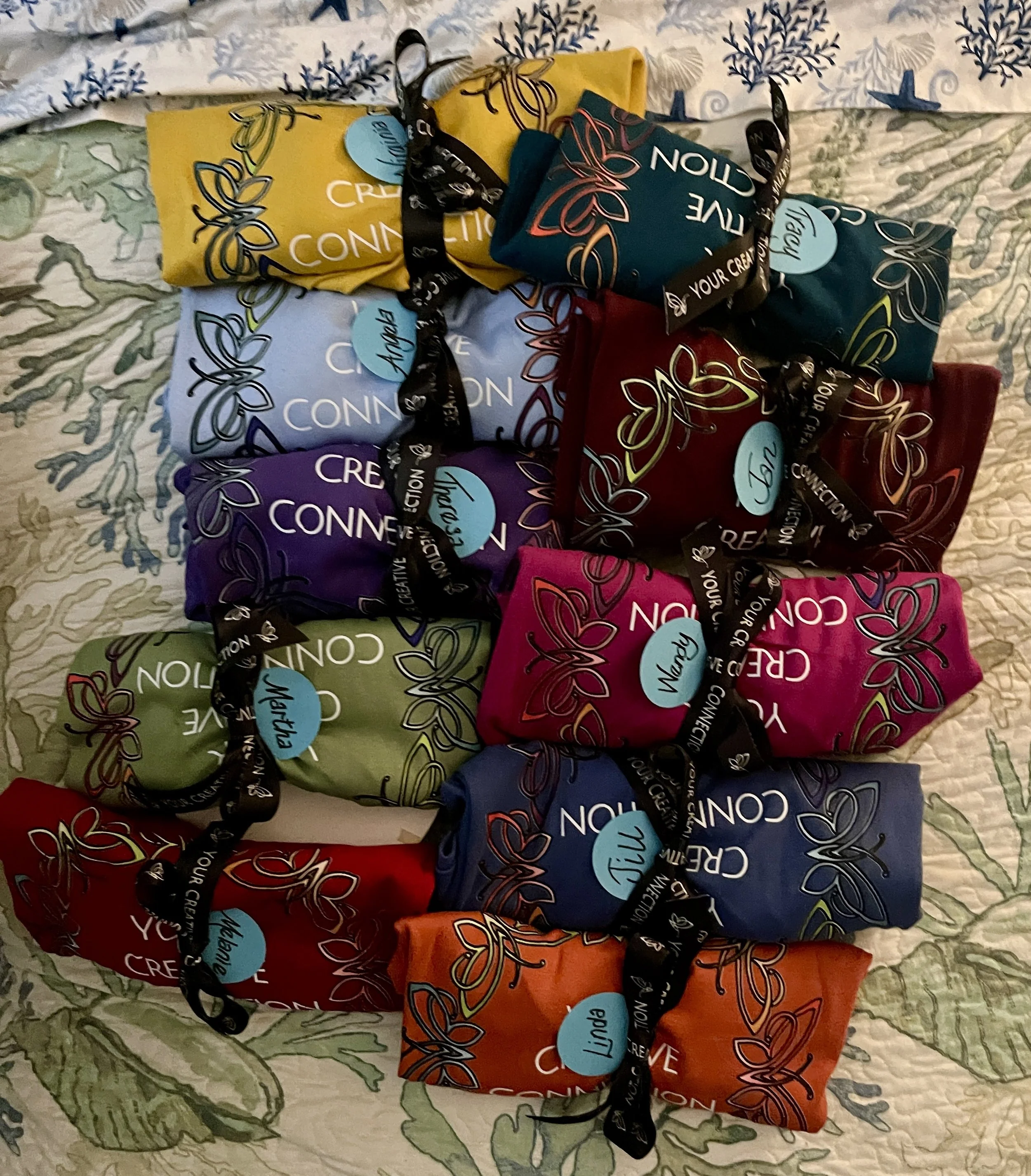
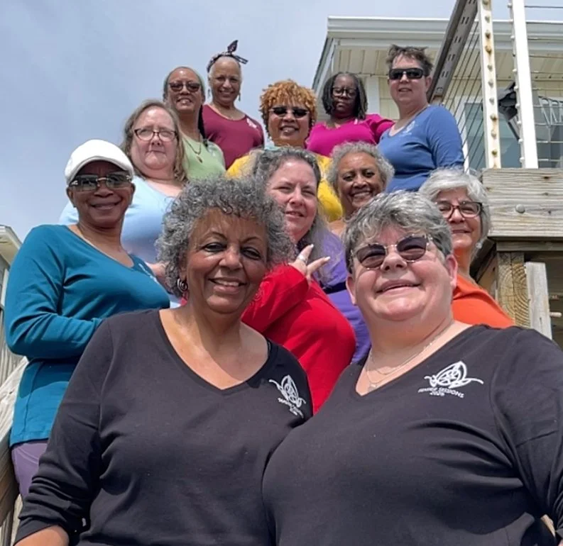
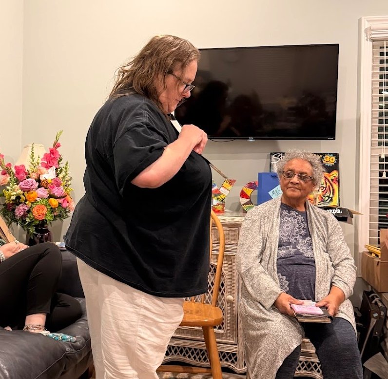
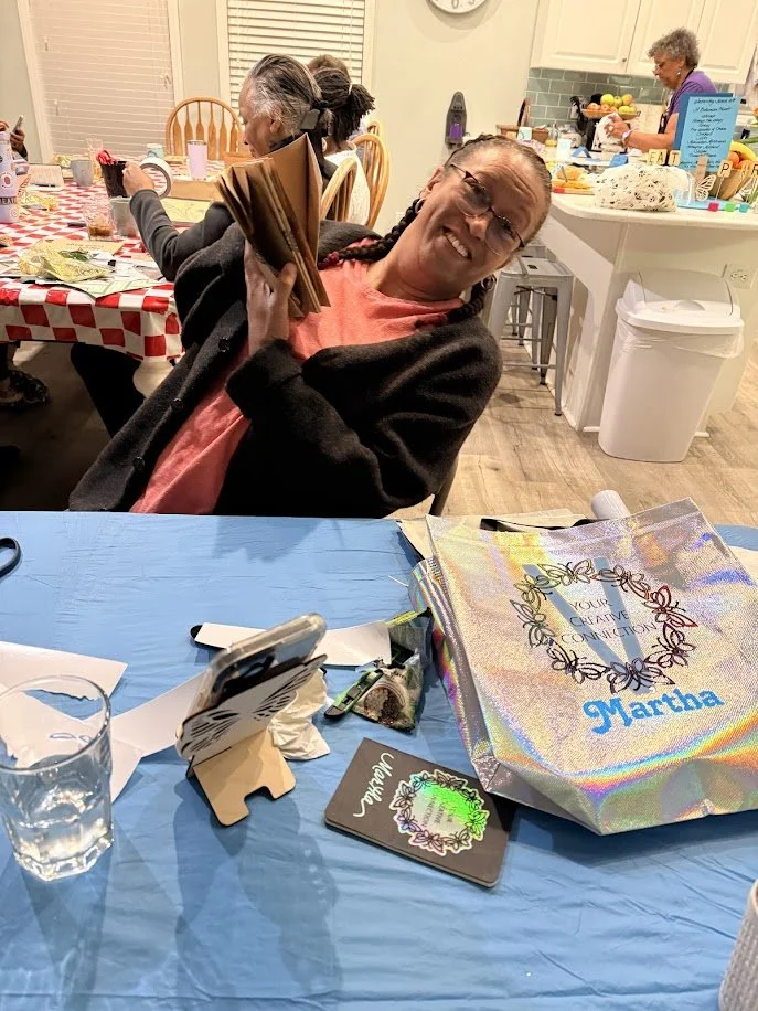
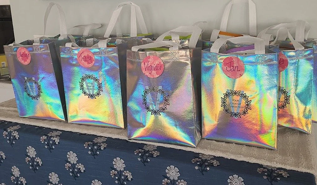
As we said our last goodbyes, we gave each Creative Explorer a ‘go bag’ chock full of goodies for the road, along with their copy of the group photo magnet from the eventful (occasionally hilarious) photo shoot of the day before. This year’s bags matched the iridescence of the tote bags—year 5 swag was truly shiny & bright!
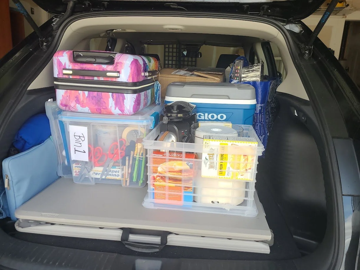
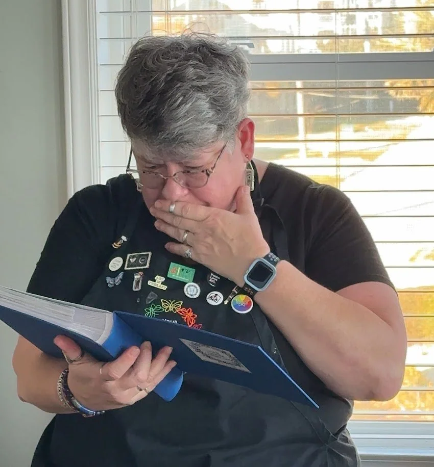
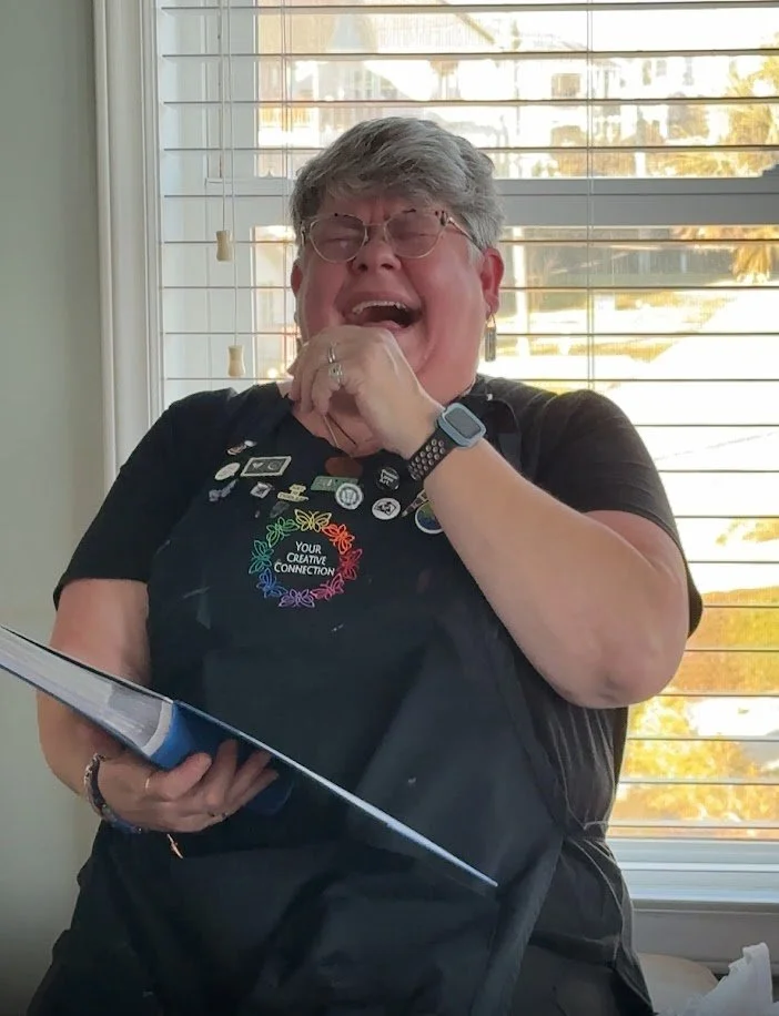
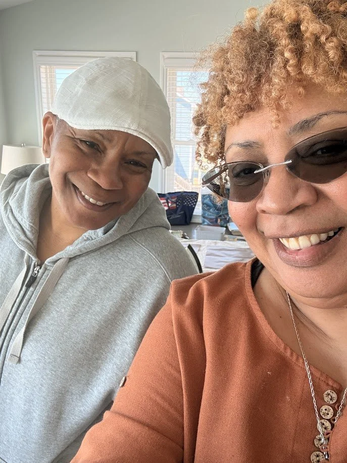
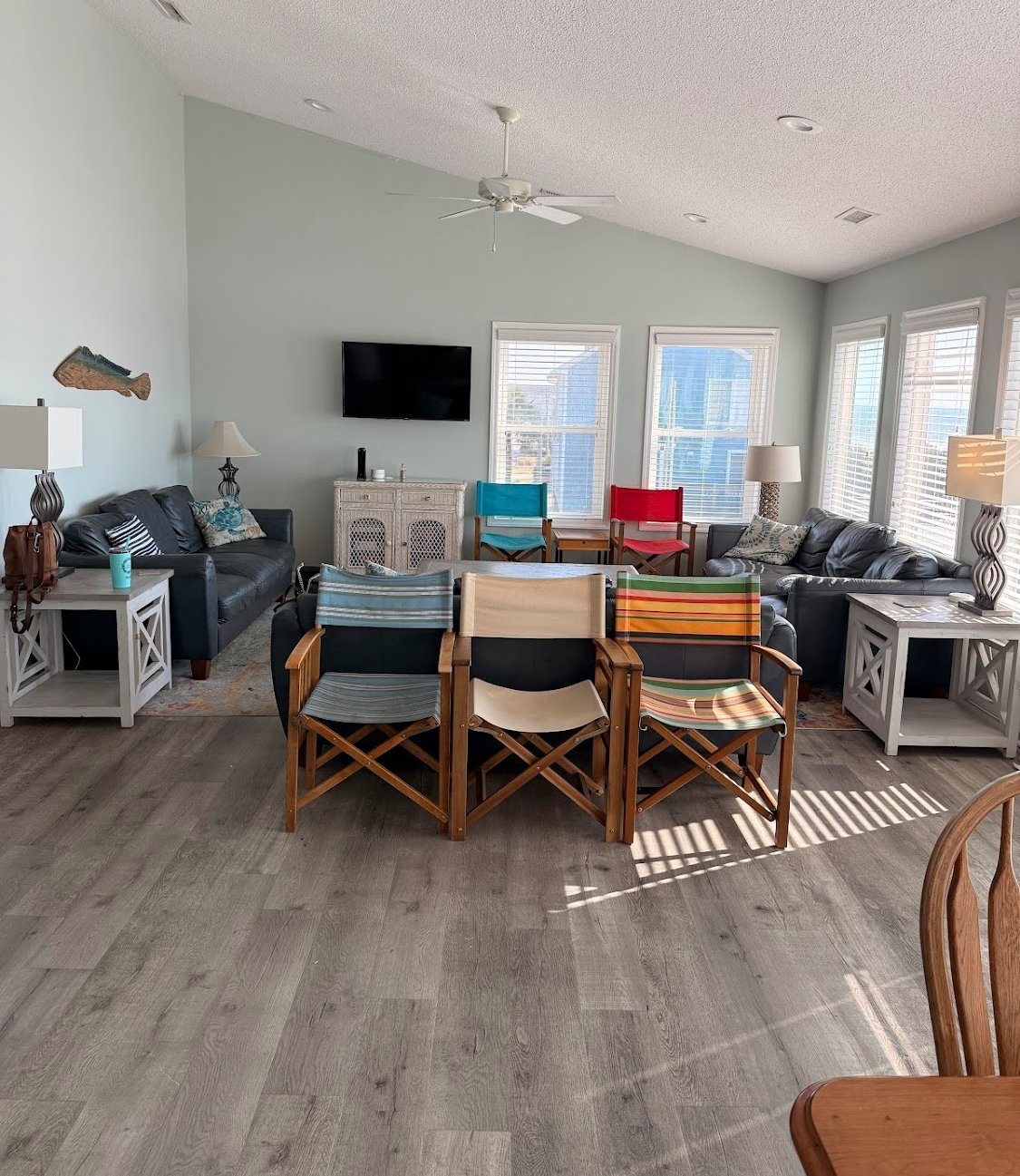
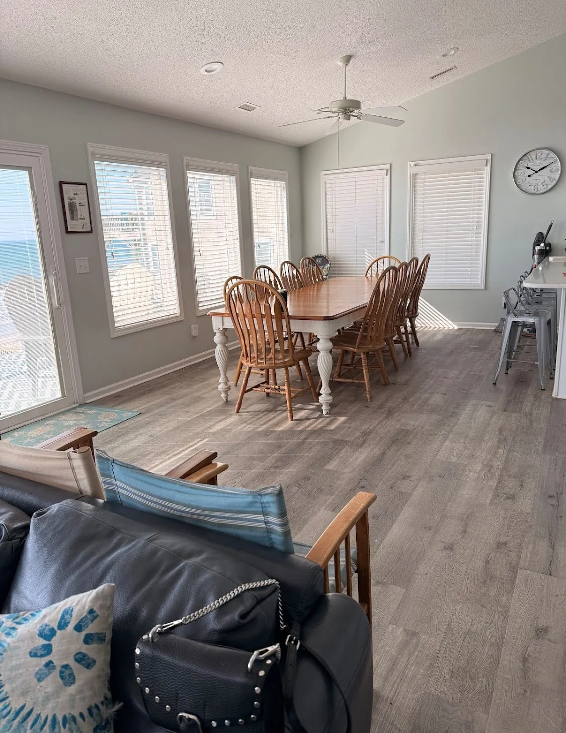
…and just like that, it was all over. But what a time we had! From beginning to end, this extended weekend was loaded with surprises and discovery. It’s amazing how quiet this big ol’ house gets once everyone has taken their leave,
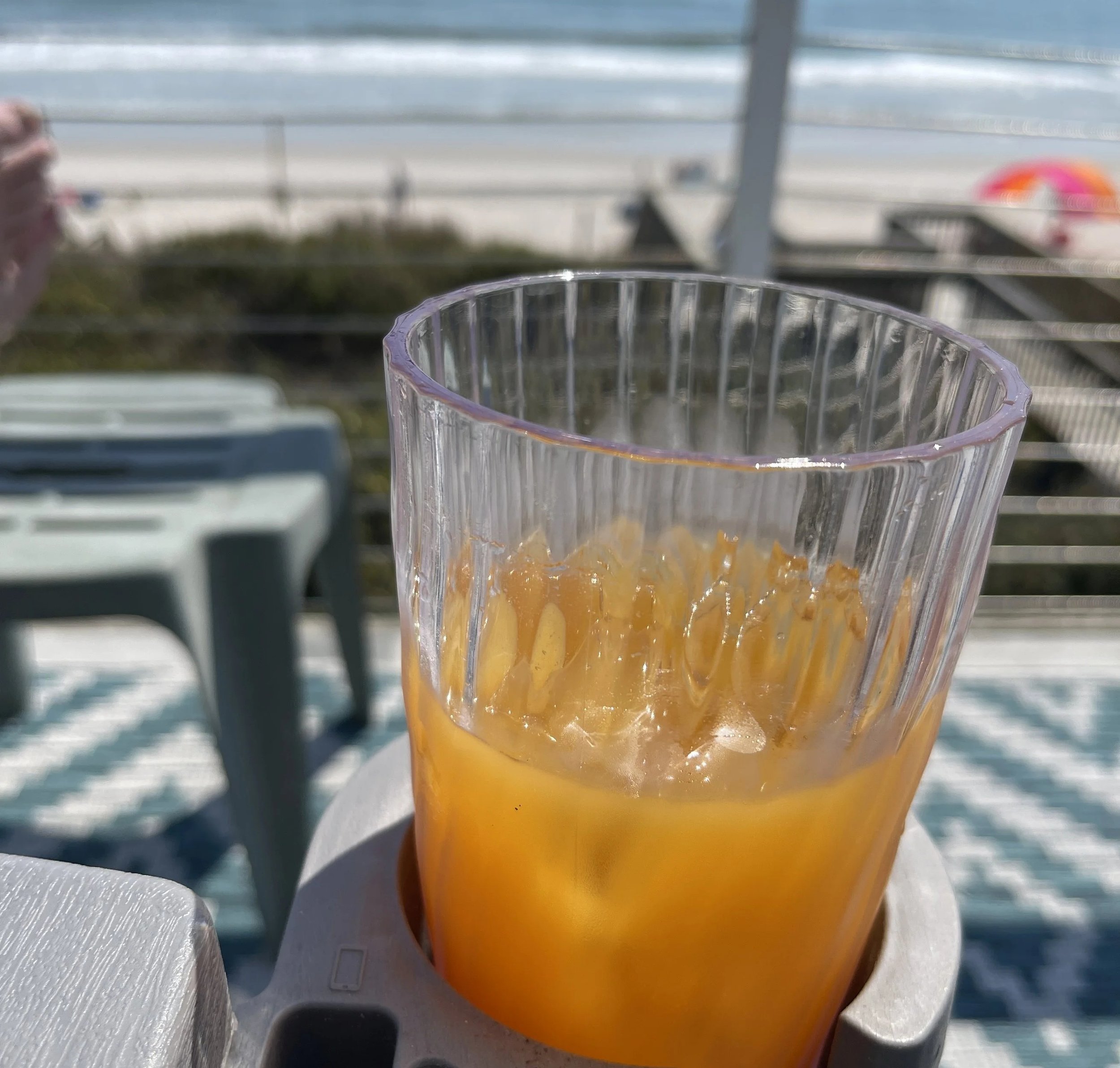
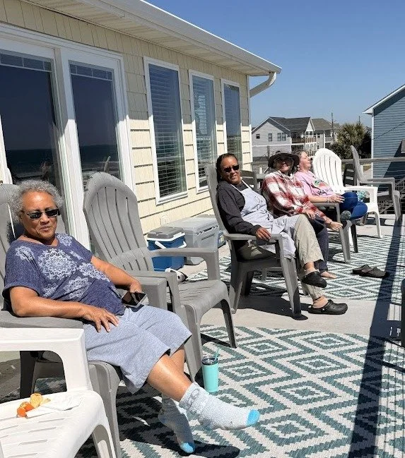
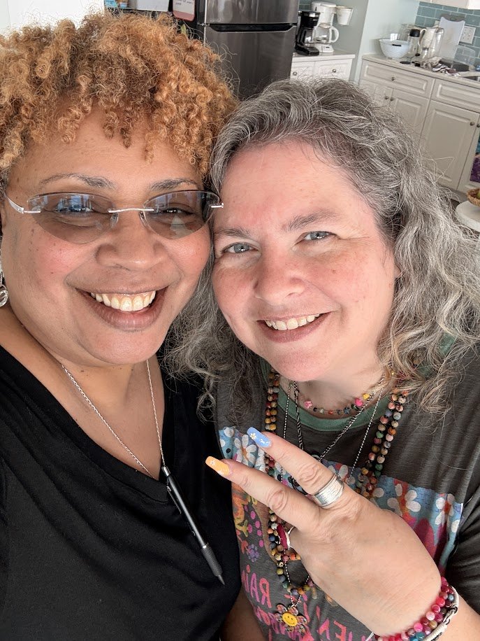
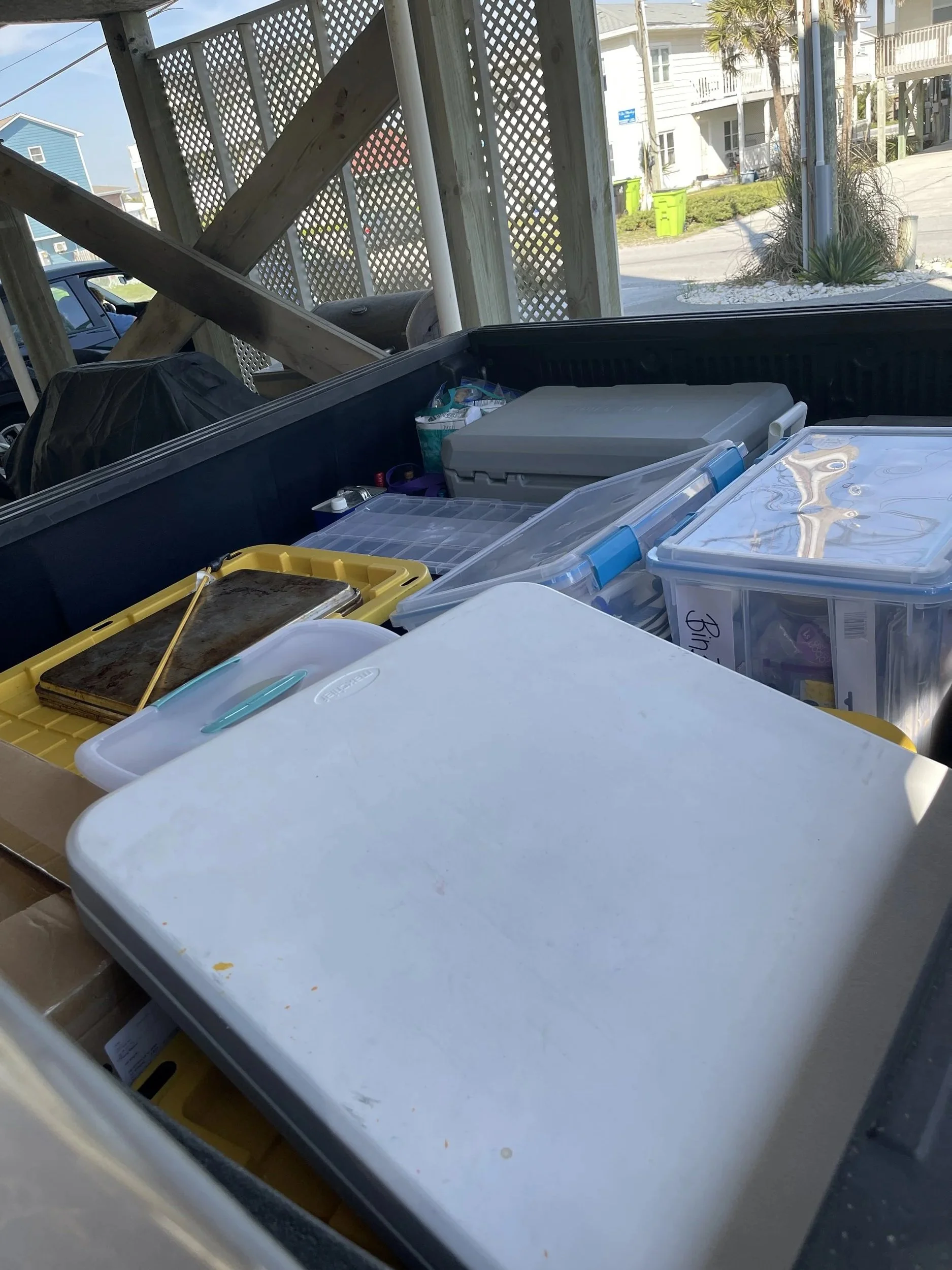
Michelle & I enjoyed a fruity beverage and a few minutes on the deck to look back at an incredible weekend. As evidenced by my “toasty complexion,” a few minutes may have lasted a little while. After which, it was time to return the house to its “pre-retreat” condition…. It nearly seems a different place!
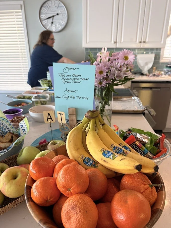
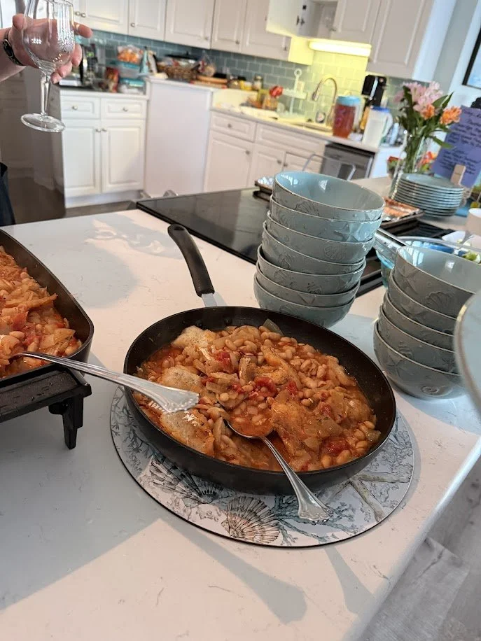
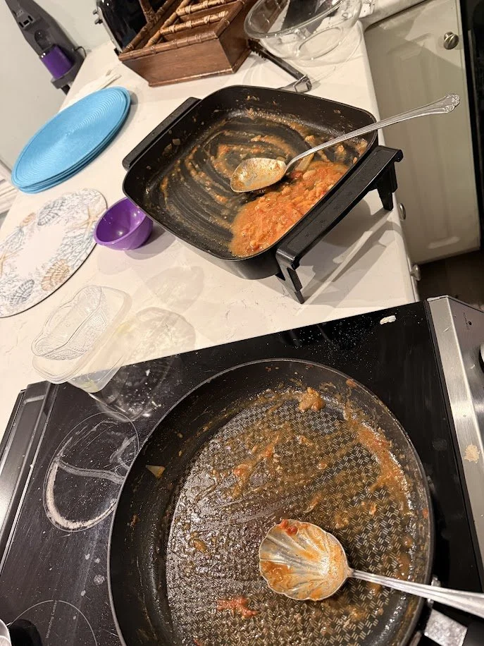
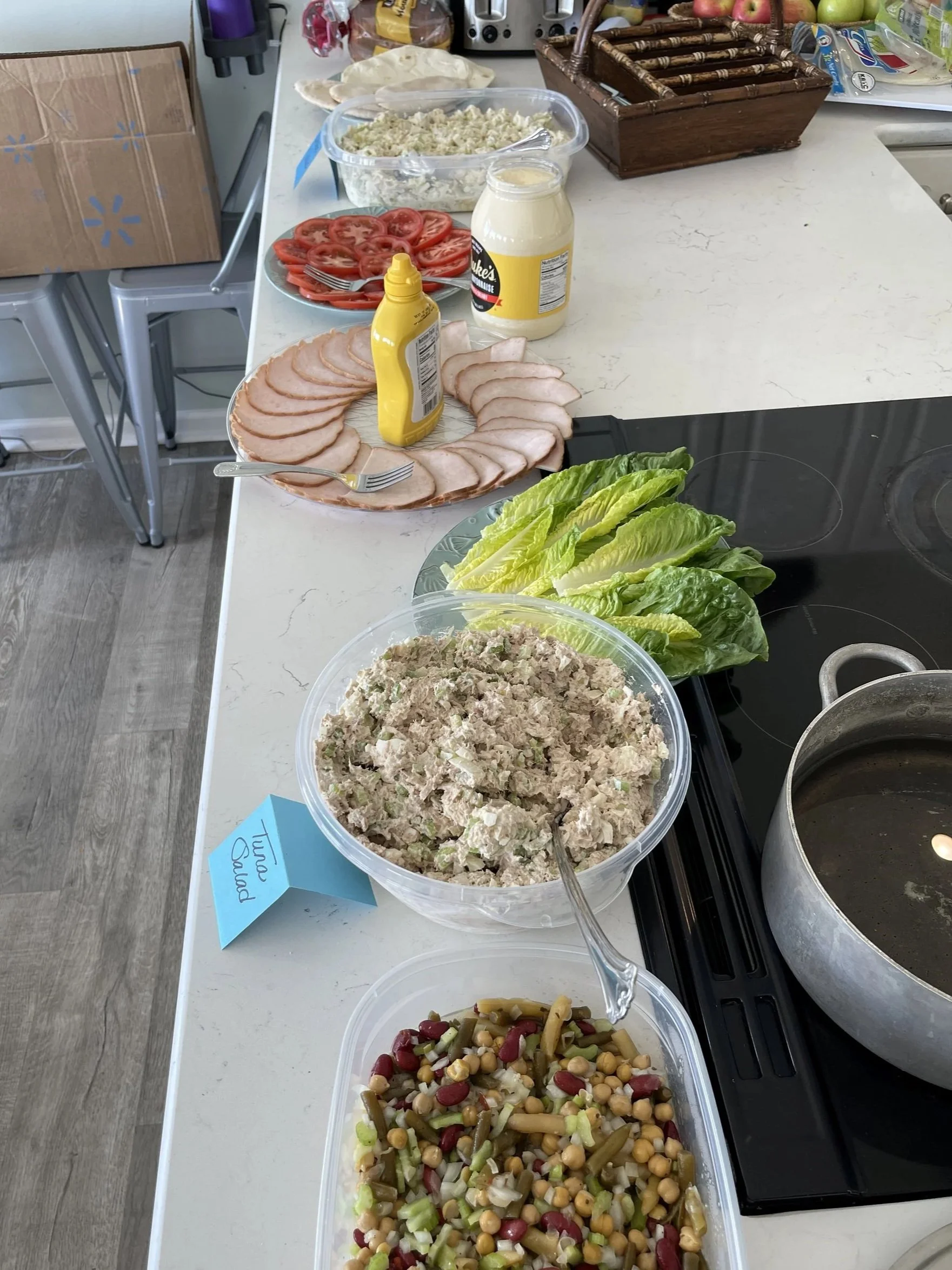
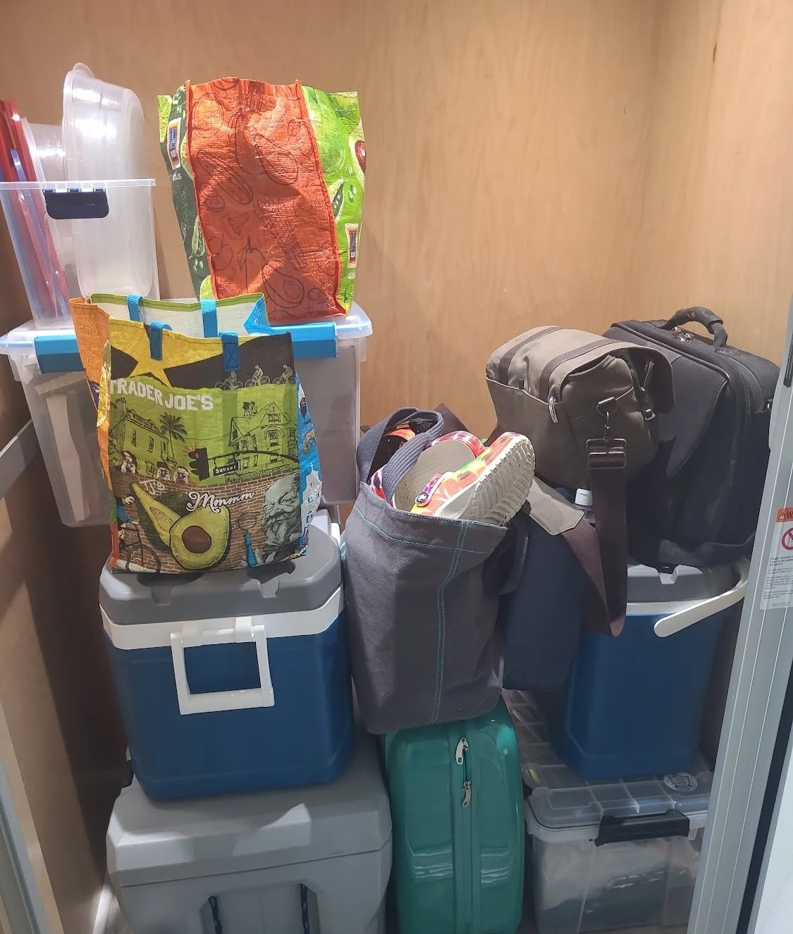
After a good run at packing up, moving furniture, and stacking things for removal we were ready for some good dinner (that none of us had a hand in making!). A quick visit to VK Pho and we were well set to finish the work of preparing for our own departure.
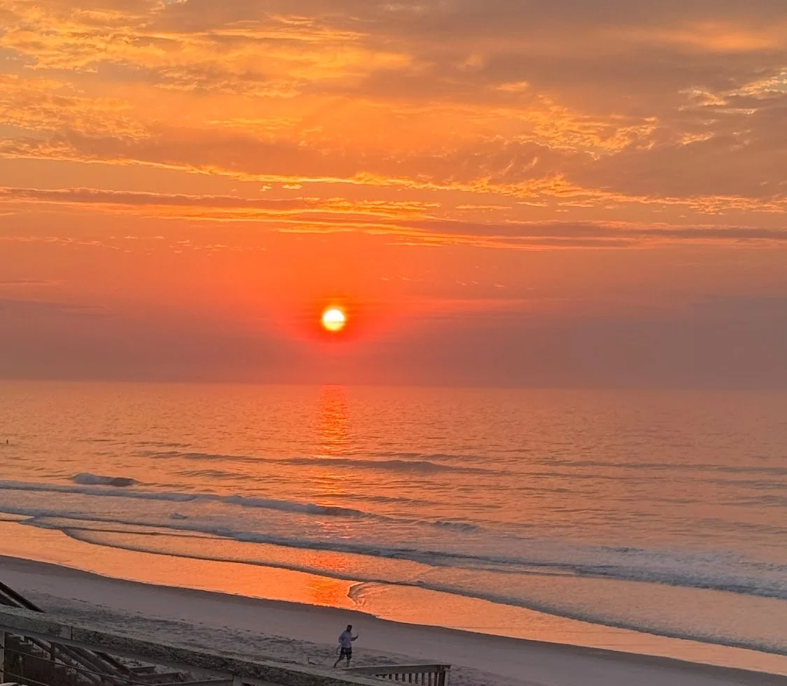
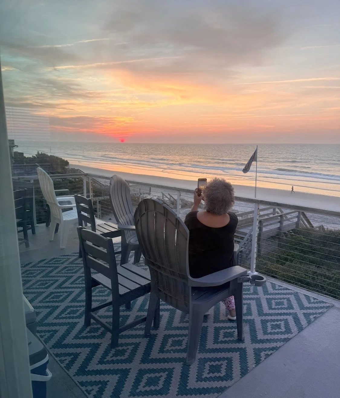
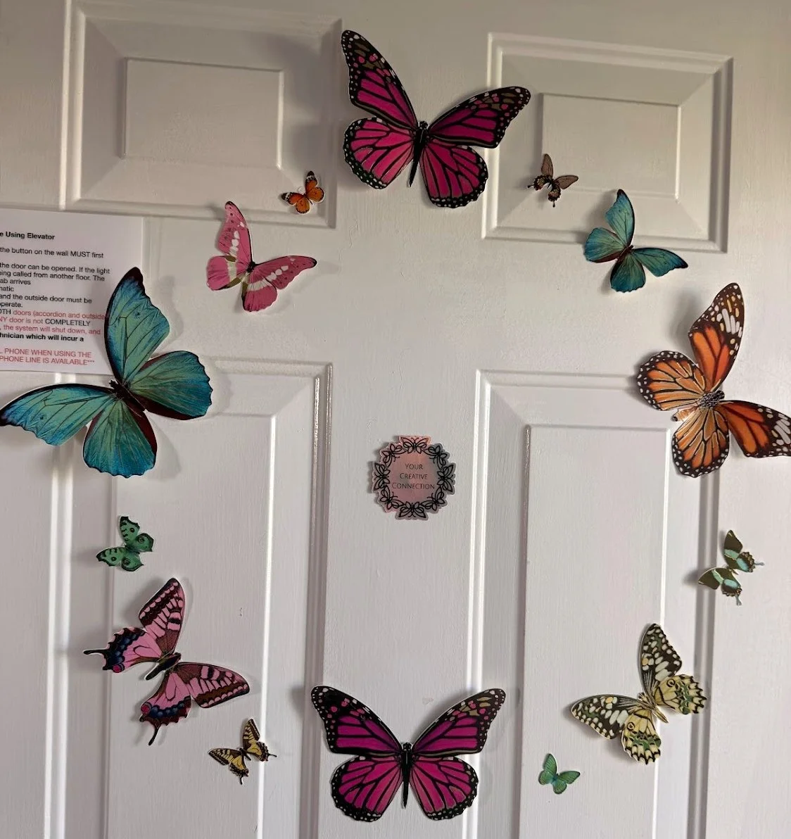
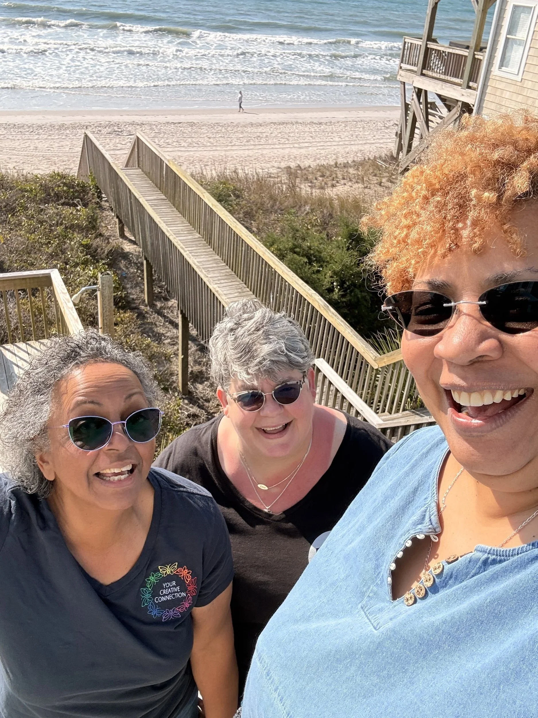
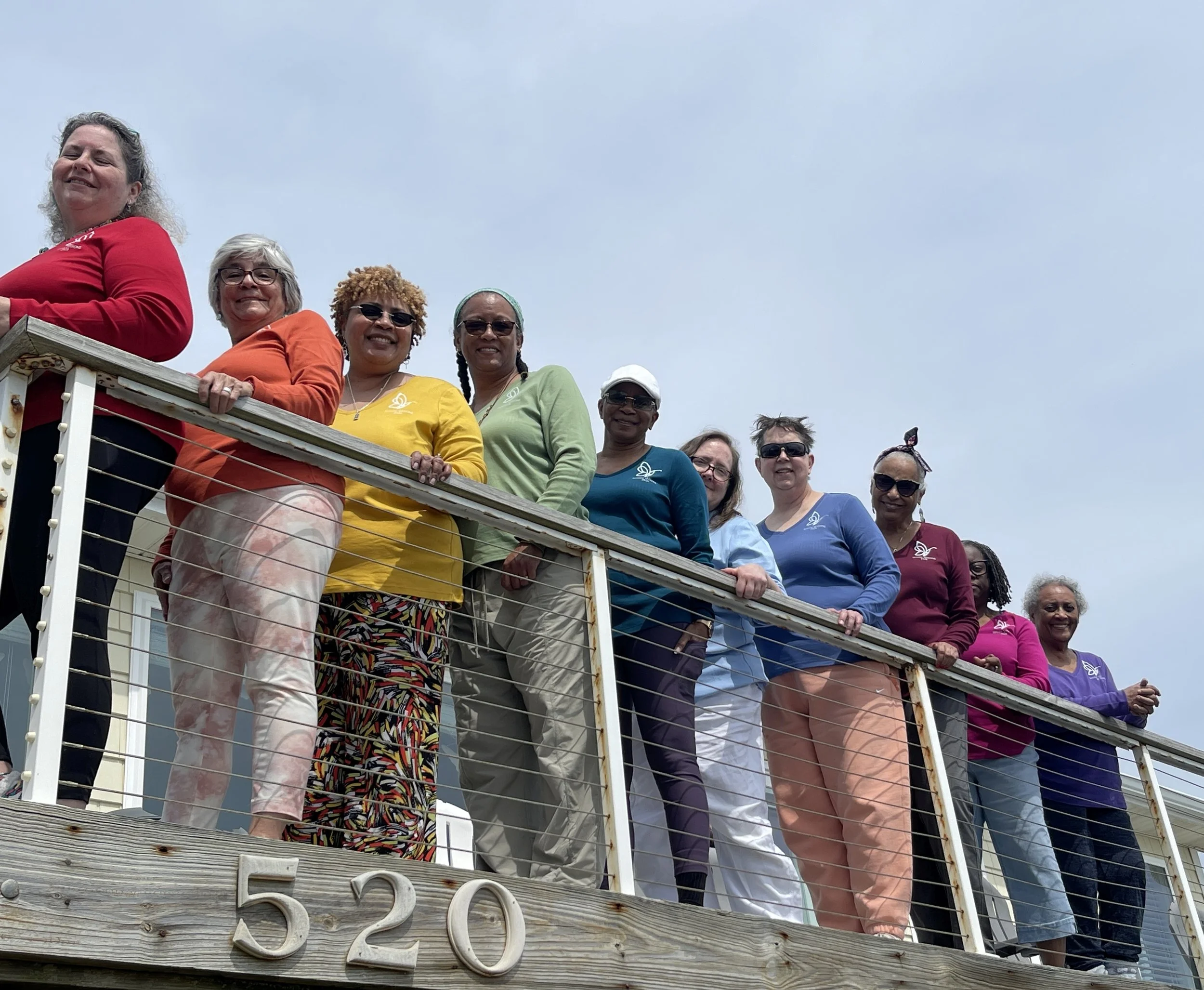
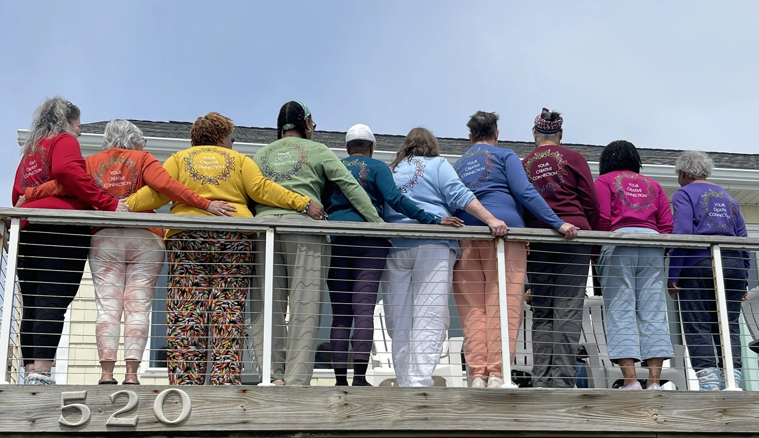
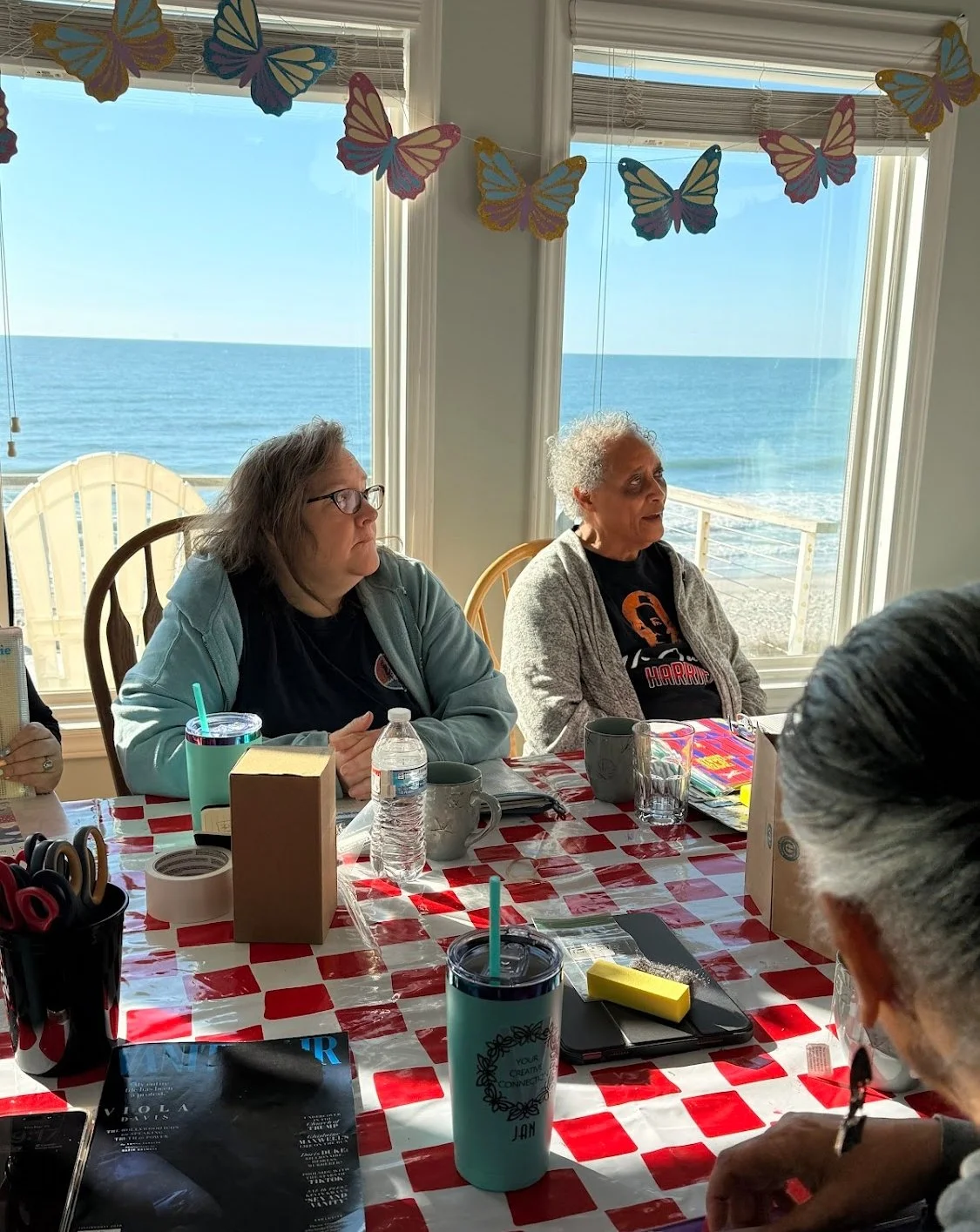
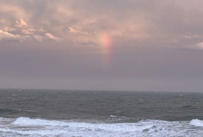
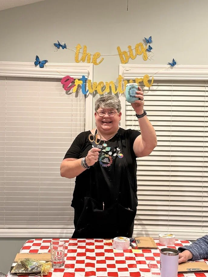
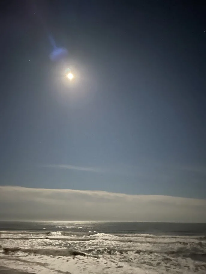
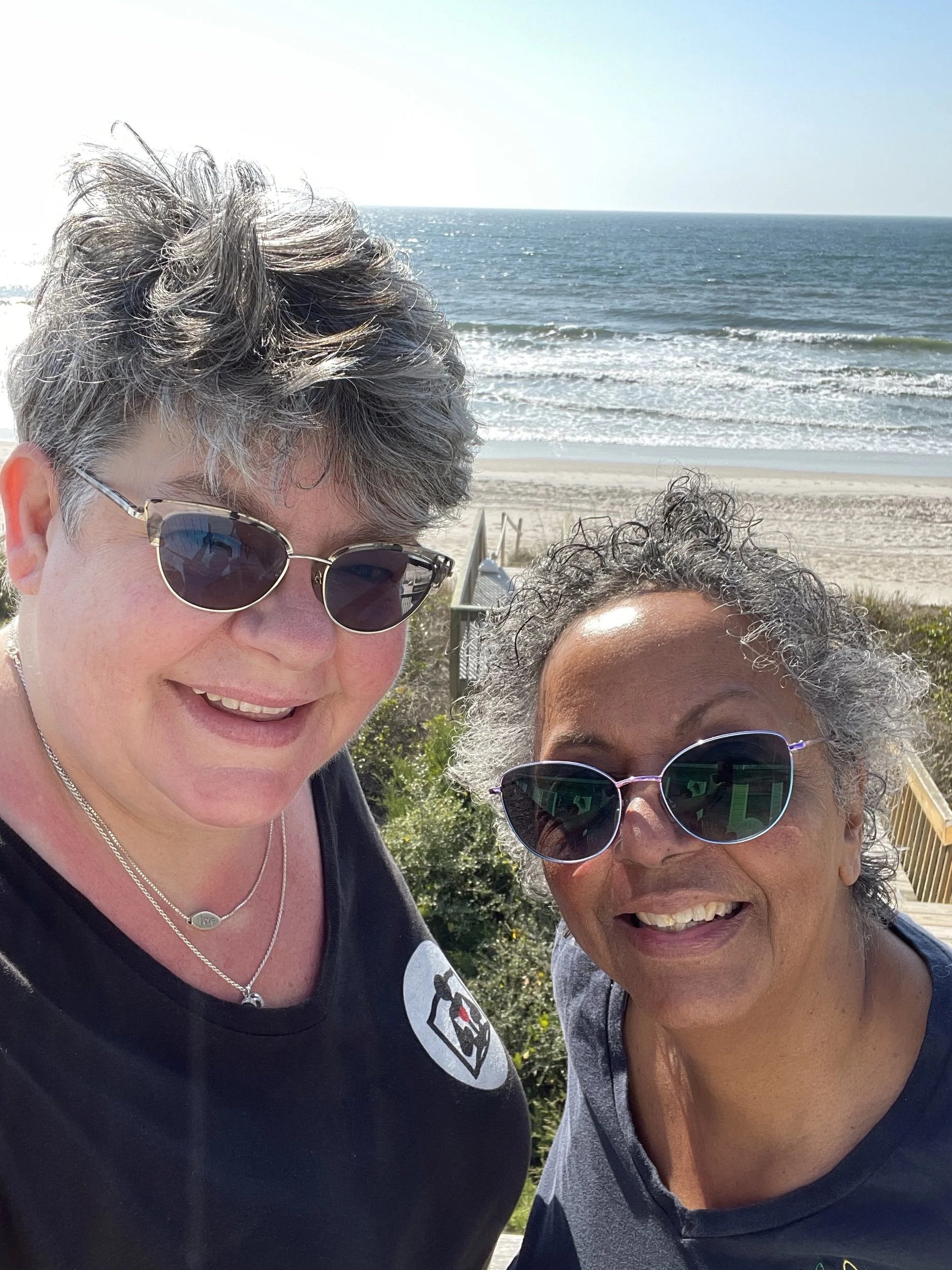
One last sunrise, the removal of all of our winged decor, one last load down in the elevator, heading home with less than we brought with us, and finally our traditional “leaving photo.” As Michelle has done, I too want to thank the infinitely generous and helpful hands of Virginia Coleman. Her contributions to this event are too many to name and we are ever grateful for each of them.
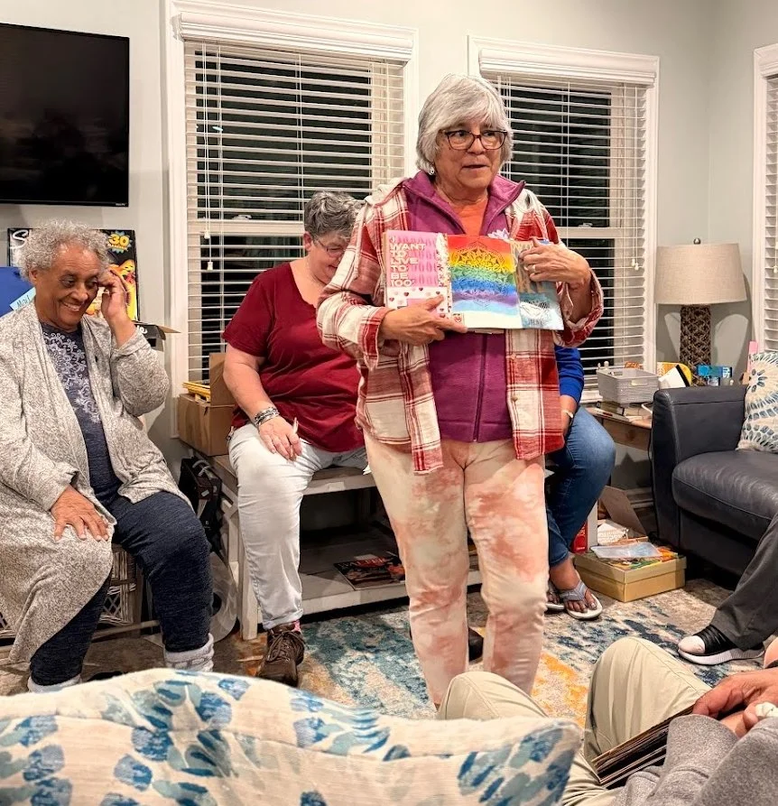
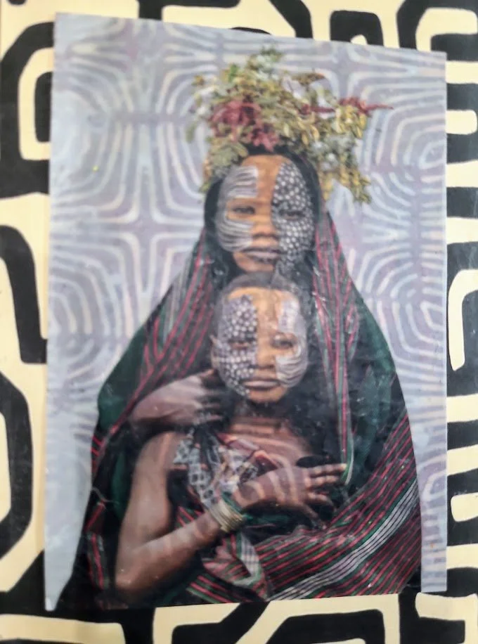
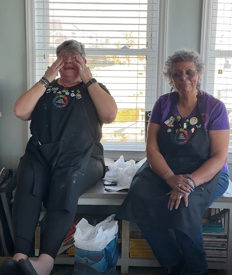
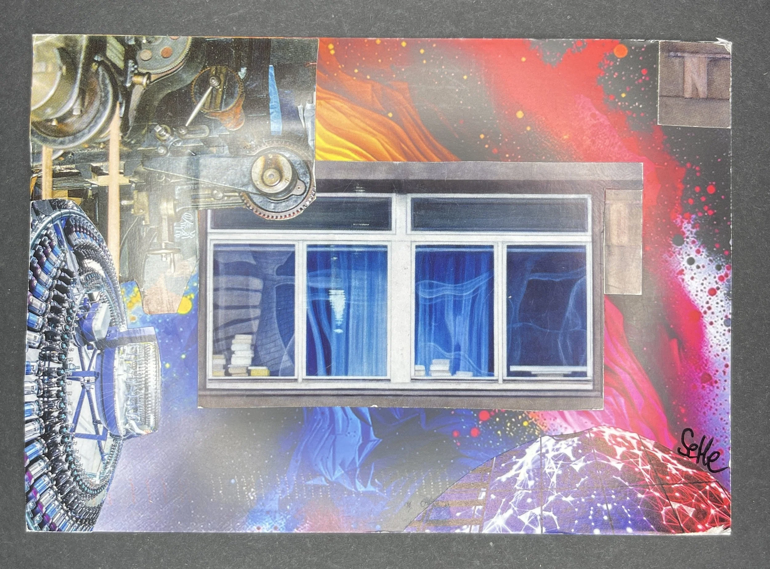
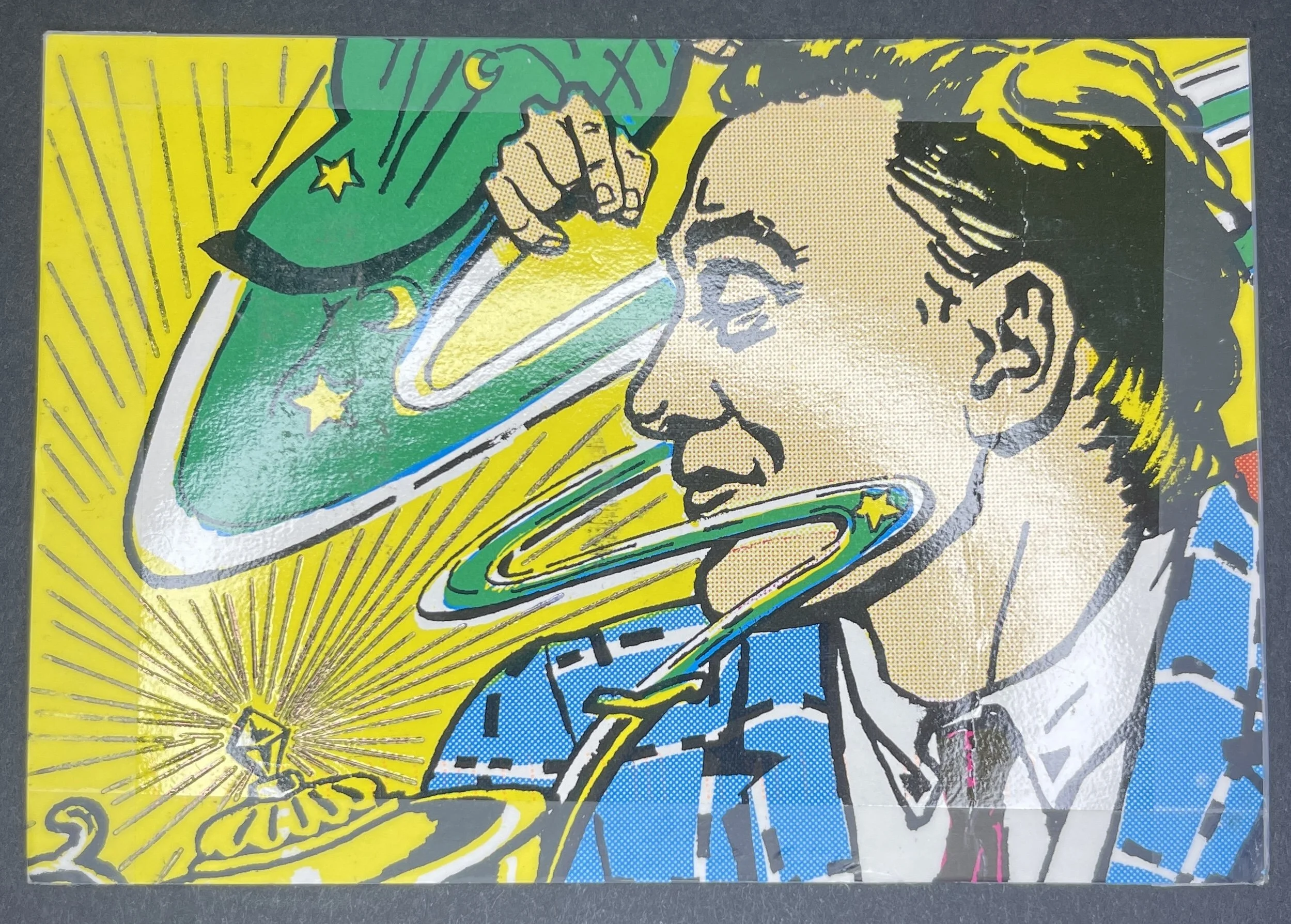
With that we will leave you. We are thankful for those who have filled the circle once again and hope that our creative paths cross again soon. Our sights have already turned toward Seaside Sessions 2027 and beyond (!) - we will have news to share on that front shortly. For just a moment more, let’s linger with the memories that we made this year….

Until next time,
Michelle & Penny