Tips on Tuesdays #006: Custom Pattern Rollers

Happy Tuesday, and welcome to the latest installment of our ToTs Series designed to inspire you to join in the fun of creating postcards for our International Mail Art | Celebration of Sapphire. This week, our topic is custom rollers. These rollers can be used to create patterns on gelatin prints, and you can create your own for a fraction of the price of commercially available ones.
If you’re like me, you’re cheap frugal, and you look for ways to spend less, and to use what you already have around the house. This is a perfect project for that. Here’s all you’ll need: recycled cardboard tubes, adhesive-backed foam sheets*, and an X-Acto knife or scissors. Note: these rollers can be used again and again, which makes them even more economical. Winning!

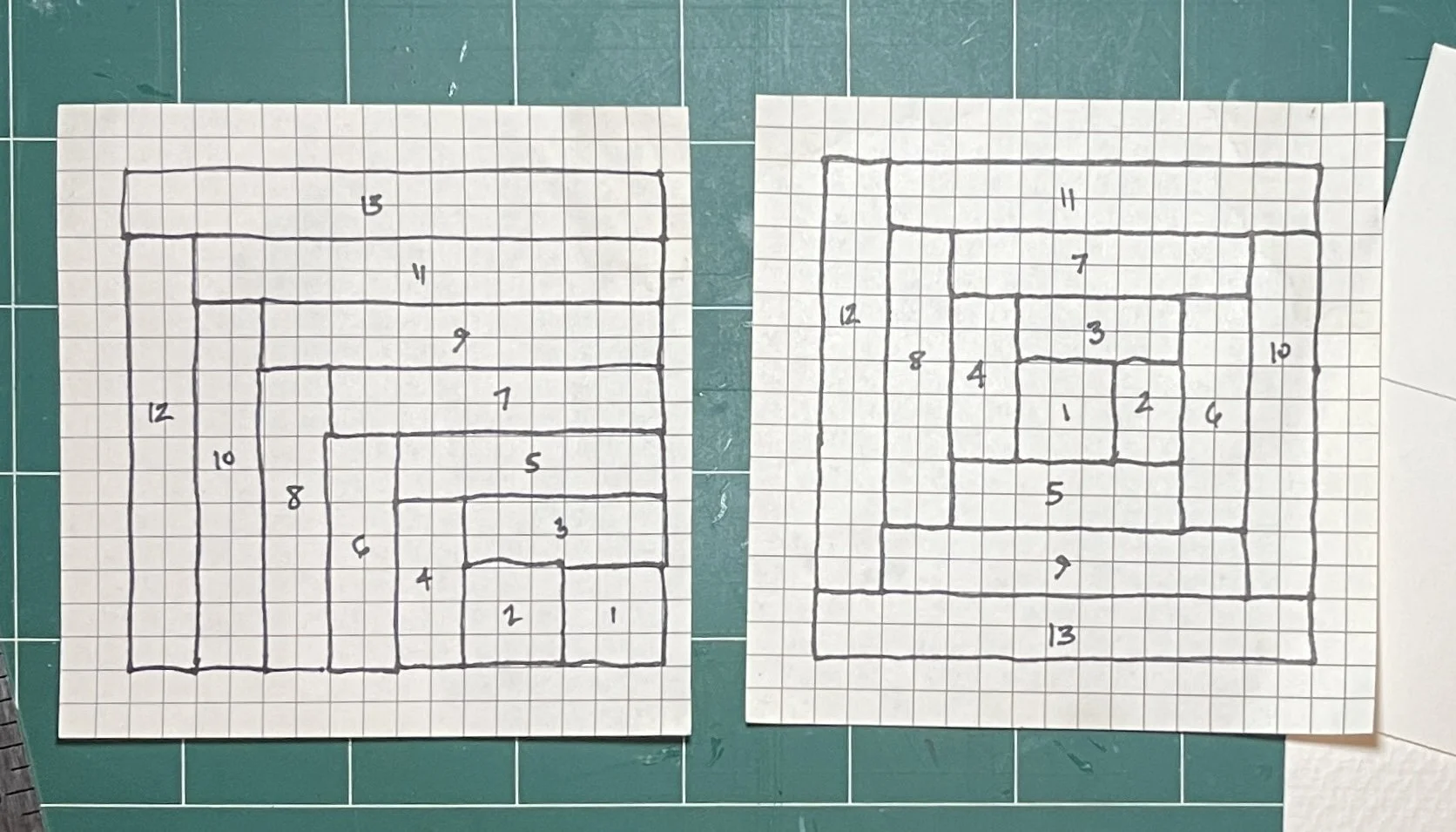
THE ROLLER DESIGNS: To begin, draw a design on the adhesive-backed foam (*although a bit more expensive than regular Dollar Store foam sheets, the adhesive backing makes glue unnecessary), keeping in mind the length of your cardboard tube.

This will be part of a 3/12” cardboard tube design. The adhesive back foam sheet was $1.25, and the tube was recycled.

The idea is to create a repeating pattern with your design which, once rolled onto the gelatin printing plate, will form a cohesive whole. Here, in photos, was my process for creating the 3/12” texture tubes:

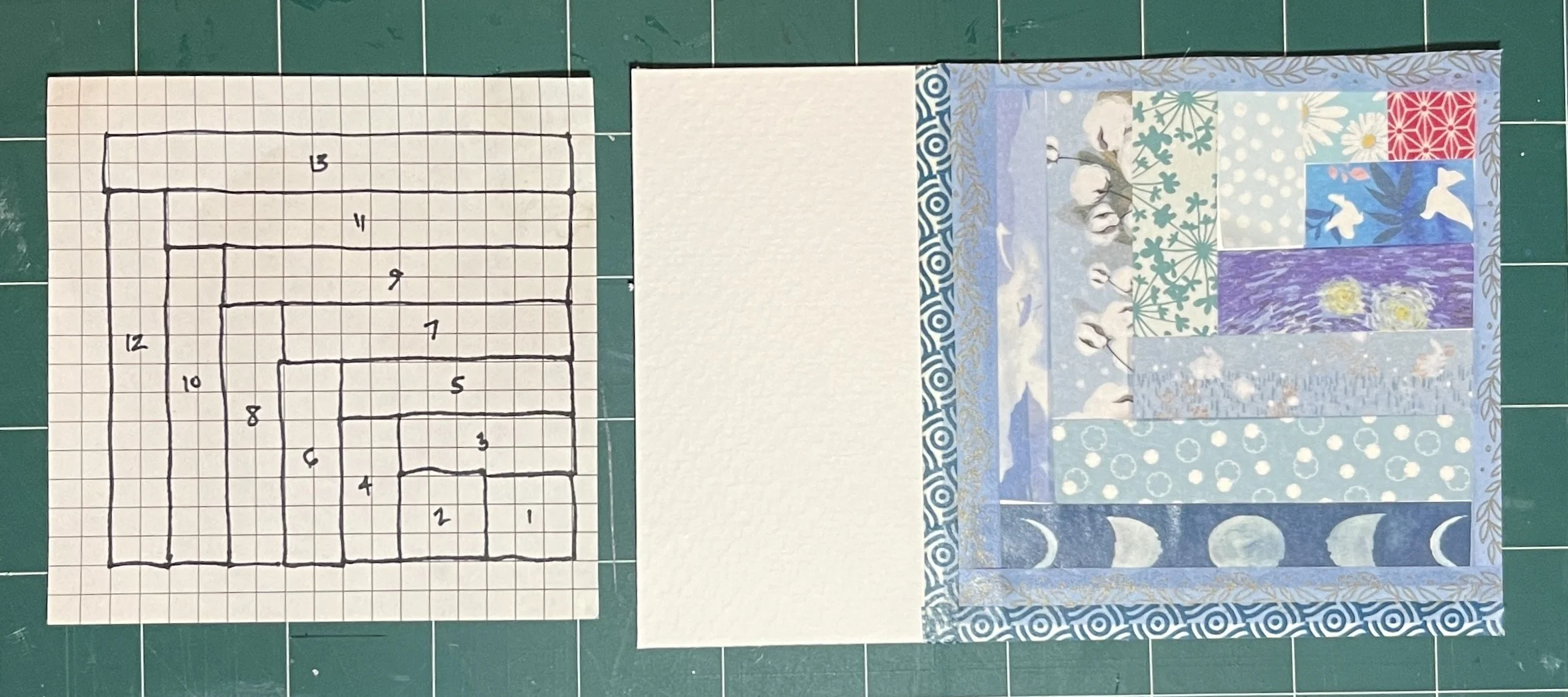
I used an X-Acto blade to cut the notches, but if you prefer scissors, go for it! Pro Tip: Cut the design with the adhesive backing still attached (your blade or scissors will thank you).

Here’s the first strip of the design adhered to the tube. The next one is a bit different, which will make the resulting pattern more interesting. I also purposely misaligned the notches, again, for more interest.

The finished roller. I also alternated between straight and notched sides facing each other…for that visual interest thing again.

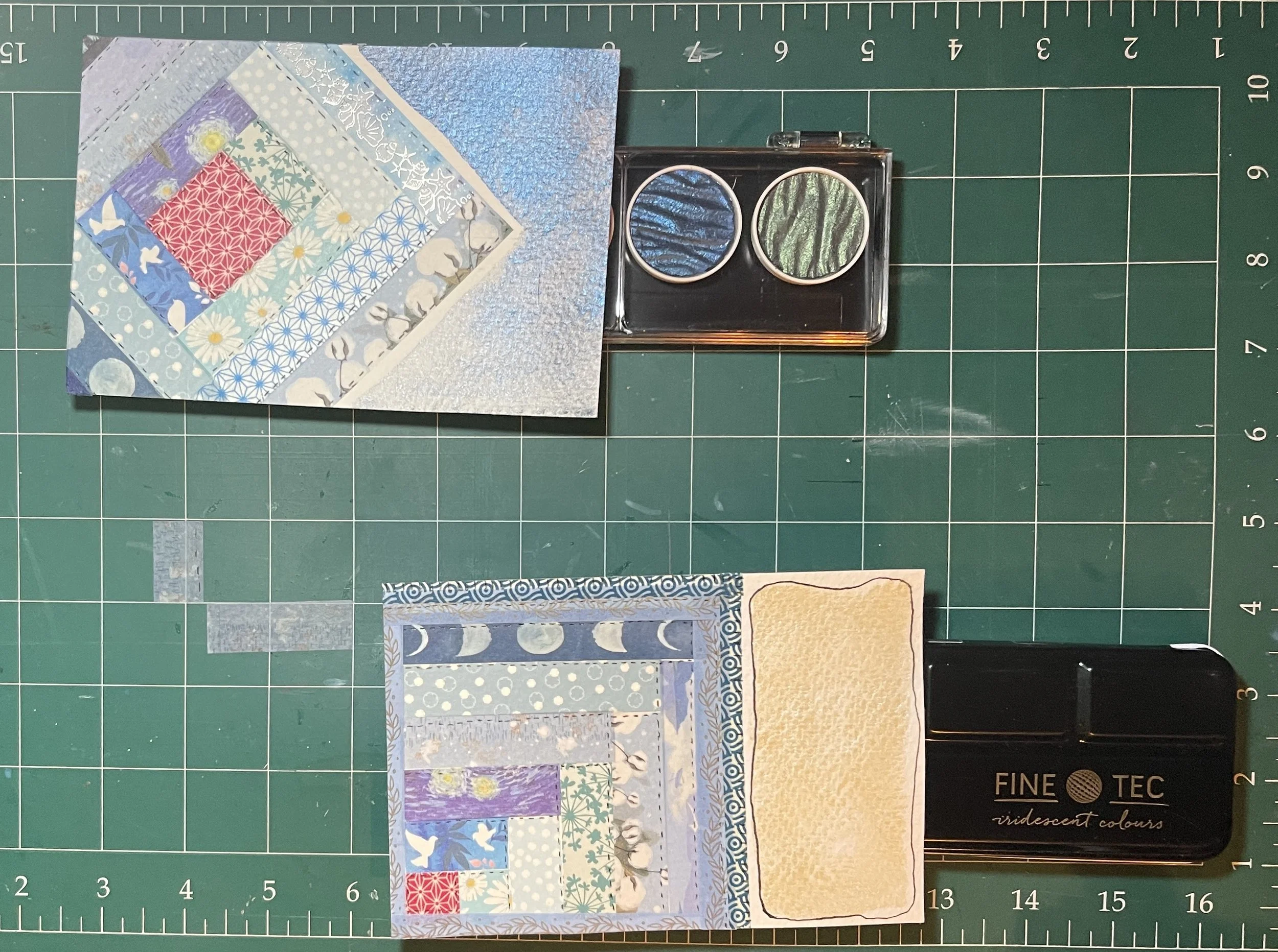
Above are the next 3 roller designs, plus the scraps! As you can see, curved elements can work. You can also treat the tube as a ‘canvas’, filling in empty spaces. Just remember that the foam will remove the paint from the plate, and the “empty” spaces will be the color of the paint on the plate, as you’ll see below.

THE PLATES AND PAPERS: After adding a thin layer of paint onto the Gelli plate with a brayer, I placed one roller at the bottom of the plate, lined up with the right edge, and rolled it to the top. I did the same on the left edge, which created two rows of my pattern. Try using the roller in different directions on the plate, too. (if I’d had a longer tube, I could have used just one pass over my 8” x 11” Gelli plate). Tip: use gloves if you don’t want your hands to get almost as much paint on them as on the plate.

Once the plate was dry, I used a pick up color of paint to create the final patterned paper. Unfortunately, I forgot to take photos of the full pages of printed papers (oops!), but here are some scraps left over after I created the postcard-sized finished collage:

Partial printed papers. I used Golden Fluid acrylic paints: Teal, Anthraquinone Blue, and Titan Buff on regular printer paper.

THE POSTCARD COLLAGE: I created the collage below using each of my printed papers. I used circle punches to break up the linear aspects, and repeated shapes around the card. I love how the two colors and their tints and shades play across the surface, and I don’t even mind where the white specks from the Gelli plate show through.

The completed 4”x 6” postcard.

I hope this project has inspired you to create custom pattern rollers to add to your stash of Gelli plate tools. And I hope you’ll create a fabulous postcard with them to add to the Celebration of Sapphire collection. ‘Can’t wait to see what you’ll design!

Penny will be up next month with another edition of ToTs, so stay tuned!

~Michelle

Tips on Tuesday #005: Washi Tape

Greetings! Welcome to the latest installment of our ToTs Series designed to inspire you to join in the fun of our International Mail Art | Celebration of Sapphire. This week, we are looking at the wonderment that is Washi Tape!

If this is your first encounter with this lovely stuff, let me tell you a bit more about it. Washi tape is a decorative adhesive tape made from traditional Japanese paper. The name comes from “wa,” meaning Japanese, and “shi,” meaning paper. Unlike regular masking tape, washi tape is made from natural fibers like bamboo, hemp, or the bark of trees native to Japan, such as the mulberry, mitsumata shrub, or gampi tree. One of the most appealing aspects of washi tape is its versatility. It is easy to tear by hand, can be re-positioned without leaving residue, and comes in a wide array of colors and patterns. Whether you’re looking to add a subtle accent or a bold design, there’s a washi tape for every occasion. Due to its recent popularity, it can be found in craft stores as well as from online specialty markets and importers.

I thought it would be fun to make “mini quilts” with washi tape; to that end, I gathered a selection of blue tapes from my treasure trove (those less kind may call it a hoard - but we’ll not be bothered by that, today). In an effort to avoid the pesky angles found in many patterns, I decided to do a couple of variations on the Log Cabin pattern. The pop of red you see in the center (above) is a traditional centerpiece to this pattern - it represents the fire in the hearth at the heart of the home.

After a romp with Mr. Google, I mapped out two variations on my theme on graph paper. In the pattern on the left, 1 indicates the “center” (or fire), the even numbers are the dark colors (representing the night), and the odd numbers are the lighter colors (representing the day time). For the pattern on the right, 1 remains the red block; it could be worked in any number of ways. I opted to have the dark colors opposing the lighter colors. It is truly fascinating to explore all of the different ways one pattern can be altered to create many, many different end results. (I highly recommend your own romp with Mr. G on this subject).

Here is the 1st card (albeit upside down) after piecing my tapes together. Below, you can see the 2nd design. With a jaunty angle it fills more of the card - you can see the darker colors on the left and lighter ones on the right.

I wanted to add handwritten quotations to each of them, but first I needed to do something to bring some more BLUE. I turned to my trusty FineTec iridescent watercolors to add a little somthin’ somthin’ to the open areas.

When it came time to photograph them, I realized that this might not have been the best choice - but they sure are pretty in real life. ;) The one on top has the Midnight Blue from the Rainbow pearl colors set; the bottom features Sapphire Blue interference color from the iridescent set. It looks oddly yellow and flat, here (above); on the completed card however, it is a shimmery, pale, flashing blue/pink — like the inside of a well-worn seashell (below). I used a 005 Micron pen to add tiny stitching to my “quilts.”

Card 1 completed. The iridescence is more visible here.

Card 2 completed. Again, the shimmery effect of the paint
is more visible here.

…and that’s a wrap on this episode of ToTs! While I used Washi Tape for these examples, you could easily to the same thing with any printed papers (i.e. security envelopes, photos from magazines (cut into strips), decorative/scrapbook papers, etc.). Before mailing, I would recommend a this coat of matt medium, ModPodge, or similar sealant. Likewise, you could actually use strips of fabric; however this might make your finished card somewhat weighty. I hope that this has provided you with a wee bit of blue inspiration! We can’t wait to see how you do blue.

Michelle will be back with ToTs #006 in a couple of weeks. Until then, keep making beauty in this crazy world!
- Penny