
Lisa Lofthouse
Fayetteville, NC
US
Tips on Tuesday #005: Washi Tape
Greetings! Welcome to the latest installment of our ToTs Series designed to inspire you to join in the fun of our International Mail Art | Celebration of Sapphire. This week, we are looking at the wonderment that is Washi Tape!
If this is your first encounter with this lovely stuff, let me tell you a bit more about it. Washi tape is a decorative adhesive tape made from traditional Japanese paper. The name comes from “wa,” meaning Japanese, and “shi,” meaning paper. Unlike regular masking tape, washi tape is made from natural fibers like bamboo, hemp, or the bark of trees native to Japan, such as the mulberry, mitsumata shrub, or gampi tree. One of the most appealing aspects of washi tape is its versatility. It is easy to tear by hand, can be re-positioned without leaving residue, and comes in a wide array of colors and patterns. Whether you’re looking to add a subtle accent or a bold design, there’s a washi tape for every occasion. Due to its recent popularity, it can be found in craft stores as well as from online specialty markets and importers.
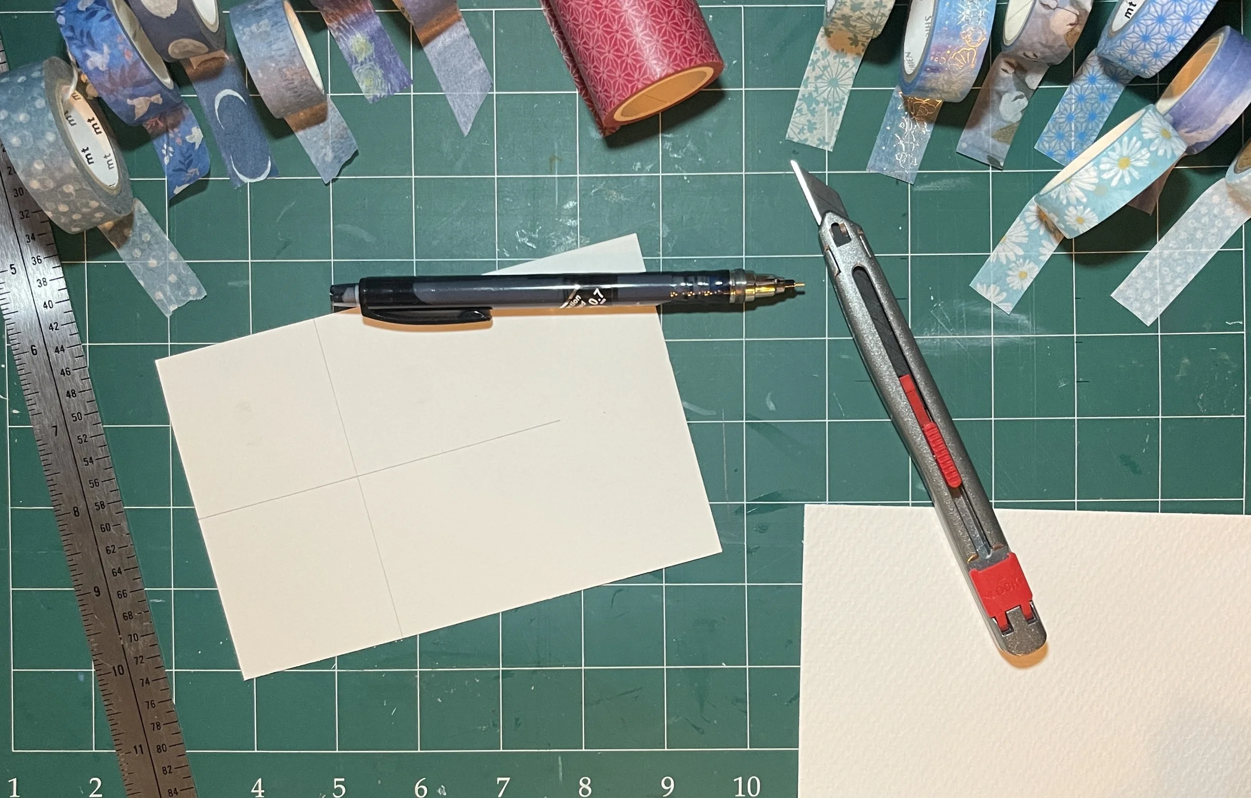
I thought it would be fun to make “mini quilts” with washi tape; to that end, I gathered a selection of blue tapes from my treasure trove (those less kind may call it a hoard - but we’ll not be bothered by that, today). In an effort to avoid the pesky angles found in many patterns, I decided to do a couple of variations on the Log Cabin pattern. The pop of red you see in the center (above) is a traditional centerpiece to this pattern - it represents the fire in the hearth at the heart of the home.
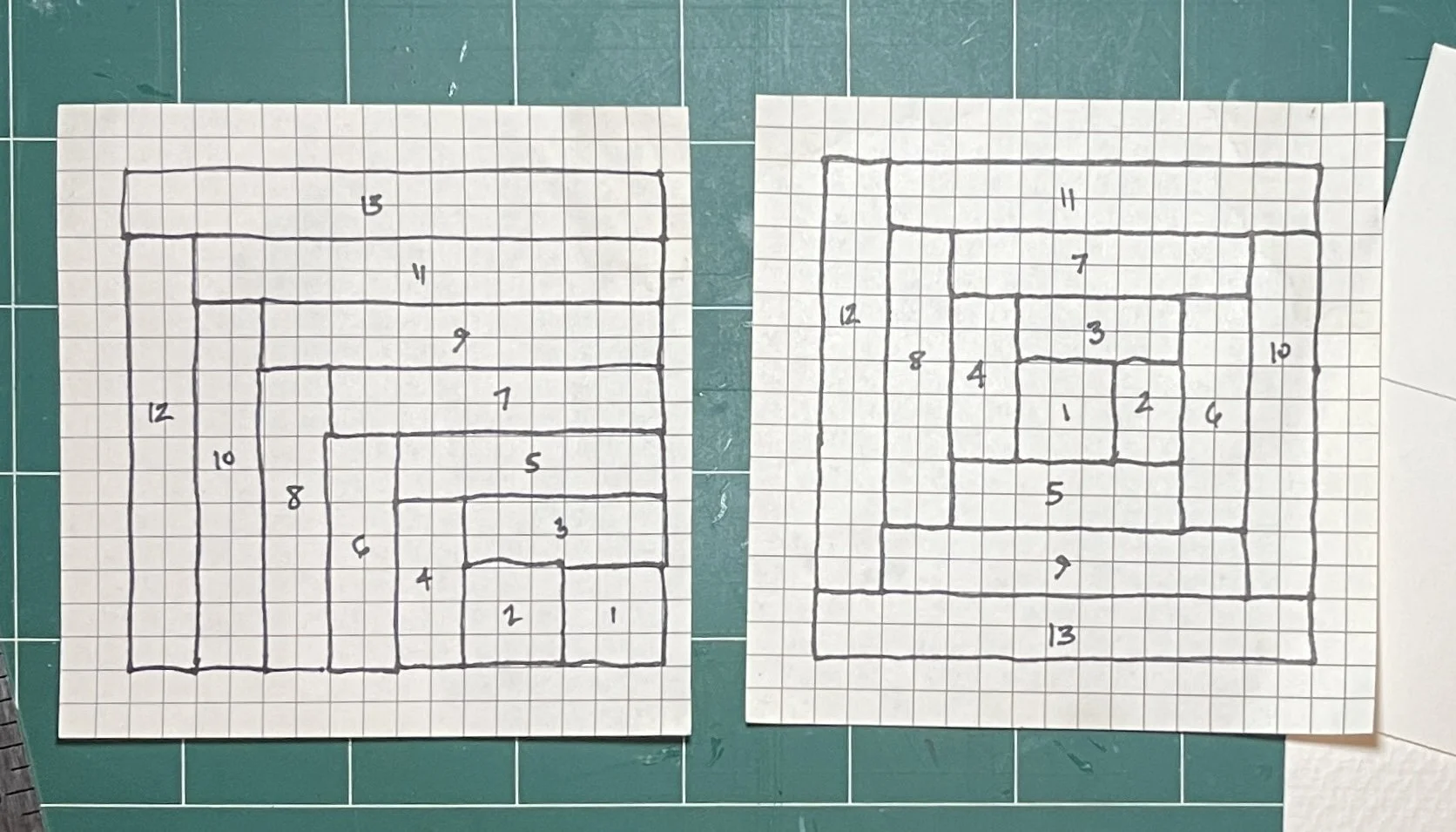
After a romp with Mr. Google, I mapped out two variations on my theme on graph paper. In the pattern on the left, 1 indicates the “center” (or fire), the even numbers are the dark colors (representing the night), and the odd numbers are the lighter colors (representing the day time). For the pattern on the right, 1 remains the red block; it could be worked in any number of ways. I opted to have the dark colors opposing the lighter colors. It is truly fascinating to explore all of the different ways one pattern can be altered to create many, many different end results. (I highly recommend your own romp with Mr. G on this subject).
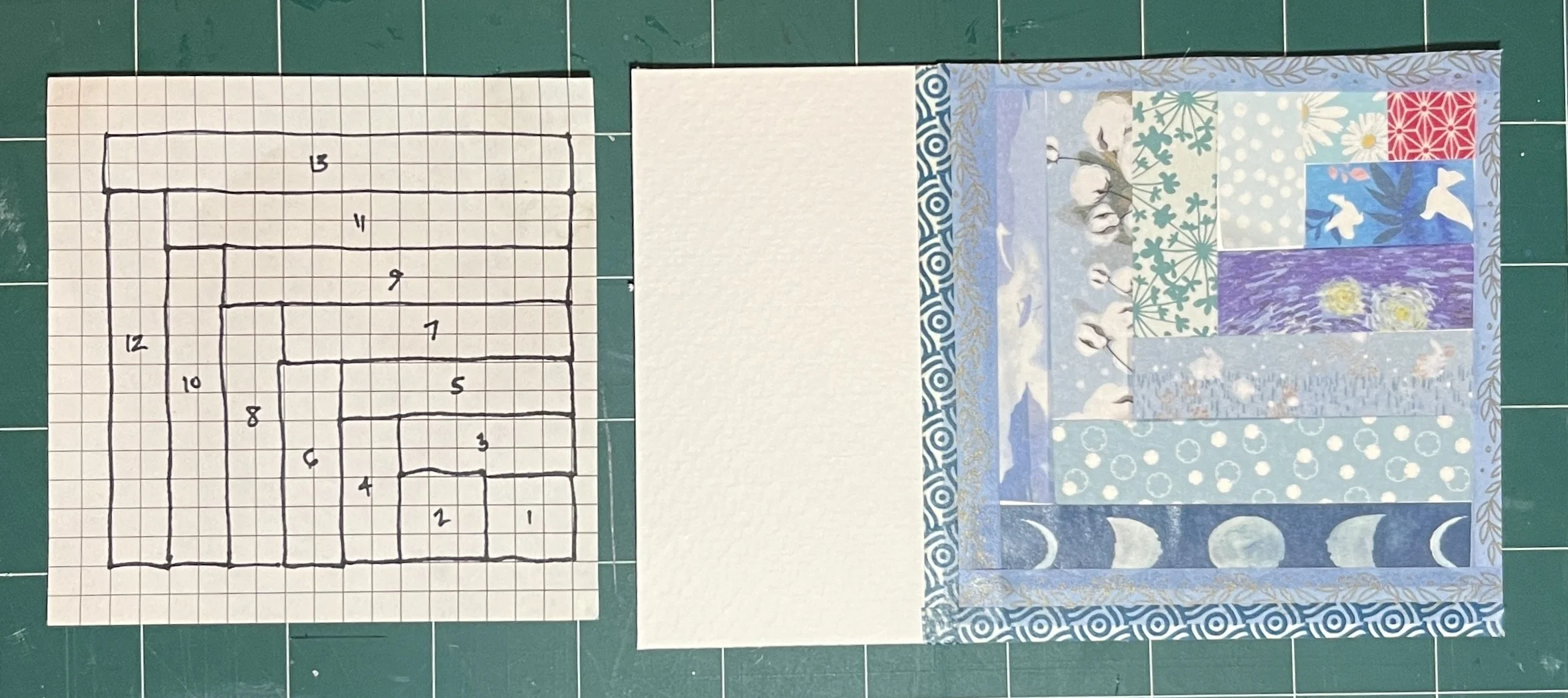
Here is the 1st card (albeit upside down) after piecing my tapes together. Below, you can see the 2nd design. With a jaunty angle it fills more of the card - you can see the darker colors on the left and lighter ones on the right.

I wanted to add handwritten quotations to each of them, but first I needed to do something to bring some more BLUE. I turned to my trusty FineTec iridescent watercolors to add a little somthin’ somthin’ to the open areas.
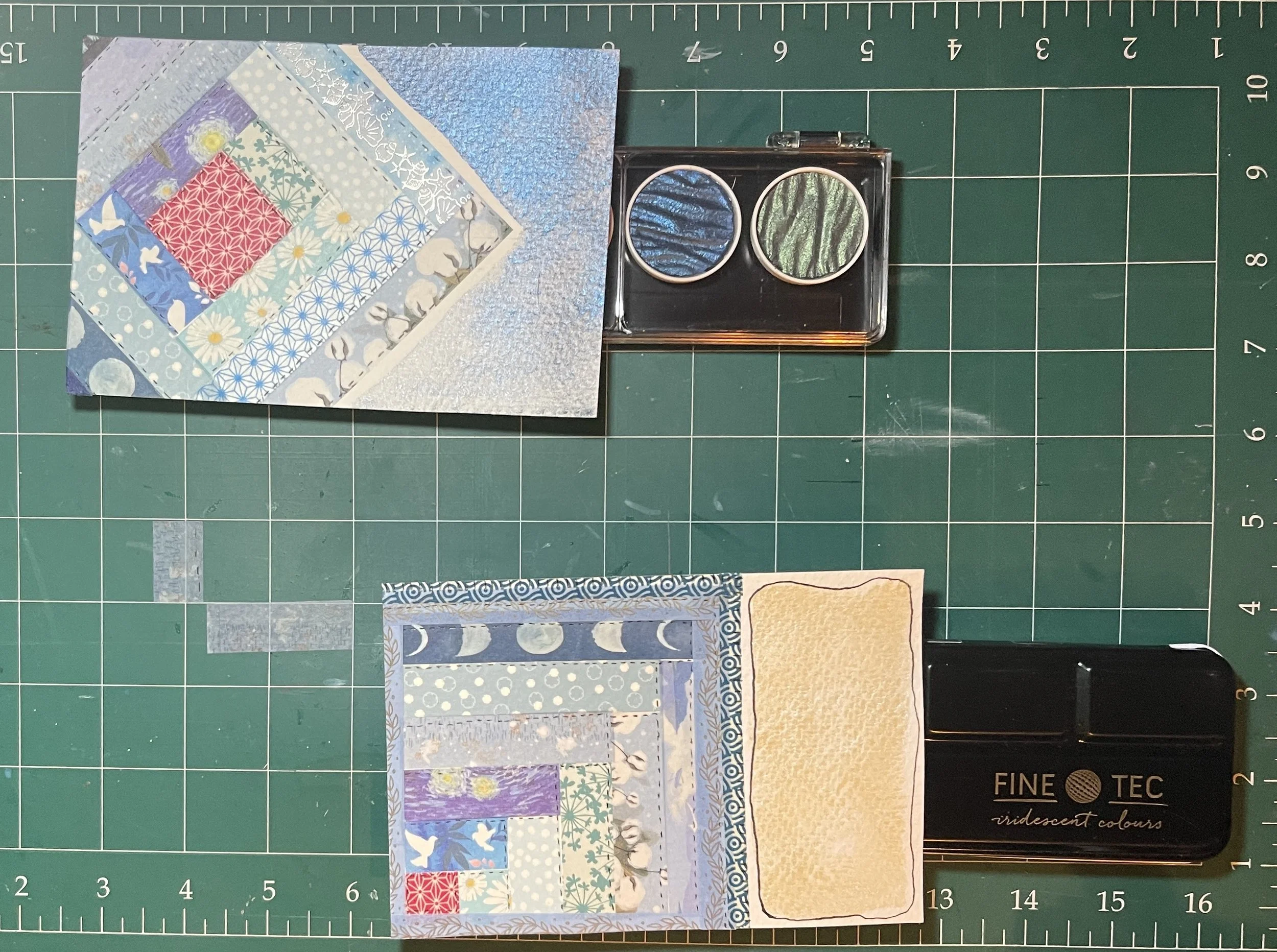
When it came time to photograph them, I realized that this might not have been the best choice - but they sure are pretty in real life. ;) The one on top has the Midnight Blue from the Rainbow pearl colors set; the bottom features Sapphire Blue interference color from the iridescent set. It looks oddly yellow and flat, here (above); on the completed card however, it is a shimmery, pale, flashing blue/pink — like the inside of a well-worn seashell (below). I used a 005 Micron pen to add tiny stitching to my “quilts.”

Card 1 completed. The iridescence is more visible here.

Card 2 completed. Again, the shimmery effect of the paint
is more visible here.
…and that’s a wrap on this episode of ToTs! While I used Washi Tape for these examples, you could easily to the same thing with any printed papers (i.e. security envelopes, photos from magazines (cut into strips), decorative/scrapbook papers, etc.). Before mailing, I would recommend a this coat of matt medium, ModPodge, or similar sealant. Likewise, you could actually use strips of fabric; however this might make your finished card somewhat weighty. I hope that this has provided you with a wee bit of blue inspiration! We can’t wait to see how you do blue.

Michelle will be back with ToTs #006 in a couple of weeks. Until then, keep making beauty in this crazy world!
- Penny
We Have a Full House!
As of today (Monday, October 6, 2025) Seaside Sessions 2026 is FULL. If you missed out, it costs nothing to be added to our Wait List. Should anyone currently registered not be able to come, we will reach out to individuals on the wait list in the order in which they were added. If you wish to be added, please contact us via email.
Stay tuned for more creative adventures and the latest news on all things Your Creative Connection.

Until next time,
- Penny & Michelle
Registration Open for Seaside Sessions 2026

Thanks to our wonderful alumnae, we are thrilled to announce that Registration is open AND that only 2 spots remain for our 5th Annual Seaside Sessions in 2026. You can make one of those spots your own by visiting the Our Events tab on the website and selecting Seaside Sessions 2026. There you will find a link to our Registration Form. Even though it is already October, there are still multiple Payment Plans available to make your magical mixed media getaway a little easier to manage.
Once these last remaining spaces are filled, we will begin a Wait List. Should a currently filled spot open, we will contact wait list individuals in the order that their requests were received. Want to attend with a friend? NOW is the time to act. We can’t wait to welcome you to our creative haven by the sea!

Until next time,
- Penny & Michelle
Founders and Hosts of
Your Creative Connection
Celebration of Sapphire #012 | The Wasted Angel

The Wasted Angel
Assebroek, Bruges
Belgium
Celebration of Sapphire #011 } Tatum Weaver

Tatum Weaver
Fayetteville, NC
US
Celebration of Sapphire #010 | Wendy Dickerson

Wendy Dickerson
Raleigh, NC
US
Tips on Tuesdays #004 - Tempera Paint Sticks
Welcome to our 4th installment of ToTs; our series of posts designed to spur you on to creative success as you create your entry into our International Mail Art Call: Celebration of Sapphire.

Shuttle Art Tempera Paint Sticks: https://www.shuttleart.com/collections/tempera-paint-sticks
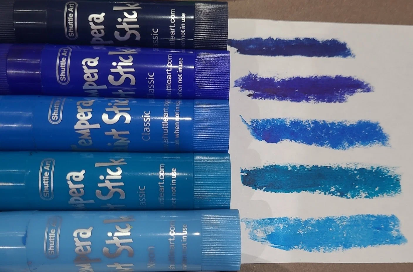
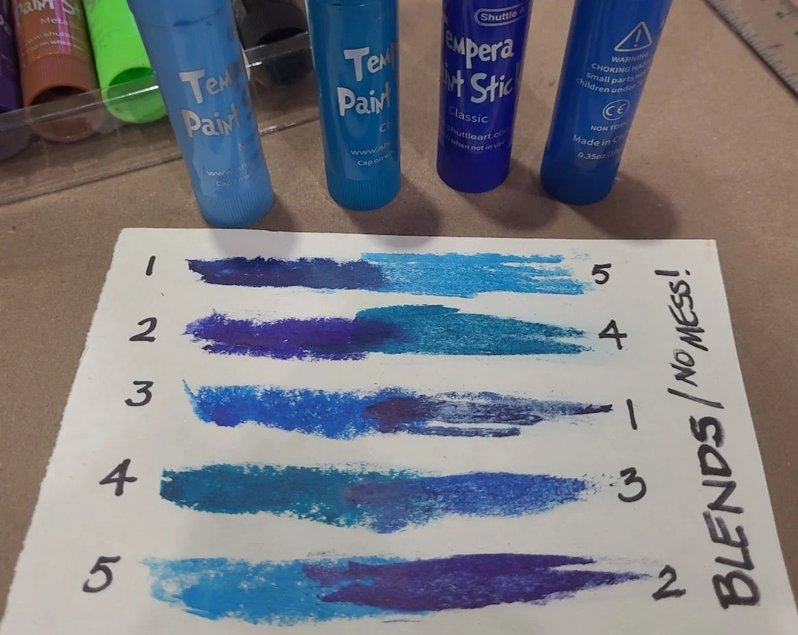
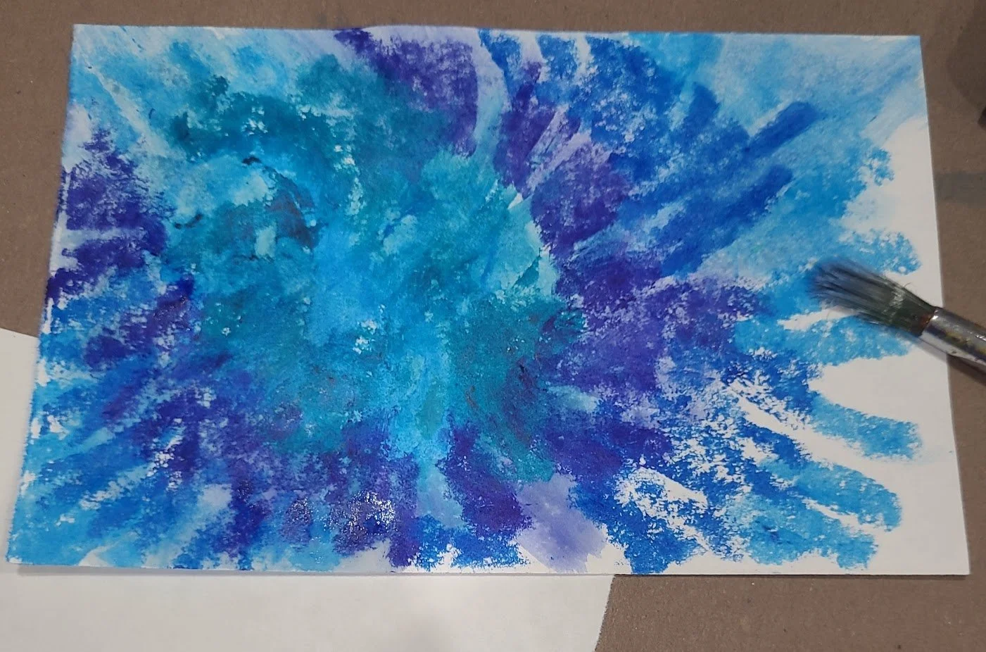
Have you ever heard of tempera paint sticks? I hadn’t either until several years ago when I was searching for a medium to use in my art classes with young students (3-4 year olds) which would allow them to color and blend without making a huge mess (even though they LOVE making messes). I found tempera paint sticks, and discovered that they fit the bill perfectly! As the name implies, they’re solid compressed tempera paint, with a consistency like an oil pastel, though not as soft. In fact, the paint sticks are virtually mess free since they go on dry. And as you can see above, they come in a pretty wide variety of colors including metallics. Tempera paint sticks can be used on just about any substrate, and smooth or textured results are easily attained. Although they’re marketed for children’s art, there’s no need for kids to have all the fun!
In the gallery below, I’ve shown the five shades of blue in the 32 color box; what it looks like when you put one shade over another to blend; the way they look on white paper when you add a bit of water to blend; and what the blended piece looked like after it dried.
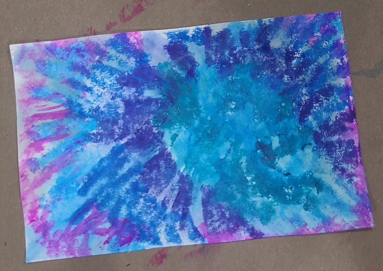
Paint stick colored papers can be used as a complete composition, or as a background; it’s up to you!
So there you have it: Tempera Paint Sticks—another arrow in your mixed media creative quiver!
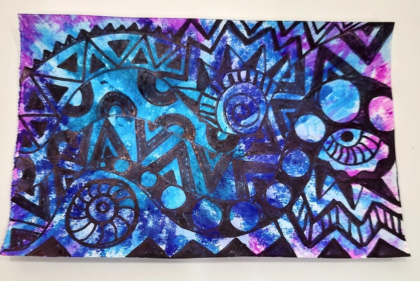
The original tempera paint stick sample used as a painted paper background with black Sharpie designs on top
To catch up on the three previous ToTs posts, click on the images below:

ToT #1: Substrates

ToT #2: Contour Lettering
ToT #3: Collage Stuff: Security Envelopes
Stay tuned for the next ToT from Penny. If you have a question about anything we’ve presented or a technique you’re curious about, let us know in the comments!
Until next time,
Michelle

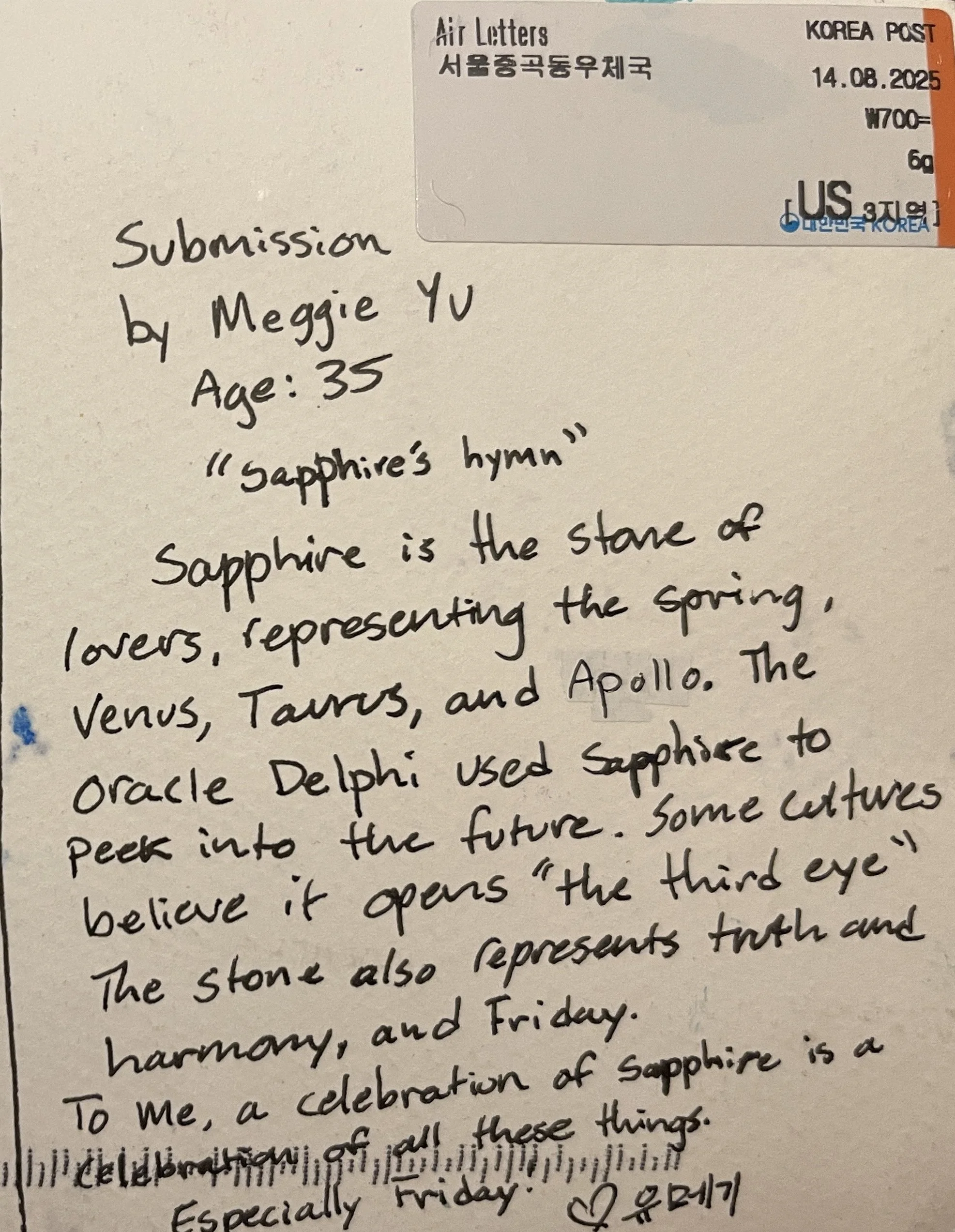
Celebration of Sapphire #009 | Meggie Yu
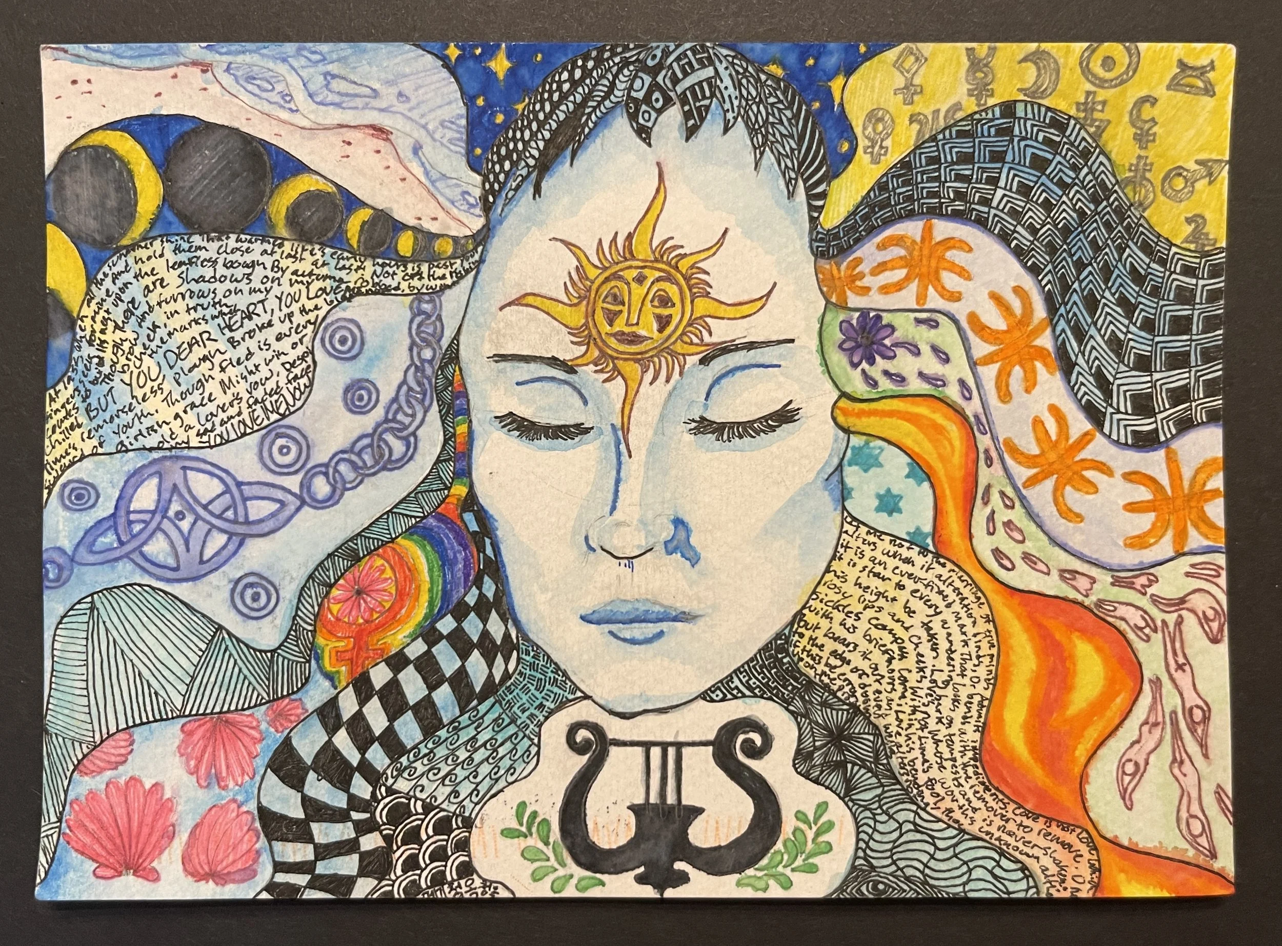
Meggie Yu
Seoul,
South Korea
This piece, like her daughter’s (#007, Mina Yu), comes with its origin story. Lovely, lovely!
Celebration of Sapphire #008 | Katerina Mandarik

Katerina Mandarik
Strasbourg
France